Compare the best AI data visualization tools based on features, pricing, pros, cons, and use cases to choose the right solution for your business.

Ka Ling Wu
Co-Founder & CEO, Upsolve AI
10 min

Have you ever been overwhelmed by data?
I mean, who hasn’t? Rows and rows of numbers are useless if you can’t make sense of them.
That’s where AI data visualization comes to the rescue—turning boring spreadsheets into jaw-dropping visuals you can actually use to make smarter decisions.
Now, if you’re a Founder, CTO, Business Analyst, or Product Manager, you already know how crucial data is.
But here’s the deal—choosing the right AI-powered tool to visualize your data can be tricky. That’s why this blog is here to save you time and headaches.
I’ll walk you through everything you need to know:
What AI data visualization is and how it transforms raw data into actionable insights.
A breakdown of the 5 best AI data visualization tools, including their pros, cons, pricing, and who they’re perfect for.
The key features that make these tools stand out and how to pick the right one for your needs
At the end, I’ve included a comparison table to give you a quick side-by-side view of all the tools, so you don’t have to waste hours digging through the details.
If you skip this, you might miss out on finding the one tool that saves you hours every week and helps your business grow.
Let’s make your data work for you, not the other way around. Ready? Let’s dive in!
What Are AI Data Visualization Tools?
AI data visualization tools help you make sense of your data by turning raw numbers into visuals like charts, graphs, and dashboards. They use artificial intelligence to automate much of the process, so you don’t have to spend hours manually creating these visuals. For a detailed breakdown of how AI compares to traditional BI, see our comparison guide.
Let’s break it down.
Think about the last time you had to analyze data. Maybe it was a sales report, customer insights, or even website traffic. You probably had spreadsheets with numbers that didn’t make much sense at first glance.
AI data visualization tools step in here. They take that data, process it, and present it in a way that’s easy to understand.
For example, instead of a list of sales figures, you could get a line graph showing trends over months. AI data visualization tools make it possible for anyone to analyze data without needing to know coding or statistics.
Key Features That Make AI Data Visualization Tools Stand Out
Here are a few things that make these tools helpful:
Automation: They can automatically suggest the best way to display your data. For instance, if you’re analyzing trends, the tool might recommend a line chart over a bar chart.
Natural Language Queries: Some tools let you ask questions like, “What were my sales last quarter?” The tool gives you the answer instantly in a visual format.
Real-Time Data Updates: These tools sync with your data sources, so your visuals stay up-to-date without manual effort.
AI data visualization tools act like assistants for your data. They save time, reduce errors, and help you focus on making decisions instead of figuring out what the numbers mean.
What Are the Best AI Data Visualization Tools?
Here’s a quick list of the top AI data visualization tools:
Upsolve AI
Tableau
Microsoft Power BI
Qlik Sense
Looker Studio
Upsolve AI
Upsolve AI is a customer-facing analytics platform designed to simplify how you provide insights to your users.
If you’re tired of spending weeks building dashboards or stressing your engineering team with analytics projects, Upsolve AI offers a solution. It allows you to embed customizable, customer-facing dashboards into your product quickly and efficiently.
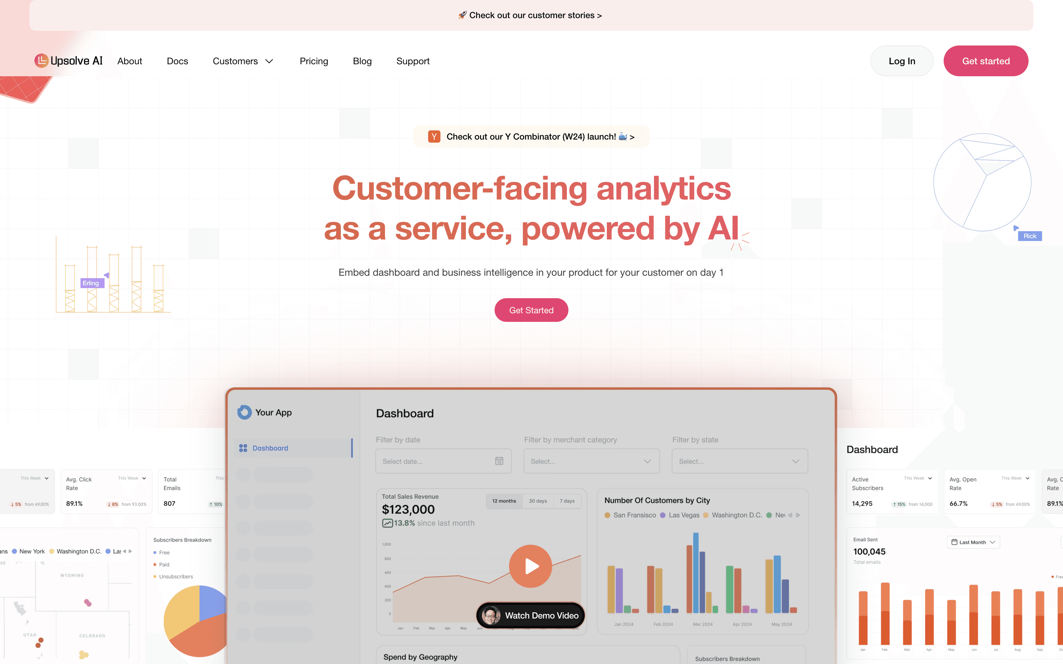
Key Features of Using Upsolve AI
Quick Deployment: Set up customer-facing dashboards in just one day. For example, if your product tracks customer sales data, you can have an analytics dashboard live within 24 hours.
AI-Powered Data Suggestions: The tool uses AI to detect patterns and trends. If your customers want to know their sales trends or high-risk areas, Upsolve AI delivers insights without manual intervention. For a deeper look at building AI-powered dashboards, see our guide.
Drag-and-Drop Interface: You don’t need coding skills to use Upsolve AI. Building dashboards is as easy as dragging and dropping elements, saving you time and effort.
Embedded Analytics: Integrate dashboards directly into your product using React or Vue components. For instance, your users can view analytics within your app without switching platforms.
Usage Analytics: Learn how your customers interact with their dashboards. This helps you understand which insights they value the most and what needs improvement.
Upsolve AI Pricing Breakdown
Upsolve AI offers a free test-drive plan and three paid tiers; embedding and multi-tenant analytics start on the Team plan ($2,000/month). Paid plans are structured around monthly credits, with $0.05/credit overage.
Free — $0
A full test-drive of Upsolve with Pro features unlocked.
2,000 one-time credits (~200 analytical questions)
All Pro features unlocked
Community support
Pro — $500/month
For teams getting started with AI-powered analytics.
2,000 credits/month (~200 questions/mo), $0.05/credit overage
50+ data connections, unlimited agents
Charts & visualization, context management suite, full observability & eval
MCP App, priority email support
Team — $2,000/month
For teams that need embedding, RBAC, and a semantic layer. Everything in Pro, plus:
10,000 credits/month (~1,000 questions/mo), $0.05/credit overage
Row-level security / RBAC, embed Upsolve in your product, multi-tenant support
AI Cockpit for data modeling & semantic-layer generation
AI dashboards + email scheduling, dedicated support, bulk credit discount
Enterprise — Custom
For custom deployment, security, and model-routing. Everything in Team, plus:
Custom base platform fee + credits, or BYOM + surcharge
On-prem / self-host / VPC, SAML SSO, HIPAA, SOC 2
Model routing (BYOM), Forward Deployed Engineering, 24/7 support + shared Slack
Annual billing is 20% off across all plans.
Pros And Cons Of Using Upsolve AI
Pros
Quick Deployment: Users appreciated that Upsolve AI lets you build and deploy dashboards in just one day.
Drag-and-Drop Interface: Users found the drag-and-drop feature helpful because it makes creating dashboards easy without coding.
Embedded Analytics: Many users liked the ability to embed dashboards directly into their products using React or Vue components.
AI-Powered Suggestions: Users appreciated how the tool automatically highlights trends and patterns in data.
Real-Time Data Syncing: Users found it useful that dashboards update automatically with real-time data.
Scalable Options: Users liked that Upsolve AI works for both startups and large enterprises.
Customer Insights: Users appreciated how Upsolve AI tracks dashboard usage, showing which features customers use most.
Cons
Limited Customization for Complex Needs: Some users found that Upsolve AI’s customization options don’t fully meet the requirements of businesses needing highly tailored or advanced dashboards.
Focus on Customer-Facing Analytics: Users noted that while Upsolve excels at external dashboards, it may not be ideal for internal analytics needs.
Dependency on Pre-Built Components: Some users mentioned that relying on React or Vue components for embedding can be restrictive if their product doesn’t use these frameworks.
✔️ So, Upsolve AI provides quick deployment, real-time data syncing, and a user-friendly drag-and-drop interface, making it a great tool for embedding customer-facing dashboards efficiently.
❌ However, it has some drawbacks, such as limited customization for advanced needs and reliance on specific frameworks for embedding.
Despite these, it remains a reliable option for businesses focused on delivering seamless external analytics to their users.
Tableau
Tableau is a leading AI-powered analytics platform that helps you create interactive, user-facing dashboards and reports.
Known for its ease of use, Tableau makes it simple to transform complex data into visuals that anyone can understand.
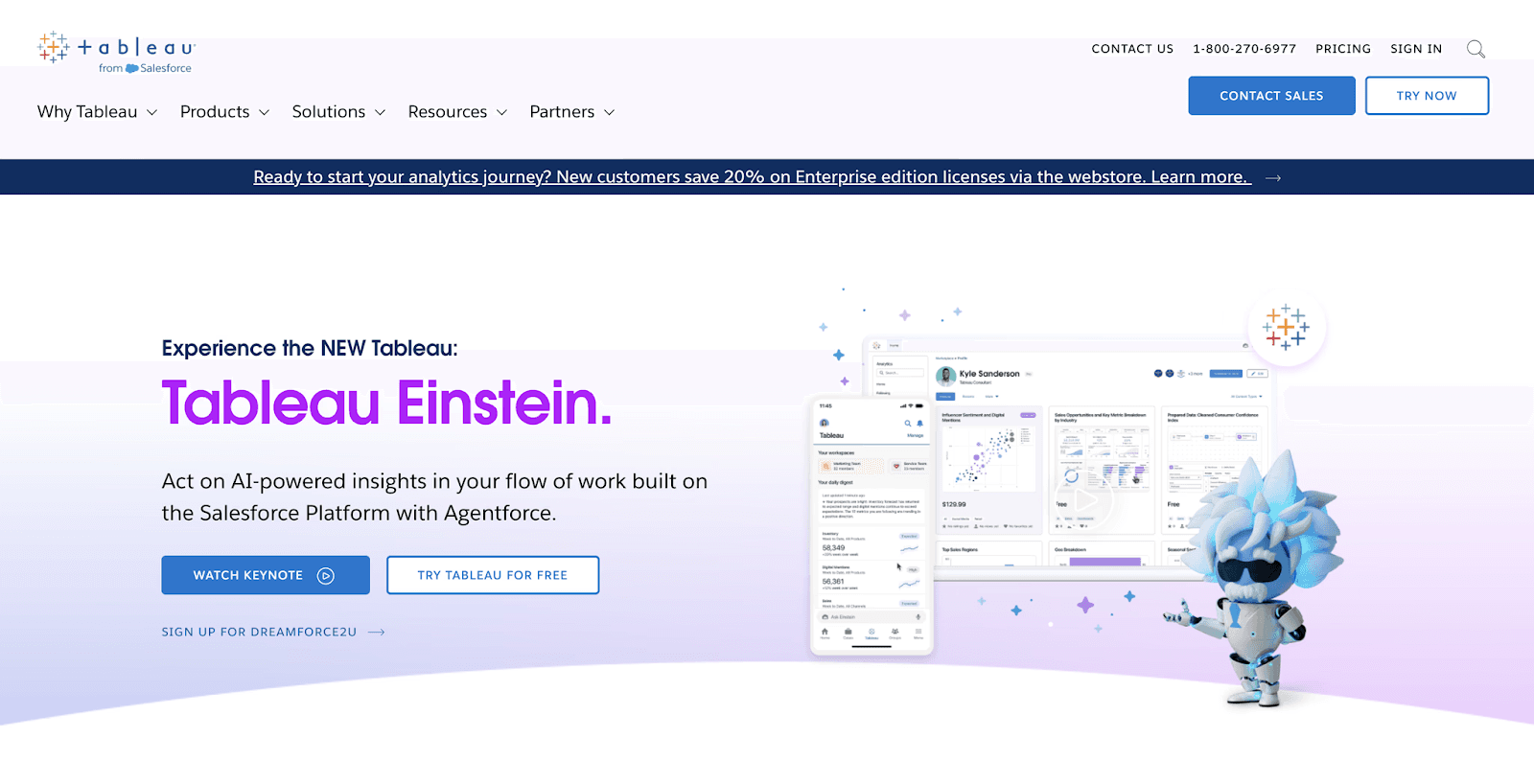
With options for both cloud and on-premise deployment, it’s designed to meet the needs of organizations of all sizes.
Key Features Of Using Tableau
Drag-and-Drop Interface: You can create professional-looking dashboards without any coding. This feature is helpful because it saves time and makes data visualization accessible to everyone, including non-technical users.
Real-Time Data Integration: Tableau connects to multiple data sources, such as Excel, SQL databases, and cloud platforms.
Advanced Visual Analytics: Tableau allows you to explore trends and patterns in your data using tools like heat maps and forecasting.
Collaboration Tools: Sharing dashboards with your team or customers is easy with Tableau’s built-in sharing and collaboration features..
User-Facing Analytics: Tableau excels in embedding analytics into your product, giving users direct access to insights.
Tableau Pricing Breakdown
Tableau Plans
Tableau Creator
Designed for users who create and manage data visualizations and dashboards.
Includes Tableau Desktop, Tableau Prep Builder, and a Creator license for Tableau Cloud or Tableau Server.
$70 per user per month, billed annually.
Tableau Explorer
Suited for users who explore and analyze data without the need for full content creation capabilities.
Includes Access to Tableau Cloud or Tableau Server with capabilities to interact with and modify existing dashboards.
$42 per user per month, billed annually.
Tableau Viewer
Intended for users who primarily view and interact with dashboards and visualizations.
Includes access to published content with interactive features.
$15 per user per month, billed annually.
Enterprise Plans
For organizations requiring advanced features, Tableau offers Enterprise editions:
Enterprise Creator
Provides all features from the Tableau Creator plan plus advanced data management.
$115 per user per month, billed annually.
Enterprise Explorer
Expands on the Tableau Explorer plan with enhanced management tools.
$70 per user per month, billed annually.
Enterprise Viewer
Similar to Tableau Viewer but with added enterprise-level features.
$35 per user per month, billed annually.
Tableau +
Ideal for large enterprises seeking maximum analytics depth, customized reporting, and powerful, organization-wide data management.
Includes all standard Tableau features and adds cutting-edge AI insights, customizable data alerts, AI-powered analytics, and exclusive Tableau Pulse capabilities.
Contact sales for pricing.
Pros And Cons Of Using Tableau
Pros
Easy-to-use Drag-and-Drop Interface: Users appreciated Tableau’s drag-and-drop functionality, which allows you to create dashboards and visualizations without coding.
Data Integration Flexibility: Users found Tableau’s ability to connect to multiple data sources, such as Excel, SQL databases, and cloud platforms, very useful.
Interactive Dashboards: Tableau’s dashboards let you interact with data by filtering, drilling down, or changing views. Users liked how this feature helps them explore data more deeply to uncover insights.
Cross-Platform Availability: Users appreciated that Tableau works on multiple platforms, including desktop, mobile, and cloud. This flexibility allows teams to collaborate and access data from anywhere.
Real-Time Updates: Tableau can connect to live data sources and provide real-time updates. Users found this feature essential for tracking key metrics and making timely decisions.
Cons
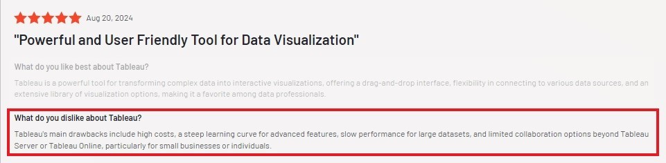
High Cost: Users often mentioned that Tableau’s pricing can be a barrier, especially for smaller teams or startups. While the features are powerful, the cost may not fit every budget. If budget is a concern, explore Tableau alternatives.
Steep Learning Curve for Advanced Features: While the basics are easy to grasp, users found that advanced functionalities like calculated fields and LOD (Level of Detail) expressions require significant training and practice.
Performance Issues with Large Datasets: Some users reported slow performance when working with very large or complex datasets. This can make Tableau less efficient for businesses handling extensive data.
Limited Built-In Visualization Options: Users noted that Tableau offers fewer built-in chart types compared to competitors like Power BI. Customizing visuals can require additional effort.
✔️ Tableau excels with its drag-and-drop interface, real-time data updates, and flexible integration options, making it ideal for creating interactive dashboards and embedding user-facing analytics.
❌ However, its high cost, steep learning curve for advanced features, and performance issues with large datasets may pose challenges for smaller teams or businesses with complex data needs.
Microsoft Power BI
Power BI is Microsoft’s business intelligence platform designed to help you connect, visualize, and analyze data from various sources.
It’s widely used for creating interactive reports and dashboards that make data easier to understand and act upon.
One of its standout features is its integration with the Microsoft ecosystem, allowing you to connect seamlessly with tools like Excel, Teams, Office 365, and SharePoint.
Key Features Of Using Microsoft Power BI
Data Integration: Power BI allows you to connect to various data sources, including Excel files, SQL databases, and cloud platforms like Azure.
Interactive Dashboards: With Power BI, you can create dashboards that let you filter, drill down, and explore your data interactively.
AI-Powered Analytics: Power BI includes AI capabilities to help identify trends, forecast outcomes, and suggest actionable insights.
User-Facing Analytics: Power BI Embedded allows you to integrate dashboards directly into your applications.
Seamless Microsoft Integration: Power BI works effortlessly with Microsoft 365 tools like Excel, Teams, and Outlook, making it a natural fit for organizations already using these platforms.
Microsoft Power BI Pricing Breakdown
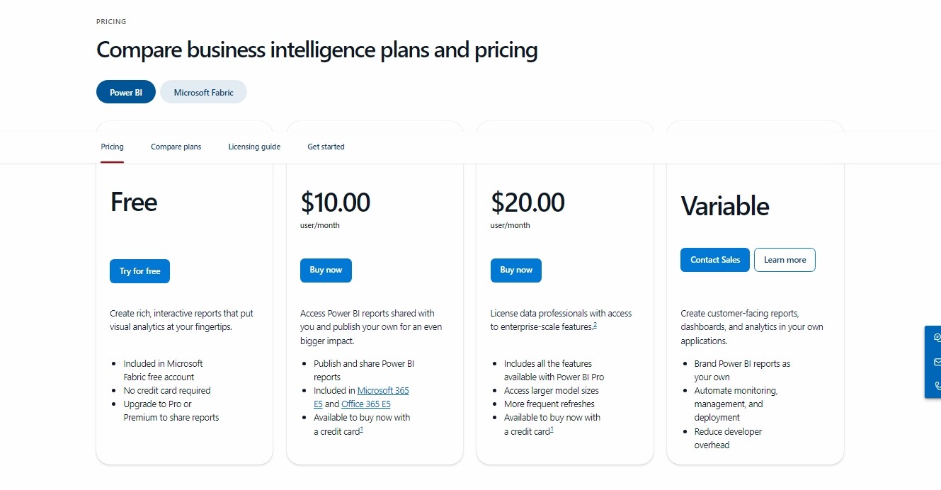
Power BI Free
Create and share simple reports.
Great for individual users exploring data.
Free
Power BI Pro
Share reports across your team.
Access to collaboration features.
$10 per user/month
Power BI Premium (Per User)
Adds enterprise-grade features like large data models and AI-enhanced insights.
Ideal for businesses managing complex data.
$20 per user/month
Power BI Premium (Capacity-Based)
Allows sharing without requiring individual licenses for every user.
Ideal for organizations with large teams.
Based on capacity, contact sales for pricing
Pros And Cons Of Using Microsoft Power BI
Pros
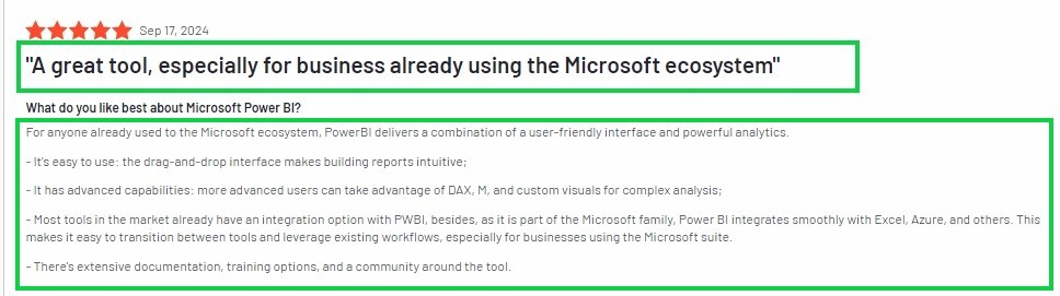
Drag-and-Drop Interface: Users appreciated how easy it is to create dashboards using the drag-and-drop feature.
Integration with Microsoft Tools: Users found it helpful that Power BI works well with Excel, Teams, and SharePoint.
Real-Time Data Updates: Many users liked the ability to see live updates in dashboards.
Customizable Visualizations: Users appreciated how they could tailor charts and graphs to match their needs.
Mobile Accessibility: Users found it convenient that reports and dashboards are available on phones and tablets.
Cons
Steep Learning Curve for Advanced Features: Users found that while basic functions are easy, mastering advanced tools like DAX and Power Query requires significant time and effort, especially for non-technical users.
Performance Issues with Large Data: Many users noted that Power BI struggles with large datasets. Slow loading times and performance drops can be frustrating for businesses with extensive data needs.
Dependence on Cloud Services: Some users found the heavy reliance on cloud services for sharing and collaboration inconvenient, especially for organizations preferring on-premises solutions.
Complex Licensing Model: Some users felt the pricing and licensing options, especially for larger teams, are confusing and not straightforward to navigate.
✔️ Power BI excels with its easy-to-use drag-and-drop interface, extensive integration with Microsoft tools, customizable visualizations, and advanced analytics capabilities that empower users to derive meaningful insights.
❌ However, users find the steep learning curve for advanced features like DAX challenging, and they also experience slow performance with large datasets. Its reliance on cloud services can be inconvenient for some organizations.
See also: Looker vs Power BI: Which Is Better for Your Business?
Qlik Sense
Qlik Sense is a data analytics and visualization tool that helps you turn raw data into actionable insights.
Whether you’re analyzing sales trends or customer behaviors, Qlik Sense allows you to explore data interactively and uncover insights quickly.

Key Features of Qlik Sense
AI-Powered Data Visualization: Qlik Sense uses AI to generate automated insights and predictive analytics. This means you can uncover patterns in your data without digging too deep manually.
Associative Engine: Unlike traditional query-based tools, Qlik Sense lets you freely explore data without predefined pathways.
Interactive Dashboards: Qlik Sense offers customizable dashboards with drag-and-drop functionality.
Mobile and Embedded Analytics: With mobile support, you can access your reports anywhere. Embedded analytics also let you integrate dashboards directly into your business applications, which can be helpful for making decisions on the go.
Flexible Data Integration: Qlik Sense connects to multiple data sources like Excel, SQL, and cloud platforms. Users appreciated how seamlessly they could pull data from various tools they already use.
Qlik Sense Pricing Breakdown
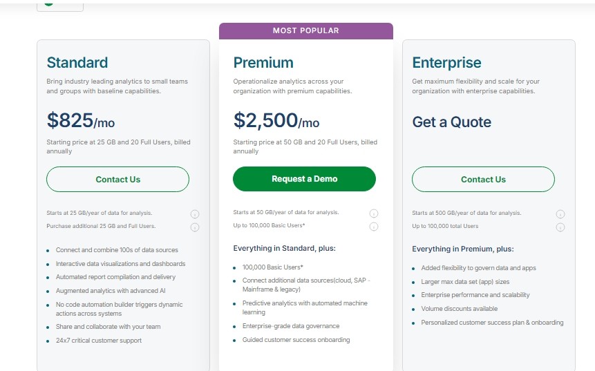
1. Standard Plan
Designed for small teams or groups, the Standard plan starts with 25 GB of annual data for analysis and 20 Full Users.
Features include:
Interactive data visualizations, automated reporting, and AI-powered analytics.
Access to a no-code automation builder to streamline actions across systems.
24/7 critical customer support for added peace of mind.
$825/month, billed annually
2. Premium Plan
Built for larger teams, the Premium plan starts with 50 GB of data and scales up to 100,000 Basic Users along with the original 20 Full Users.
Includes everything in the Standard plan, plus:
Expanded data sources, such as SAP, mainframe, and legacy systems.
Predictive analytics powered by machine learning and advanced governance.
A guided customer success onboarding to get teams up and running smoothly.
$2500/month, billed annually
3. Enterprise Plan
For organizations with extensive data needs, the Enterprise plan offers a starting capacity of 500 GB and scales to accommodate up to 100,000 users.
Adds extra features beyond the Premium plan, such as:
Higher performance, scalability, and larger app sizes.
Volume discounts, enhanced data governance, and a customized onboarding plan.
Custom Pricing
Pros And Cons Of Using Qlik Sense
Pros
AI-Powered Analytics: Users appreciated Qlik Sense's AI-powered insights that simplify complex data analysis. Features like automated data visualizations and natural language interaction make it easier to uncover patterns without technical expertise.
Associative Engine: The unique Associative Engine allows users to explore data freely, without being limited to predefined queries.
Interactive Dashboards: Users found the drag-and-drop functionality for creating dashboards intuitive and efficient.
Self-Service Analytics: Qlik Sense empowers users to analyze and visualize data independently, without heavy reliance on IT teams.

Cons
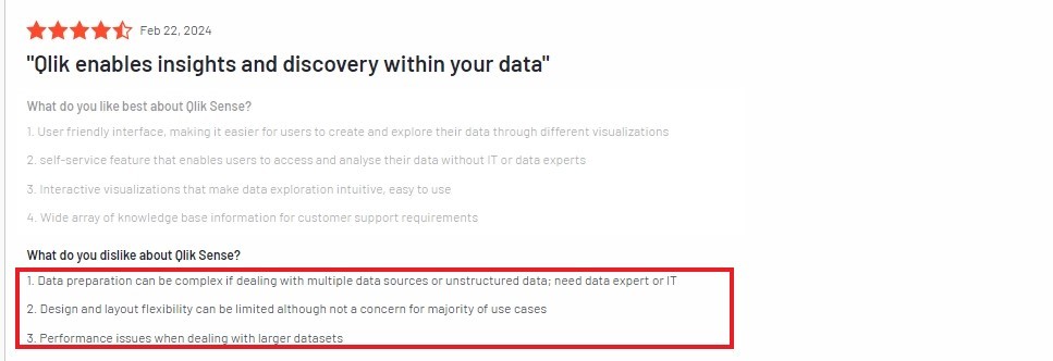
Steep Learning Curve for Advanced Features: Users found that mastering Qlik Sense's scripting language and advanced functions, like set analysis, requires time and technical expertise.
Performance Issues with Large Datasets: Several users reported that Qlik Sense struggles with processing very large datasets.
Limited Design Customization: Users noted that while the dashboards are functional, the design and layout customization options are somewhat restricted compared to other tools.
High Cost for Small Businesses: Compared to other business intelligence tools, Qlik Sense's pricing was seen as expensive, especially for small businesses with limited budgets. Consider reviewing Qlik alternatives if cost is a concern.

✔️ Qlik Sense shines with its user-friendly interface, powerful associative engine, and AI-driven insights, enabling users to explore data dynamically and create interactive visualizations with ease.
❌ However, users found the advanced features challenging to learn, noted performance slowdowns with large datasets, and highlighted limited customization options and high costs for small businesses.
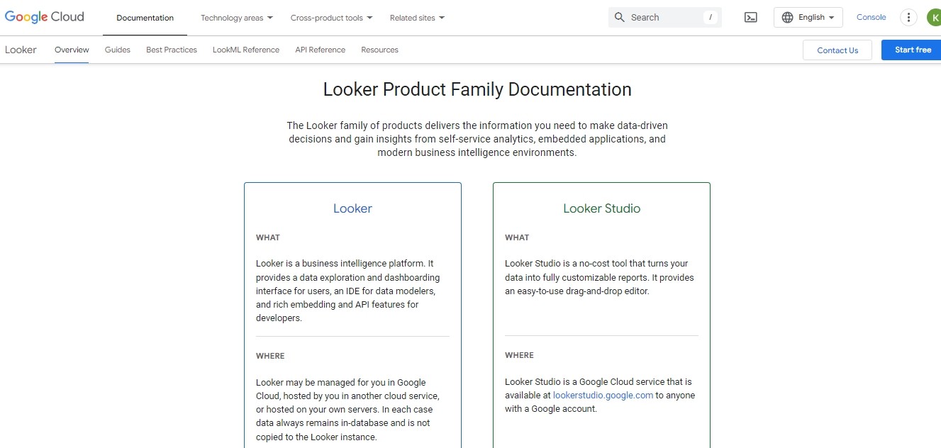
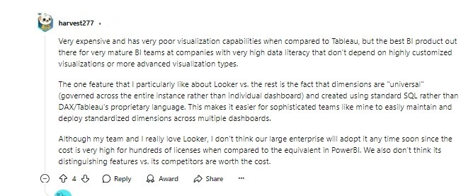
Looker
Looker is a modern business intelligence (BI) and analytics tool built on Google Cloud. It helps you analyze your data, create powerful visualizations, and build custom applications.
Looker stands out with its semantic modeling layer, which ensures consistent metrics across your organization. It’s also API-first, meaning you can easily integrate it into your existing workflows or applications.
Key Features of Looker
AI-Powered Analytics: Looker integrates AI to simplify workflows. For example, you can use natural language to ask questions about your data, and Looker will provide insights or create visualizations automatically.
Custom Data Applications: You can use Looker’s robust API and embedded analytics to create custom applications.
Interactive Dashboards: Looker offers real-time, interactive dashboards that let you drill down into the details of your data. You can filter, adjust, and explore without waiting for a report to update.
Seamless Integration: Looker connects with over 800 data sources, including Google BigQuery, AWS, and SQL databases.
Data Governance: With Looker’s semantic layer, all users get the same metrics and definitions. This ensures your reports are accurate and consistent, no matter who creates them.
Looker Pricing Breakdown
Quick heads up; Looker’s pricing is not transparent.
Everything you find here is just a product of my research. You’ll have to contact sales for pricing tailored to your business needs.
Standard Edition
Designed for smaller teams with fewer than 50 users.
Includes:
One main setup (production instance).
10 Standard Users.
2 Developer Users.
1,000 query-based API calls per month.
1,000 admin API calls per month.
Pricing: Contact Looker’s sales team for custom pricing.
Enterprise Edition
Built for larger teams needing enhanced security features.
Includes:
One main setup (production instance).
10 Standard Users.
2 Developer Users.
100,000 query-based API calls per month.
10,000 admin API calls per month.
Pricing: Custom quote available through Looker’s sales team.
Embed Edition
Ideal for embedding analytics in customer-facing applications.
Includes:
One main setup (production instance).
10 Standard Users.
2 Developer Users.
500,000 query-based API calls per month.
100,000 admin API calls per month.
Pricing: Requires a custom quote from Looker’s sales team.
Pros And Cons Of Using Looker
Pros
User-Friendly Interface: The drag-and-drop functionality makes it simple for users, even those without technical backgrounds, to create dashboards and visualizations. Many users appreciated how easy it was to build reports without writing complex code.
Centralized Data Governance: Users liked this feature because it provided a "single source of truth," reducing discrepancies in metrics.
Real-Time Data Insights: With real-time updates, Looker helps users make quick, informed decisions. For example, marketing teams used this feature to adjust campaigns based on live performance data.
Customizability Through APIs: Looker’s robust API allows businesses to build tailored analytics applications. Users mentioned that this flexibility made it easier to adapt Looker to their unique workflows and needs.
Cons
Steep Learning Curve for New Users: While Looker’s interface is intuitive, many users found advanced features like LookML and custom dashboards challenging to learn. This makes onboarding slower for non-technical users.
Performance Issues with Large Data: Users reported slow performance when handling massive datasets, especially without a strong backend database like BigQuery or Snowflake. This can delay reporting and analysis for large enterprises.
Limited Visualization Options: Compared to tools like Tableau, Looker offers fewer chart types and less flexibility for customization. Some users felt this limitation restricted creativity in presenting complex data.
High Cost for Enterprise Teams: Looker’s pricing model is tailored to enterprise users, making it expensive for smaller teams or organizations. Many users noted that the high cost isn’t always justified, especially for basic analytics needs.
✔️ Looker stands out with its intuitive dashboards, seamless data integrations, and robust collaboration features. It’s ideal for creating governed data models and exploring real-time insights with ease.
❌ However, users noted challenges with its steep learning curve, high cost, and limited visualization options. Performance issues with large datasets and dependence on internet connectivity were also common concerns.
Comparison Table
Metric | Upsolve AI | Tableau | Power BI | Looker | Qlik Sense |
|---|---|---|---|---|---|
Key Features | AI-powered insights, embedded dashboards, usage analytics | Real-time data updates, advanced visualizations, flexible deployment | Interactive dashboards, AI insights, seamless Microsoft integration | Unified data modeling, real-time dashboards, robust API integration | Associative data engine, AI-powered insights, interactive dashboards |
Ease Of Use | Drag-and-drop interface, quick setup | Intuitive for basic use, steep learning curve for advanced features | Easy for basic tasks, training required for advanced use | Intuitive for basic tasks, technical expertise needed for advanced features | Intuitive interface, but advanced features require expertise |
Integration | React/Vue components for seamless embedding | Wide range of integrations, cloud/on-premise support | Seamless with Microsoft tools like Excel, Teams | Excellent integration with Google tools like BigQuery, Analytics | Connects with platforms like Salesforce, SAP, and cloud services |
Scalability | Scales from startups to enterprises | Ideal for enterprises, flexible deployment options | Scales with Microsoft Premium plans | Built for large teams, supports enterprise-grade analytics | Handles small to enterprise-level projects, hybrid options available |
Pricing | Free tier; $500/mo (Pro), $2,000/mo (Team), custom (Enterprise) | $15–$70/user/mo (standard); $35–$115/user/mo (enterprise) | Free, $10/user/month (Pro), $20+/month (Premium) | Custom pricing tailored to team size and use case | $825+/month (standard), $2,500+/month (premium), custom for enterprise |
Best For | Startups needing quick, user-facing dashboards | Enterprises seeking visually compelling dashboards | Microsoft-centric teams needing affordable, scalable solutions | Google-based ecosystems and businesses needing custom analytics apps | Businesses needing associative data exploration and advanced analytics |
Conclusion: Which AI Data Visualization Tool Should You Choose?
Picking the right AI data visualization tool depends on your business needs, technical expertise, and budget.
Each tool excels in different areas, making them suitable for various use cases and goals.
Quick Setup for Customer-Facing Analytics: If you want a tool that allows you to deploy user-facing dashboards quickly, Upsolve AI is a top choice. Its drag-and-drop simplicity and AI-powered insights are perfect for startups and customer-centric businesses.
Advanced Visual Storytelling: For teams focused on creating highly interactive, visually compelling dashboards, Tableau stands out. Its real-time updates and customizable visualizations are ideal for businesses that value aesthetics and depth in reporting.
Seamless Integration with Microsoft Ecosystem: If your organization is already using tools like Excel, Teams, or SharePoint, Power BI offers unmatched compatibility. Its affordability also makes it accessible for businesses of all sizes.
AI-Powered Customization for Enterprises: Looker is a great fit for enterprise-level needs. With its semantic modeling and strong API capabilities, it’s perfect for building custom analytics applications and ensuring consistent metrics across teams.
Exploratory Data Analysis: If uncovering hidden insights and exploring data dynamically is your goal, Qlik Sense is hard to beat. Its Associative Engine provides flexibility, making it ideal for businesses with complex datasets.
Upsolve AI offers the perfect balance of speed, ease of use, and value for businesses aiming to simplify data insights and improve decision-making. It’s designed to help you deliver impactful analytics to your customers without overwhelming your team.
Ready to unlock the power of AI data visualization? Explore how Upsolve AI can elevate your analytics game today.

Try Upsolve for Embedded Dashboards & AI Insights
Embed dashboards and AI insights directly into your product, with no heavy engineering required.
Fast setup
Built for SaaS products
30‑day free trial