Explore the main types of data visualization dashboards, real-world examples, and top tools teams use to turn data into clear, actionable insights.

Ka Ling Wu
Co-Founder & CEO, Upsolve AI
10 min

In today’s data-driven world, making sense of complex information is critical for business success.
That is why data visualization dashboards are important.
They transform raw numbers into clear, interactive visuals, helping teams track KPIs, uncover insights, and make informed decisions at a glance.
But with so many data visualization dashboard types and tools available, how do you choose the right one?
This blog will help you understand data visualization dashboards, their types, top tools, and how to pick the right one for your business.
What Is a Data Visualization Dashboard?
A data visualization dashboard is a tool that helps businesses organize and display data in a clear, visual format.
Instead of sorting through endless spreadsheets or complex reports, a dashboard presents key information using charts, graphs, and interactive visuals.
This makes it easier to understand trends, track performance, and make quick decisions.
Key Benefits of a Data Visualization Dashboard
Simplifies complex data – Converts raw numbers into easy-to-read visuals, making insights accessible to everyone.
Improves decision-making speed – With real-time data, teams can spot trends and act quickly instead of waiting for reports.
Enhances collaboration – Dashboards keep everyone on the same page by providing a shared view of important metrics.
Provides real-time insights – Live data updates ensure that decisions are based on the latest information, not outdated reports.
Types of Data Visualization Dashboards
Data visualization dashboards come in different types, each designed to serve a specific purpose.
Below are the five main types of dashboards:
Strategic Dashboards
A strategic dashboard gives executives and senior managers a high-level overview of business performance.
It focuses on long-term goals, key company metrics, and overall trends rather than daily operations.

Purpose of a Strategic Dashboard
Helps leadership track company growth and financial health
Highlights key trends for better long-term decisions
Aligns teams with business objectives
Provides a clear, real-time snapshot of overall performance
Who Uses It?
CEOs & Founders → To monitor revenue, growth, and strategy
Executives & Managers → To track department performance
Investors & Board Members → To assess financial stability
Key Metrics in a Strategic Dashboard
Revenue & Profit Margins – Tracks overall financial performance
Customer Growth & Retention – Monitors new vs. returning customers
Market Share & Competitive Position – Shows where the company stands
Departmental KPIs – Summarizes sales, marketing, and operations data
Operational Dashboards
An operational dashboard focuses on real-time data to help teams manage daily business activities efficiently.
Unlike strategic dashboards that show long-term trends, operational dashboards provide live updates on sales, customer interactions, inventory, and workflows to ensure everything runs smoothly.

Purpose of an Operational Dashboard
Monitors daily operations and key workflows
Tracks real-time performance to prevent issues
Helps teams make quick adjustments based on live data
Improves efficiency by highlighting bottlenecks
Who Uses It?
Operations Managers → To oversee business activities
Team Leads → To track productivity and service levels
Customer Support Teams → To monitor response times and issues
Key Metrics in an Operational Dashboard
Sales Transactions – Tracks revenue and order volume in real time
Inventory Levels – Helps prevent stock shortages or overstocking
Customer Support Tickets – Monitors open, resolved, and pending issues
Website Traffic & Engagement – Shows how customers interact with digital platforms
Tactical Dashboards
A tactical dashboard provides detailed insights into specific business functions, helping managers and teams make informed short-term decisions.
They analyze performance trends, campaign effectiveness, and team productivity over weeks or months.

Purpose of a Tactical Dashboard
Helps managers track team performance and key business functions
Supports short-term decision-making based on trends and patterns
Identifies areas for improvement within specific departments
Enables goal setting and progress tracking at an operational level
Who Uses It?
Department Heads & Middle Managers → To evaluate performance and optimize processes
Project Teams → To track progress on key initiatives
Sales & Marketing Teams → To analyze trends and adjust strategies
Key Metrics in a Tactical Dashboard
Sales Pipeline Movement – Tracks deals from prospect to close
Customer Retention Trends – Measures repeat customers and loyalty efforts
Marketing Campaign Performance – Shows ad spend, conversion rates, and ROI
Employee Productivity – Tracks efficiency across different projects and roles
Analytical Dashboards
An analytical dashboard is designed for deep data analysis, helping businesses spot patterns, identify correlations, and make data-driven decisions based on historical and real-time data.
It dives into complex datasets to predict trends and optimize long-term strategies.

Purpose of an Analytical Dashboard
Helps businesses analyze large volumes of data
Identifies trends and patterns for strategic planning
Supports data-driven decision-making with deep insights
Improves forecasting and predictive analytics
Who Uses It?
Data Analysts & BI Teams → To extract insights and drive business strategy
Product Teams → To analyze user behavior and feature adoption
Marketing & Sales Teams → To track long-term campaign performance and customer trends
Key Metrics in an Analytical Dashboard
Customer Behavior Trends – Tracks buying patterns and engagement levels
Product Adoption Rates – Measures how users interact with new features
Market Segmentation Insights – Identifies key customer demographics
Revenue Growth Analysis – Compares historical sales data to forecast future performance
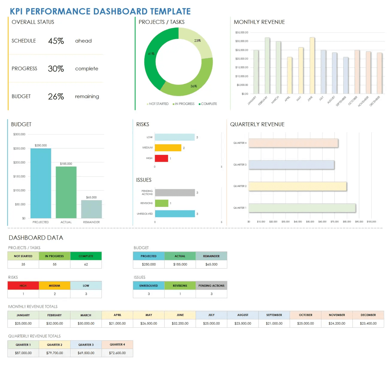
KPI Dashboards
A KPI (Key Performance Indicator) dashboard is designed to monitor critical business metrics in real-time, ensuring teams stay focused on key objectives.
They highlight essential numbers that indicate success or areas needing improvement.
Purpose of a KPI Dashboard
Provides a quick overview of business performance
Helps teams stay aligned with company goals
Tracks real-time progress against targets
Simplifies reporting by displaying key metrics in one place
Who Uses It?
Executives & Managers → To track business performance at a glance
Sales & Marketing Teams → To measure campaign and revenue success
Customer Support Teams → To monitor response times and satisfaction rates
Key Metrics in a KPI Dashboard
Revenue & Sales Growth – Tracks monthly, quarterly, or yearly revenue performance
Customer Acquisition Cost (CAC) & Lifetime Value (LTV) – Measures marketing efficiency
Conversion Rates – Analyzes how well leads turn into customers
Marketing ROI – Evaluates ad spend effectiveness and customer engagement
Customer Satisfaction Score (CSAT) – Measures support team performance and service quality
3 Best Data Visualization Dashboard Tools
Feature | Upsolve AI | Looker | Tableau |
Ease of Use | No-code, drag-and-drop builder | Requires SQL & LookML knowledge | Steep learning curve for beginners |
Customization | Fully customizable dashboards | Limited without LookML expertise | Highly customizable but complex |
Embedded Analytics | Seamless, built-in embedding | Requires additional setup & costs | Available but with extra setup |
Real-Time Insights | Instant real-time data updates | Slower query speeds on large datasets | Real-time updates available |
AI-Powered Insights | Automated recommendations & trend analysis | Advanced modeling with LookML | AI-powered analytics & forecasting |
Integration | Easy integration with databases & cloud platforms | Best for Google Cloud users | Strong data integration with multiple sources |
Collaboration | User-friendly access controls & sharing | Strong governance & role-based access | Enterprise collaboration via Tableau Server |
Security | Row-level security & advanced access controls | Enterprise-grade data governance | Secure access & permissions management |
Best For | Businesses needing fast, embedded, and user-facing analytics | Large enterprises needing structured BI & data modeling | Organizations requiring rich visual storytelling & interactive dashboards |
Pricing | Free tier; from $500/mo (Team $2,000/mo for embedding) | Estimated $40K+/year | Starts at $15/user/month |
Let’s get into some more detail.
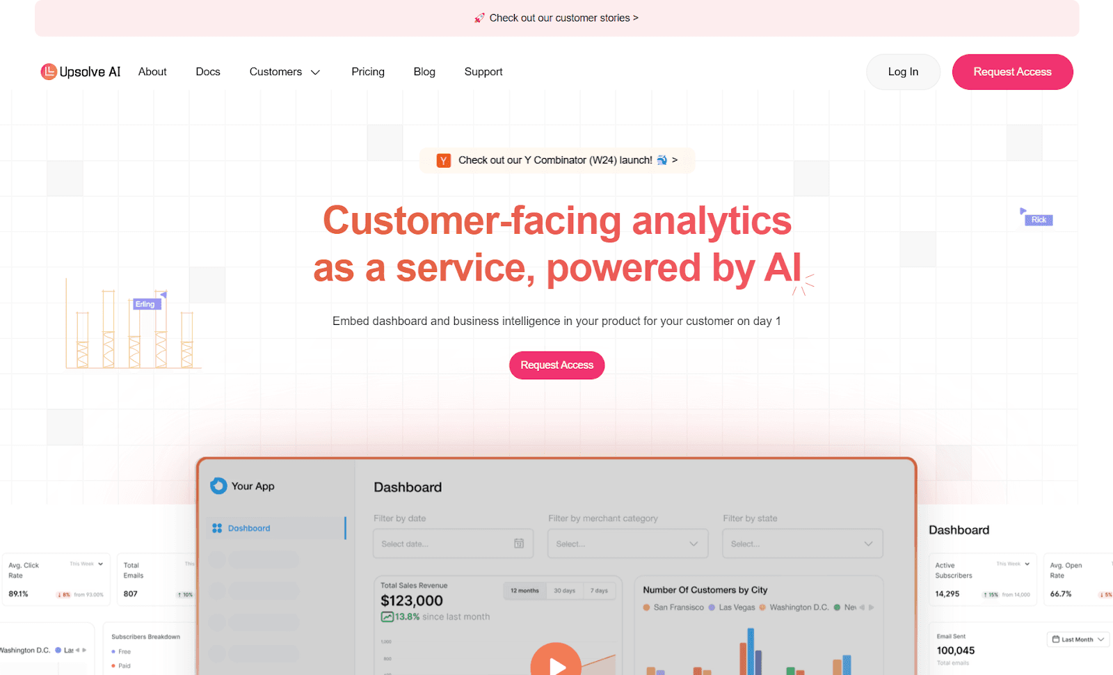
Upsolve AI
Upsolve AI is a no-code, AI-powered data visualization dashboard tool designed to help businesses create real-time, interactive, and customer-facing analytics.
It allows users to seamlessly embed dashboards into their applications, SaaS platforms, or internal workflows without technical expertise.
Key Features Of Upsolve AI
No-Code Dashboard Builder – Drag-and-drop interface for building dashboards without coding.
Real-Time Data Processing – Live updates ensure that insights are always fresh.
Embedded Analytics – Easily integrate dashboards into apps, SaaS platforms, and websites.
Custom Branding & White-Labeling – Modify the appearance to match your brand seamlessly.
AI-Powered Insights – Get automated recommendations and trend analysis.
Advanced Security & Access Controls – Ensure data privacy with row-level security.
Upsolve AI Pricing
Upsolve AI offers a free plan plus three paid tiers, billed around monthly credit usage:
Free ($0): 2,000 one-time credits (~200 questions); all Pro features, to test-drive
Pro ($500/mo): 2,000 credits/month; 50+ data connections, unlimited agents, full observability
Team ($2,000/mo): 10,000 credits/month; adds embedding, RBAC/row-level security, multi-tenant, and semantic-layer generation
Enterprise (custom): on-prem/VPC, SAML SSO, HIPAA, SOC 2, and BYOM
Annual billing is 20% off.
Looker
Looker is a business intelligence (BI) and data analytics platform that enables companies to explore, analyze, and visualize data.
Acquired by Google Cloud, Looker is known for its powerful data modeling capabilities using LookML, but it requires SQL expertise, making it more suitable for technical teams rather than business users looking for a no-code solution.
Key Features Of Looker
Advanced Data Modeling with LookML – Allows structured data relationships but requires technical knowledge.
Customizable Dashboards – Create interactive dashboards with SQL-driven queries.
Google Cloud Integration – Seamlessly connects with BigQuery and other Google services.
Data Governance & Security – Strong access controls and enterprise-grade security.
Embedded Analytics – Supports embedding dashboards into applications but with additional setup.
Looker Pricing
Looker follows a custom pricing model, meaning you’ll need to contact their sales team for a quote.
However, estimates suggest:
Starting at $40K+ per year, it is a costly option for small businesses.
Additional fees may apply for extra user licenses and embedding capabilities.
Tableau
Tableau is a data visualization tool that helps businesses create interactive, visually rich dashboards.
Known for its drag-and-drop functionality, Tableau makes it easier for users to analyze and present data.
However, while it excels in visual storytelling, it can have a steep learning curve and high costs, especially for smaller businesses.

Key Features
Drag-and-Drop Dashboard Builder – Create highly interactive dashboards with minimal coding.
Advanced Data Visualization – Supports different chart types, including heatmaps, tree maps, and scatter plots.
Seamless Data Integration – Connects with cloud databases, spreadsheets, and third-party applications.
AI-powered insights – Uses automated analytics and machine learning for trend identification.
Collaboration & Sharing – Share reports across teams using Tableau Server or Tableau Cloud.
Tableau Pricing

Tableau follows a tiered pricing model, which includes:
Tableau Creator – $70/user/month (for analysts and report creators).
Tableau Explorer – $42/user/month (for business users analyzing dashboards).
Tableau Viewer – $15/user/month (for those who only need to view reports).
Enterprise Pricing – Custom quotes for large-scale deployments.
How to Choose the Right Data Visualization Dashboard Tool
Selecting the right data visualization dashboard tool requires understanding your business needs, technical capabilities, and budget.
Follow these five steps to ensure you choose the best tool for your team.
Define Your Needs
Start by identifying what you want from a data visualization dashboard. Ask yourself:
Do you need real-time tracking, embedded analytics, or interactive dashboards?
Will the tool serve internal teams, external customers, or both?
How much customization do you require?
For businesses embedding analytics, Upsolve AI offers a seamless and user-friendly solution.
If you need a tool for internal analysis, Tableau or Looker might fit better.
Assess Ease of Use
Your dashboard tool should simplify data analysis, not complicate it.
Look for a no-code or low-code interface if your team lacks technical expertise.
Choose a tool with drag-and-drop functionality for quick dashboard creation.
Consider training time—some platforms, like Looker, require SQL knowledge, while Upsolve AI and Tableau are easier to learn.
Compare Features & Integrations
Your tool should work smoothly with your existing systems.
Check whether it connects with your databases, CRMs, and cloud platforms.
Review customization options—can you tailor dashboards to match your brand?
Ensure it supports AI-driven analytics for deeper insights.
Upsolve AI allows you to embed live dashboards into SaaS platforms, while Tableau provides extensive visualization options. If you rely on Google Cloud, Looker might be the best fit.
Consider Pricing & Scalability
Your choice should align with both your budget and future growth.
Compare subscription costs, hidden fees, and enterprise pricing models.
Choose a tool that scales with your business—can it handle growing datasets and users?
Look for transparent pricing. Upsolve AI offers a free tier with paid plans from $500/month, while Looker's pricing can exceed $40,000/year.
For small to mid-sized businesses, Upsolve AI offers the best balance of affordability and functionality.
Test It Out
Before committing, you can test the dashboard tool with a free trial or demo.
Explore how easily you can create and customize dashboards.
Check if the user interface makes data analysis simple.
Evaluate customer support—will they assist you when you need help?
Upsolve AI, Tableau, and Looker all offer trials or demos, making it easy to compare.
Conclusion
Data visualization dashboards aren’t just about making data look good—they’re essential for making smarter, faster business decisions.
Here’s a quick summary of the blog:
Section | Key Points |
What is a Data Visualization Dashboard? | A tool that converts raw data into visual insights for better decision-making. |
Key Benefits | - Simplifies complex data - Improves decision-making speed - Enhances collaboration - Provides real-time insights |
Types of Dashboards | Strategic: For executives to track business performance Operational: Real-time tracking for daily activities Tactical: Short-term decision-making Analytical: Deep data analysis for long-term strategy KPI: Tracks key business performance indicators |
Top 3 Dashboard Tools | 1. Upsolve AI (Best Overall): No-code, real-time embedded analytics 2. Looker (Best for Enterprises): Advanced BI, Google Cloud integration, requires SQL 3. Tableau (Best for Data Visualization): Rich visual storytelling, customizable, but has a learning curve |
How to Choose the Right Tool | 1. Define your needs (real-time, embedded, internal) 2. Assess ease of use (no-code vs. technical) 3. Compare features & integrations 4. Consider pricing & scalability 5. Test with free trials |
Start leveraging data visualization dashboards today to transform your data into a strategic advantage and move your business forward with clarity and confidence.
And, if you’re looking for a no-code, fast-to-deploy dashboard tool that embeds seamlessly, you can try Upsolve AI.

Try Upsolve for Embedded Dashboards & AI Insights
Embed dashboards and AI insights directly into your product, with no heavy engineering required.
Fast setup
Built for SaaS products
30‑day free trial