See practical financial dashboard examples with free templates to track KPIs, go beyond reporting, and build dashboards that support better decisions.

Ka Ling Wu
Co-Founder & CEO, Upsolve AI
10 min

Messy finances slow teams down. Founders, CFOs, and PMs often juggle scattered data without clear answers.
What you need is a financial dashboard that shows:
Your real cash position
Progress toward revenue goals
Areas of overspending
In this blog, you’ll get 15 real dashboard examples, key KPIs for SaaS and DTC, tool comparisons, and a free template to build your own.
Let’s make your finances easier to track, starting with the right financial dashboard.
What is a Financial Dashboard?
A financial dashboard is an embedded analytics overview that shows your key financial data clearly in one place.
It’s built for founders, CFOs, and PMs who need to track revenue, spending, and cash flow at a glance.
For example, you can instantly compare actual revenue vs forecast, spot overspending, or monitor runway—all in one place.
A strong financial dashboard includes:
Real-time updates
Clean visuals and charts
Alerts for key metrics
It keeps your team aligned, speeds up decision-making, and replaces guesswork with clarity.
Interactive Dashboard: What It Is and 5 Examples To Understand Better
15 Financial Dashboard Examples (Quick Look)
S.No | Dashboard | Category | Best For |
1 | CFO Dashboard | Leadership & CFO | Executive overview, financial health |
2 | Executive Dashboard | Leadership & CFO | Top-level KPIs, profitability tracking |
3 | Revenue Dashboard | Revenue & Profitability | SaaS revenue, subscription metrics |
4 | Profit and Loss Dashboard | Revenue & Profitability | Income, expenses, profit monitoring |
5 | Sales Revenue Dashboard | Revenue & Profitability | Sales pipeline, revenue targets |
6 | Cash Flow Dashboard | Cash Flow & Expense Management | Cash inflow and outflow tracking |
7 | Expense Tracking Dashboard | Cash Flow & Expense Management | Expense control and monitoring |
8 | Budget Planning Dashboard | Cash Flow & Expense Management | Budgeting, controlling spending |
9 | Accounts Payable & Receivable | Cash Flow & Expense Management | Payments, cash flow management |
10 | Personal Finance Dashboard | Personal | Individual income, expense tracking |
11 | Financial Dashboard (Power BI) | Power BI & Mobile UI | Interactive financial reporting |
12 | Mobile Financial Dashboard | Power BI & Mobile UI | On-the-go financial visibility |
13 | Balance Sheet Dashboard | Financial Reporting | Asset, liability, equity tracking |
14 | Investment Performance Dashboard | Financial Reporting | Investment tracking, ROI monitoring |
15 | Burn Rate Dashboard | Financial Reporting | Startup cash runway management |
With this quick reference, you can easily select a financial dashboard that matches your goals.
Benefits of Using a Financial Dashboard
A financial dashboard helps you manage your business with less guesswork and more clarity. Here's what it offers:
Instant overview: View revenue, profit, and expenses in one place without digging through spreadsheets.
Real-time insights: Use live data to make faster, smarter financial decisions.
Fewer errors: Automate data updates and reduce manual mistakes.
Team alignment: Everyone works with the same numbers, making it easier to sync on goals and budgets.
Better budget control: Quickly spot overspending and adjust before it becomes a problem.
It’s the easiest way to stay in control of your finances and act with confidence.
15 Financial Dashboard Examples (Explained)
Building a financial dashboard from scratch can be tough if you don’t know what to aim for.
To make it easier, I’ve collected 15 proven examples.
Let’s start by exploring dashboards designed specifically for executives and CFOs:
1. CFO Dashboard
This dashboard gives a clear view of your overall financial health without digging through complex reports.
Key KPIs: Total revenue, profit margins, cash runway, major expenses, and budget vs actuals.
Why it’s useful: Helps leaders spot trends, catch budget issues early, and make faster decisions.
Best for: CFOs, CEOs, and exec teams in SaaS, startups, or DTC brands.
2. Executive Financial Dashboard
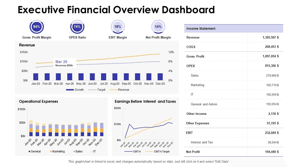
This dashboard highlights key leadership KPIs to help track profitability, growth, and efficiency with ease.
Key KPIs: EBITDA, revenue growth, gross profit, operating costs, and other executive-level metrics.
Why it’s useful: Helps leaders spot trends, reduce inefficiencies, and align on strategic decisions quickly.
Best for: CEOs, CFOs, and leadership teams at growing companies.
5 Popular Financial Analytics Tools for CFOs
3. Revenue Dashboard
This financial dashboard example tracks MRR, churn, and subscriptions to give a real-time view of your revenue growth.
Key KPIs: Monthly recurring revenue, churn rate, new subscriptions, cancellations, and net revenue growth.
Why it’s useful: Helps teams spot churn early, monitor subscription health, and adjust strategy fast.
Best for: SaaS founders, growth teams, and product managers needing live revenue insights.
4. Profit and Loss Dashboard
This financial dashboard example shows income, expenses, and net profit clearly, giving you quick insights into overall profitability.
Key KPIs: Revenue, COGS, operating expenses, gross profit, net income, and profit margins.
Why it’s useful: Helps teams monitor expenses, track profit trends, and adjust budgets quickly.
Best for: Startups, SaaS companies, and finance teams focused on profitability and cost control.
5. Sales Revenue Dashboard
This financial dashboard example tracks sales performance, pipeline health, and growth trends for a clear view of sales effectiveness.
Key KPIs: Total sales revenue, pipeline status, deal velocity, average deal size, and targets vs actuals.
Why it’s useful: Helps teams spot sales slowdowns, fix pipeline issues, and stay aligned on revenue goals.
Best for: Sales leaders, RevOps teams, and founders needing real-time sales insights.
6. Cash Flow Dashboard
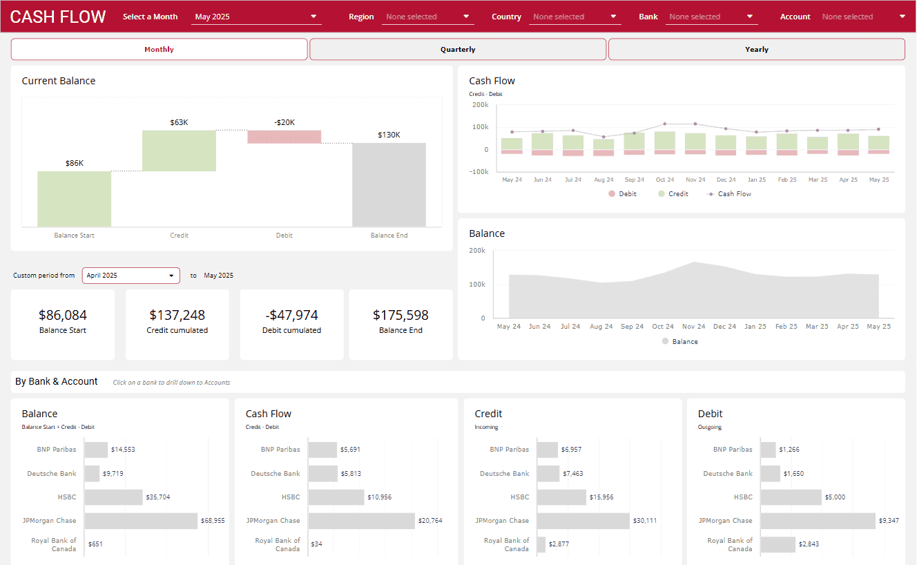
This dashboard example helps you track cash inflow, outflow, and balances so you’re never caught off guard.
Key KPIs: Cash inflow, outflow, net balance, runway, and overdue payments.
Why it’s useful: Helps prevent cash shortages, spot late payments, and plan spending with confidence.
Best for: Startups, small businesses, and finance teams managing runway and expenses.
7. Expense Tracking Dashboard
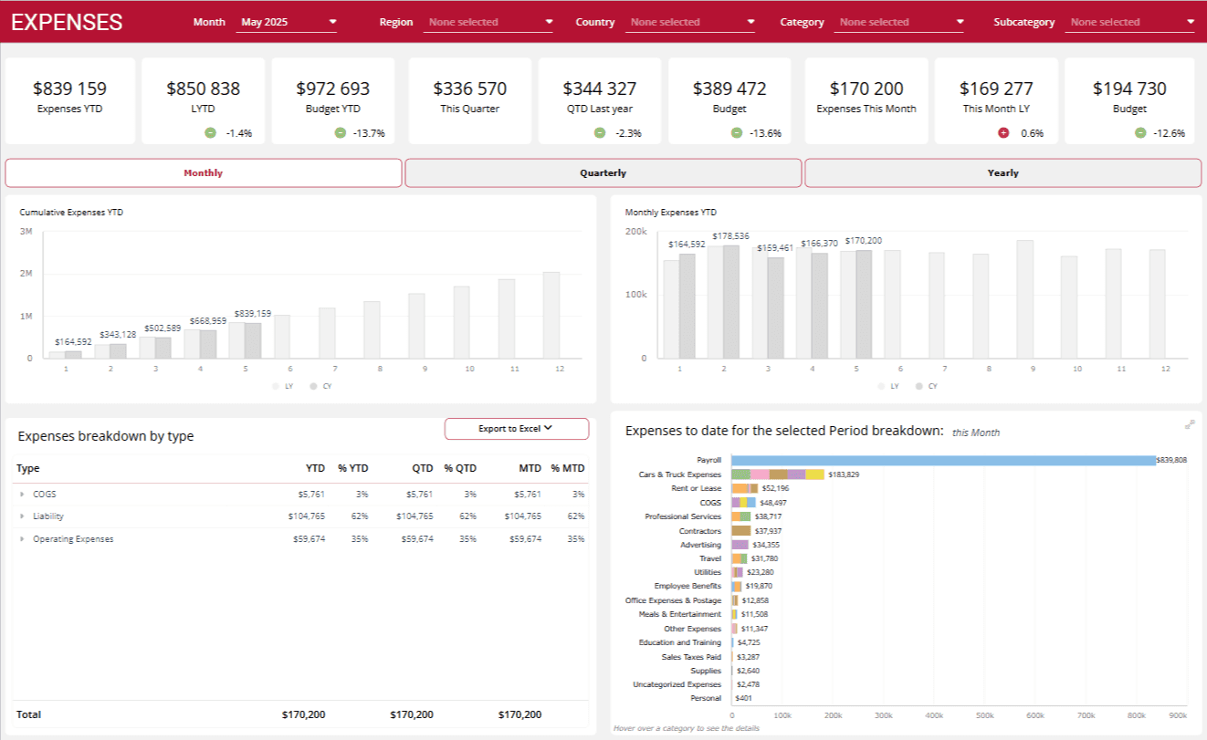
This financial dashboard example gives a clear view of all expenses across accounts and tools.
Key KPIs: Monthly expenses, categories, budget limits, trends, and unusual spend.
Why it’s useful: Helps you catch overspending early, cut unnecessary costs, and manage budgets better.
Best for: Founders, finance managers, and ops teams focused on controlling spend.
8. Budget Planning Dashboard
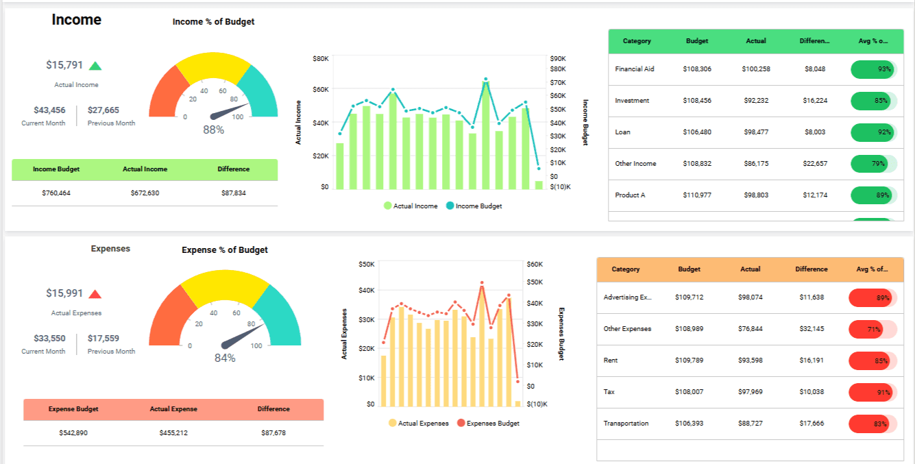
This financial dashboard example compares planned budgets with actual spending to help you stay on track.
Key KPIs: Budget vs actuals, spend by department, deviations, and historical trends.
Why it’s useful: Makes it easy to spot overspending, adjust budgets fast, and maintain financial control.
Best for: Finance leaders, project managers, and startups managing tight budgets.
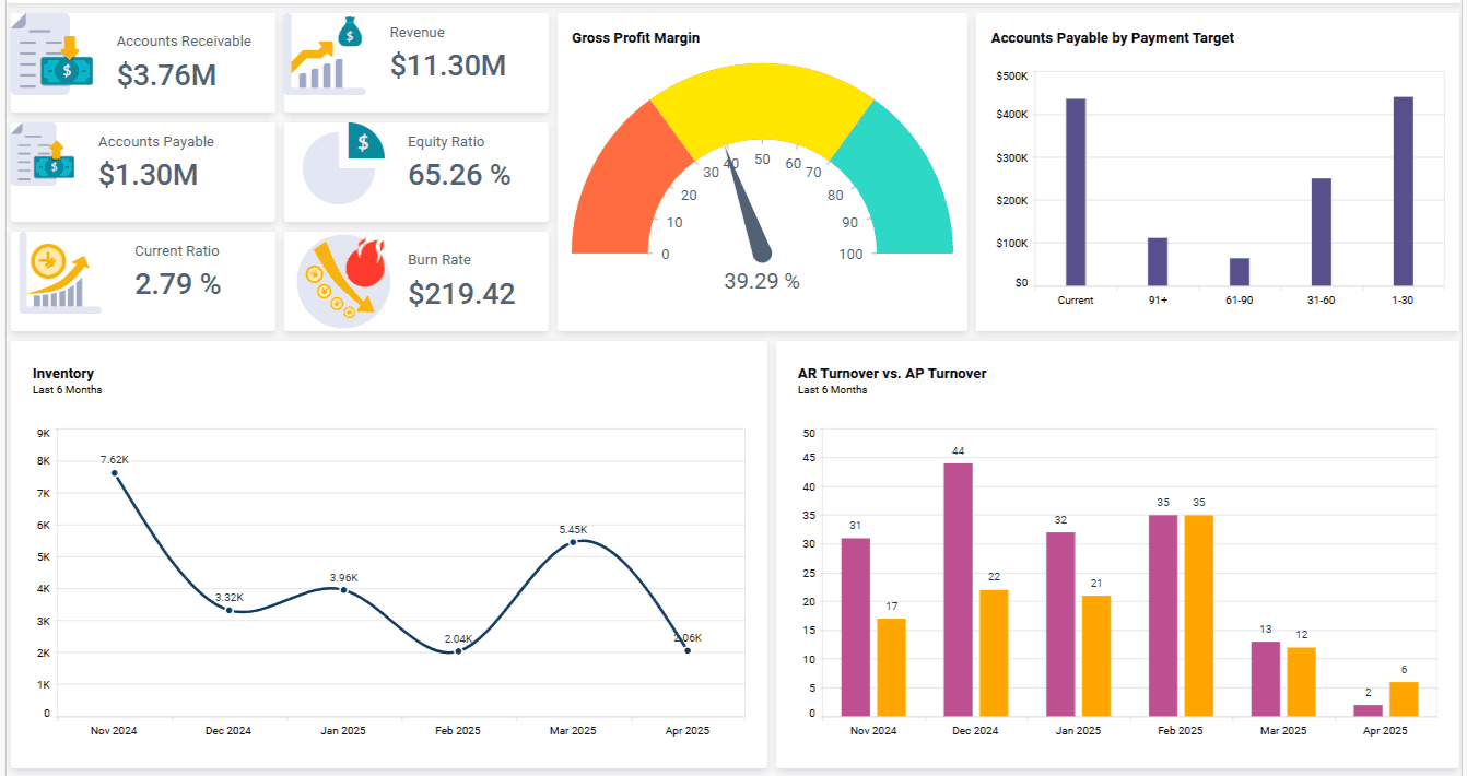
9. Accounts Payable & Receivable Dashboard
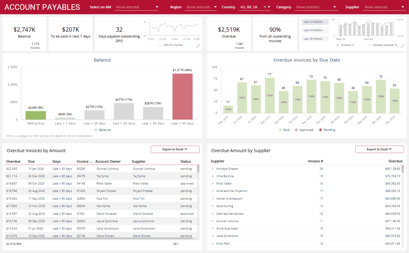
This dashboard example tracks incoming and outgoing payments to keep your cash flow steady.
Key KPIs: Unpaid invoices, aging receivables, upcoming payments, and payables timeline.
Why it’s useful: Helps you avoid cash flow surprises, manage vendors better, and improve payment forecasting.
Best for: Finance teams, founders, and businesses needing tight cash flow control.
10. Personal Finance Dashboard
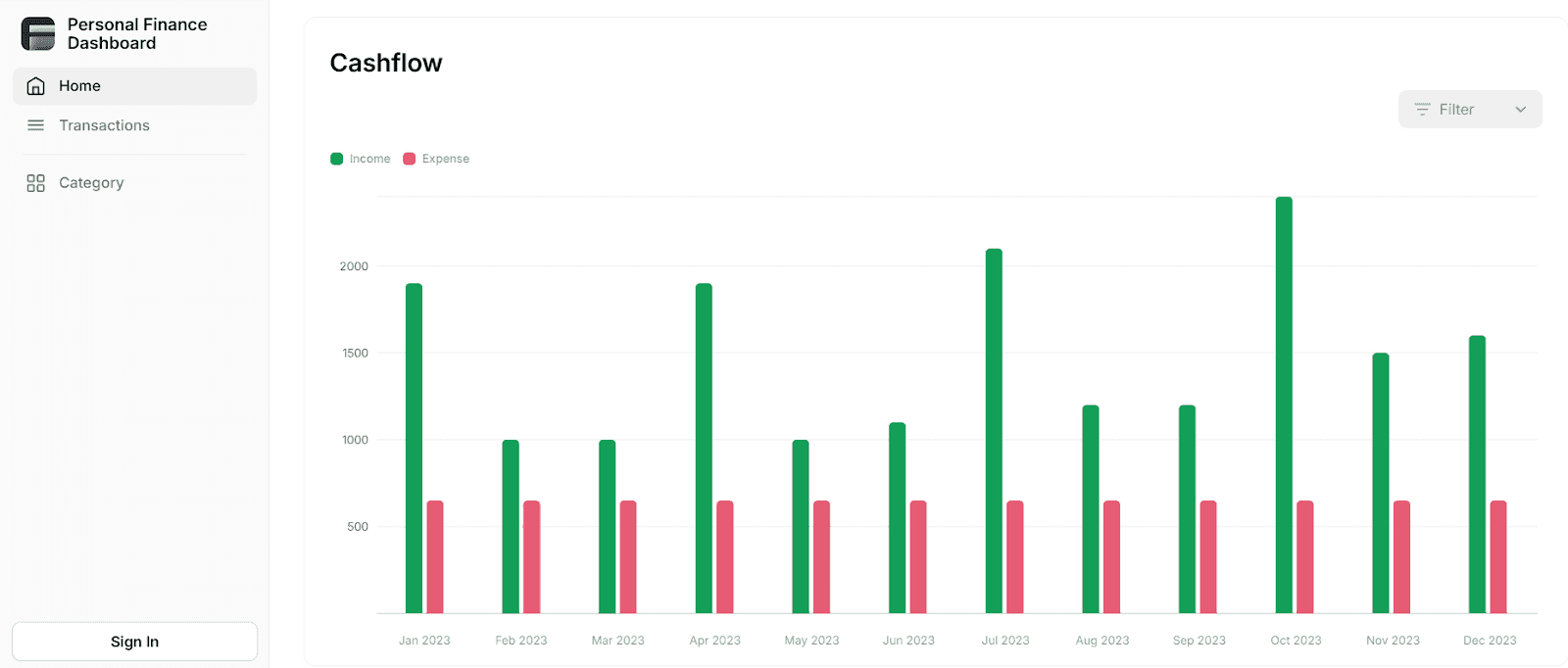
This financial dashboard example simplifies personal finance by tracking income, expenses, savings, and goals in one view.
Key KPIs: Income, daily expenses, savings, investments, and goal progress.
Why it’s useful: Helps you manage your budget, control spending, and stay focused on financial goals.
Best for: Freelancers, individuals, and entrepreneurs managing personal finances.
11. Financial Dashboard (Power BI)
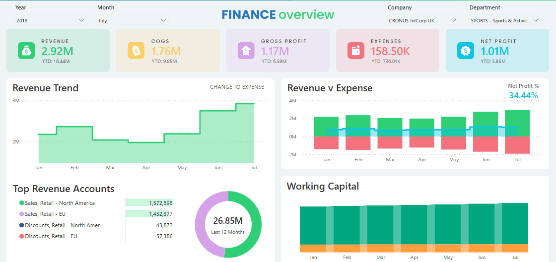
This financial dashboard example uses Power BI to turn raw data into interactive, visual insights—far beyond Excel or Sheets.
Key KPIs: Revenue, profit trends, cash flow, budget variances, and category drill-downs.
Why it’s useful: Makes data easy to explore, spot issues fast, and share reports with ease.
Best for: Finance teams, PMs, or anyone needing advanced financial visuals.
Tool Comparison:
Tool | Best For | Ease of Use | Collaboration |
Excel | Quick analysis, basic reporting | Medium | Low |
Power BI | Interactive dashboards, insights | Medium-High | High |
Google Sheets | Easy budgeting and sharing | High | High |
Power BI Dashboard vs Report: 7 Key Differences To Know
12. Financial Dashboard App (Mobile UI)
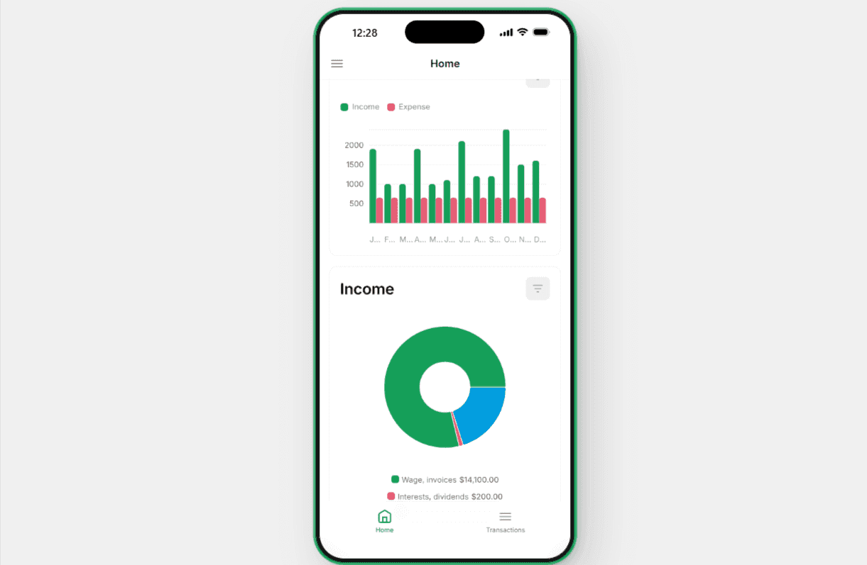
This financial dashboard example gives you quick access to key metrics on your phone—perfect for decisions on the go.
Key KPIs: Daily cash balance, transactions, revenue, expense alerts, and budget usage.
Why it’s useful: Helps you check financial health, get alerts, and make decisions anytime.
Best for: Founders, execs, and entrepreneurs who need mobile access to finances.
13. Balance Sheet Dashboard
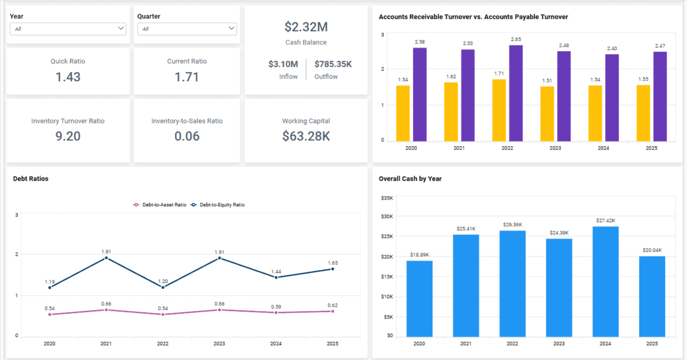
This example simplifies balance sheets by visualizing assets, liabilities, and equity clearly.
Key KPIs: Assets, liabilities, equity, debt-to-equity, and liquidity ratios.
Why it’s useful: Helps you understand financial stability, manage debt, and share insights with stakeholders.
Best for: CFOs, finance teams, and founders needing a clear financial overview.
14. Investment Performance Dashboard
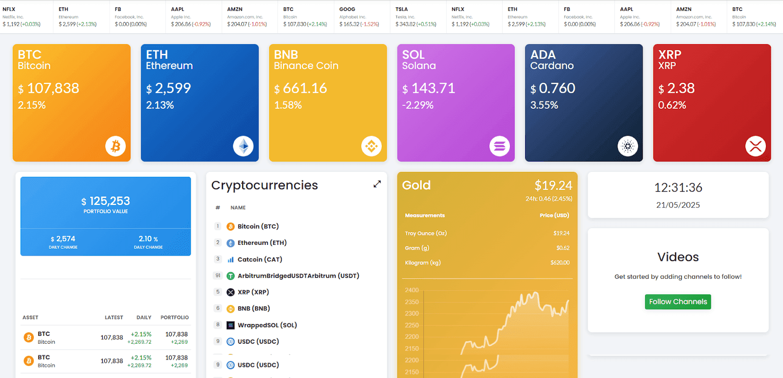
This dashboard example makes it easy to track ROI and portfolio performance without manual effort.
Key KPIs: ROI, growth rate, portfolio value, asset allocation, and benchmarks.
Why it’s useful: Lets you assess portfolio health, spot underperformers, and align with long-term goals.
Best for: Investors, finance teams, and companies managing multiple assets.
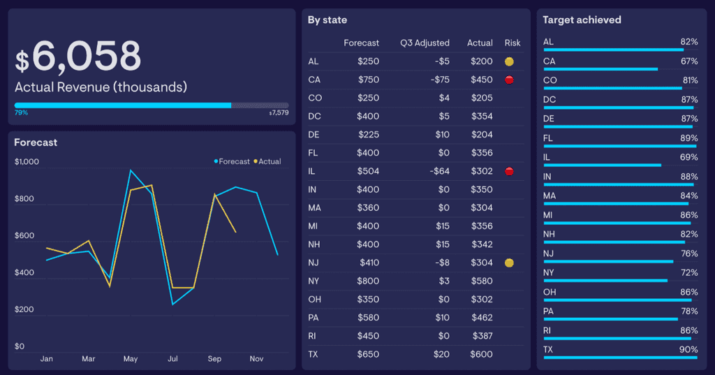
15. Burn Rate Dashboard
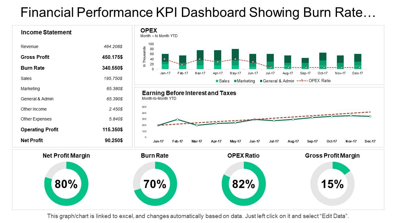
Alt tag: Burn rate dashboard showing income statement, operating expenses, EBIT trends, and profitability KPIs
This financial dashboard example tracks your burn rate and runway, so you know exactly how long your cash will last.
Key KPIs: Burn rate, runway, monthly expenses, cash balance, and revenue impact.
Why it’s useful: Helps you control spending, plan hiring, and update investors with clarity.
Best for: Startup founders, CFOs, and finance leads managing early-stage finances.
Also Read:
How to Build Your Financial Dashboard (Step-by-Step)
Creating your first financial dashboard might feel confusing, especially if you've never done it.
Let's simplify things into clear, actionable steps so you can start easily.
Step | What to Do | Why It Matters |
1 | Choose 5–7 key KPIs | Focus on metrics like revenue, expenses, and burn rate. |
2 | Gather financial data | Pull from tools like QuickBooks, HubSpot, or bank logs. |
3 | Clean and organize the data | Remove duplicates and group data by type (e.g., income). |
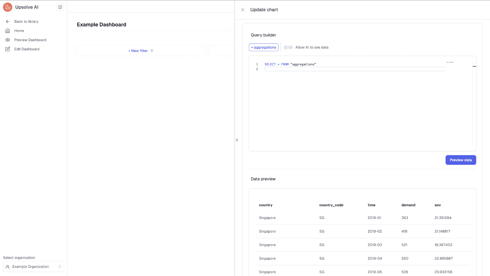
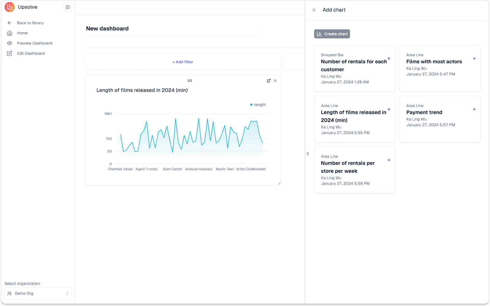
4 | Pick a dashboard tool | Start with Google Sheets or Excel, or use Upsolve AI to build faster. |
5 | Use a ready-made template | Saves time and auto-generates key visuals. |
6 | Customize your dashboard | Add your data, focus on readability, highlight KPIs. |
7 | Update and review regularly | Spot trends, fix issues, and make better decisions. |
Step 1: Choose Your Metrics (KPIs)
Start by listing exactly what you need to see clearly.
Don't track everything—just the 5-7 KPIs that truly show your business’s health.
Example KPIs to start with:
Revenue (monthly or annual)
Expenses (fixed and variable)
Cash balance
Profit margin
Burn rate (crucial for startups)
Step 2: Gather Your Financial Data
Collect accurate data for each KPI from tools you already use.
Common sources include:
Accounting: QuickBooks, Xero
Sales/CRM: HubSpot, Salesforce
Banking: Bank statements, expense logs
Spreadsheets: Google Sheets, Excel
With Upsolve AI, you can connect multiple data sources directly to your financial dashboard for faster, real-time sync.
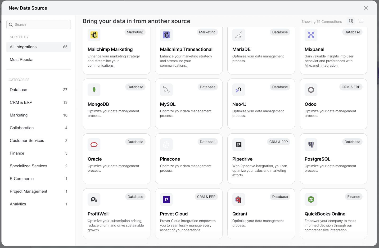
Alt tag: Data source integration screen for connecting financial and analytics tools to a dashboard
Step 3: Clean and Organize the Data
Clean data is the foundation of a useful dashboard.
Quick cleanup tips:
Remove duplicates
Standardize date and currency formats
Group data by category (income, expenses, profit)
This makes your financial dashboard easier to read and analyze.
Step 4: Pick Your Dashboard Tool
Start simple—Google Sheets or Excel work well. Upgrade later if needed.
Tool options:
Google Sheets: Easy to share and update
Excel: Great for formulas and control
Power BI: Ideal for interactive visuals
Or skip setup with Upsolve AI, which lets you build powerful dashboards without coding.
Step 5: Use a Ready-to-Use Template
Templates save hours and reduce setup headaches.
Most financial dashboard templates include:
Prebuilt charts and visuals
Auto-calculated KPIs
Simple step-by-step instructions
Upsolve also offers templates tailored for SaaS, DTC, and startup teams.
Step 6: Customize Your Dashboard
Adapt the template to fit your metrics and data sources.
Tips for customization:
Keep only essential KPIs
Use clear graphs and color-coded highlights
Label everything for easy scanning
The goal is to make your financial dashboard useful at a glance.
Step 7: Regularly Update and Review
A dashboard is only helpful if it stays current.
Make it a habit to:
Update weekly or monthly
Review trends and outliers
Adjust decisions based on fresh insights
With Upsolve AI, your financial dashboard updates automatically, saving time and reducing manual work.
Follow these steps, and you’ll have a streamlined, real-time financial dashboard that drives smarter, faster decisions for your business.
Business Intelligence Dashboard For Fintech Using AI: How to Create It?
Top KPIs to Track on Your Financial Dashboard
To effectively manage your finances, your financial dashboard should clearly track these essential KPIs. Here's what matters most, especially for SaaS and startups:
KPI | What It Tells You |
Revenue and Profit Margins | Total income and the percentage that’s actual profit after costs — a measure of real growth. |
Gross Profit Margin | Shows how healthy your core operations are by revealing revenue left after COGS. |
Cash Flow and Liquidity | Displays available cash, upcoming expenses, and how long you can operate comfortably. |
Burn Rate | Tracks how fast you're spending cash — critical for startups managing runway. |
Budget vs. Actuals | Compares planned vs. actual spending to highlight overspending or misalignment. |
Operating Expenses | Helps you monitor regular costs like salaries, tools, and marketing to spot trends. |
Accounts Payable & Receivable | Shows what you owe and what’s owed to you — crucial for managing cash flow. |
Tracking these KPIs on your dashboard gives clarity, simplifies finances, and helps you confidently navigate business decisions with updated data.
Also Check:
Customer Experience Analytics - 10 KPIs and Metrics You Need To Know
Customer Engagement Analytics: 10 Metrics + Use Cases To Boost Engagement
Free Financial Dashboard Template for Quick Start
Grab this free financial dashboard template to track revenue, expenses, profit, and budgets—no setup needed.
Why it works:
Clean design with pre-built charts
Easy to customize
No tech skills required
👉 Download your free financial dashboard template!
Financial Dashboard- Free vs. Paid Tools: Which One is Better?
Choosing between free or paid dashboard tools depends on your current needs, team size, and budget.
Here's a quick side-by-side comparison:
Feature | Free Tools | Paid Tools |
Ease of Use | Easy, beginner-friendly | Slight learning curve |
Visuals | Basic charts & graphs | Advanced interactive visuals |
Automation | Limited manual updates | Automatic real-time updates |
Customization | Basic, limited templates | Highly customizable |
Collaboration | Basic collaboration | Advanced sharing & teamwork |
Free tools are fine to start, but consider upgrading when you need:
Real-time updates without manual effort
Better visuals for faster decisions
Easy team access and collaboration
Custom tracking for advanced KPIs
Scalability as your data grows
Best Practices for Effective Financial Dashboards
A great financial dashboard is clear, simple, and actionable. Here’s how to get it right:
Use clean visuals: Charts and graphs should be easy to read at a glance.
Focus on key KPIs: Stick to 5–7 metrics that drive decisions.
Enable real-time updates: Automate data sync for faster, smarter actions.
Make it team-friendly: Ensure easy access so everyone stays aligned.
Review regularly: Update monthly to keep it relevant and useful.
Follow these steps to keep your dashboard effective and decision-ready.
Conclusion: So, What's Next?
Most teams still treat financial dashboards like a reporting task.
But the best ones aren’t just about tracking—they help you make faster, smarter calls when it counts.
Today, guessing from old spreadsheets won’t cut it. You need a dashboard that shows:
What you’re earning
Where the money’s leaking
How much runway you’ve actually got
And what needs fixing—today, not next quarter
If you’re ready to stop managing finances in the dark, start with the free template.
Need something more advanced that updates in real-time and scales with you?
Upsolve gives you the dashboards—without the mess.
Connect your tools, pick your KPIs, and get a clear view of your numbers in minutes.
FAQs About Financial Dashboards
What is a CFO dashboard?
A CFO dashboard is a type of financial dashboard built for executive teams. It tracks high-level KPIs like revenue, cash flow, profit margins, and burn rate to help with fast, strategic decision-making.
What is a budget dashboard?
A budget dashboard compares planned vs actual spending. It helps teams track financial discipline, reduce overspending, and adjust budgets in real time.
What is a financial dashboard app?
A financial dashboard app lets you track key financial metrics—like expenses, revenue, and cash balance—on your phone. It’s useful for founders and executives who make decisions on the move.
Which is better: Excel, Power BI, or Google Sheets for dashboards?
Excel is great for formulas and control
Google Sheets offers easy collaboration and sharing
Power BI delivers advanced, interactive visual dashboards
For real-time, no-code dashboards, Upsolve AI is a modern alternative to all three.
Are there financial dashboard templates available on GitHub?
Yes, you can find open-source financial dashboard Excel and Power BI templates on GitHub, though they usually require customization and setup. If you want plug-and-play templates, use ready-made ones like the one offered in this blog.
What is a KPI dashboard in finance?
A KPI dashboard in finance tracks key performance indicators such as cash flow, profit margins, burn rate, and revenue. It gives a quick overview of financial health in one place.
How to build a CEO dashboard?
A CEO dashboard includes strategic KPIs—like revenue growth, runway, and operational efficiency. Tools like Upsolve AI, Power BI, or Google Sheets can be used to build one with real-time data integration.
What are the two main dashboard types in finance?
Strategic dashboards – for executives to monitor financial performance over time
Operational dashboards – for daily tracking of transactions, budgets, or expenses
What is the role of a dashboard in finance?
The main role is to simplify decision-making. A dashboard organizes complex financial data into clear visuals so teams can track KPIs, identify problems, and stay aligned on goals.
Can I download a free finance dashboard template?
Yes. Download your free financial dashboard template here. It’s beginner-friendly and helps you track KPIs like revenue, expenses, and budgets without starting from scratch.

Try Upsolve for Embedded Dashboards & AI Insights
Embed dashboards and AI insights directly into your product, with no heavy engineering required.
Fast setup
Built for SaaS products
30‑day free trial