Explore five supply chain dashboard examples and download a free template to track inventory, logistics, and supply chain performance across teams.

Ka Ling Wu
Co-Founder & CEO, Upsolve AI
10 min

Most supply chain dashboards suck.
They’re either too complex for teams to use, or too basic to drive real decisions. The result is always the same: every team builds their own version of “truth” in spreadsheets. Operations sees one thing, procurement sees another, and logistics is left guessing.
A modern supply chain dashboard fixes that by giving inventory, logistics, procurement, and leadership a shared, real-time view of performance. When everyone is working from the same data, you spot issues faster, align priorities, and make decisions with confidence.
In this article, you’ll see:
What a good supply chain dashboard should include
5 supply chain dashboard examples built for real stakeholders across inventory, logistics, and procurement
A free dashboard template you can copy and use today
If your supply chain runs across multiple teams and systems, and clarity is still missing, this will help you build a dashboard people actually use. Let’s make your data useful again.
Why Supply Chain Dashboards Are No Longer Optional
Supply chains today are not linear. They are layered.
Warehouse teams track stockouts. Operations monitor vendor delays. Finance watches budgets. Leadership wants clear, top-line visibility. All of this happens at the same time.
When each team relies on a different dashboard, or worse, spreadsheets, decisions start to conflict. That is when delays, overspending, and missed opportunities begin to stack up.
A well-built supply chain dashboard is no longer a nice-to-have. It acts as an internal operating system that keeps every stakeholder aligned on what is actually happening.
It allows:
Less technical users to access insights without relying on data teams
Multiple departments to analyze the same data from different perspectives
Data from PoS systems, TMS, ERPs, and spreadsheets to live in one place
The bottom line is simple. If your team is still guessing instead of seeing, you are already behind.
Dashboards fix this when they are built the right way.
Next, let’s look at what that looks like in practice.
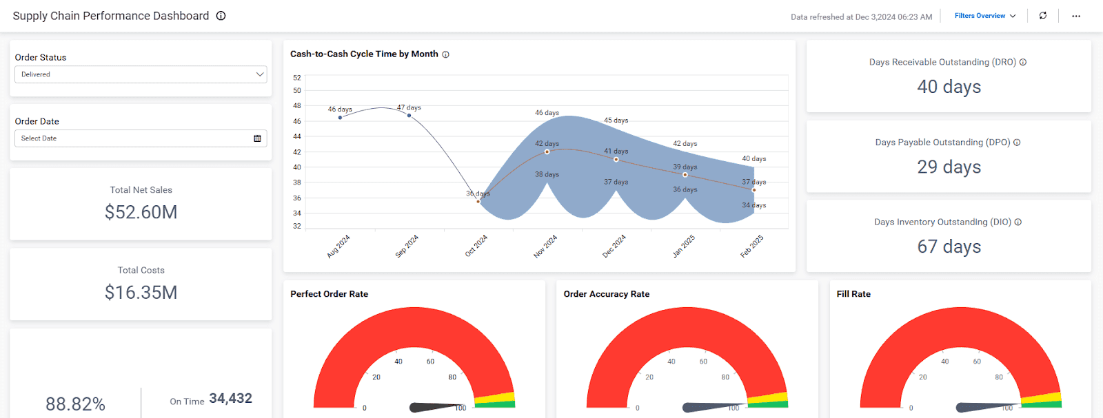
5 Best Supply Chain Dashboard Examples
Theory does not move supply chains. Data does. But only when it is built for the people actually using it.
This is where most companies get it wrong. They try to force a single dashboard to work for everyone. It never does.
A warehouse manager cares about stockouts and inventory turnover.
A logistics team focuses on delays and delivery performance.
A CFO wants visibility into vendor costs and spending trends.
That is why effective supply chain dashboards are multi-level. One system, different views, all built to support real decisions.
Here is how that looks in practice.
1. Inventory Management Dashboard (For Warehouse + Finance)
An Inventory Management Dashboard helps you keep an eye on everything you have in stock.
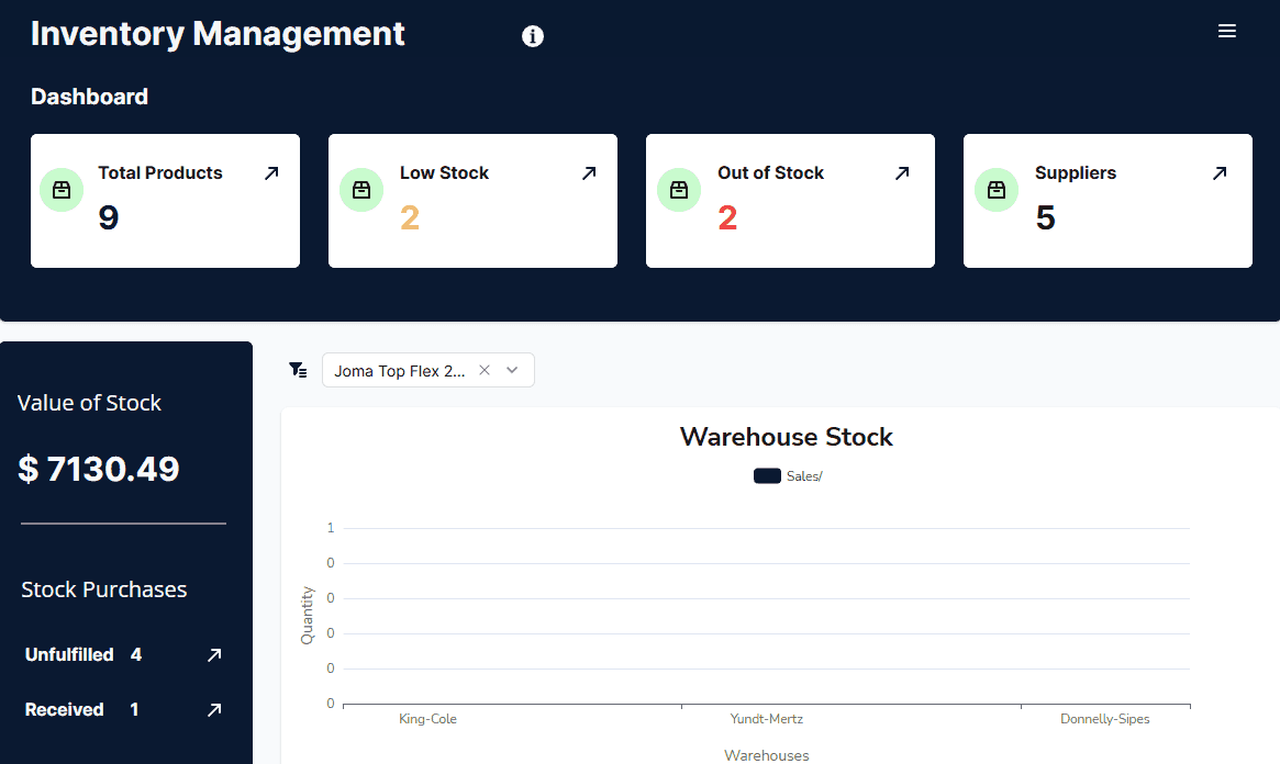
Here’s what it shows:
What’s selling fast (so you can reorder on time)
What’s not moving (so you stop burning cash)
Where you’re running out (so your ops team gets alerts before it’s too late)
👥 Warehouse managers, finance teams, and procurement all need different views of this data. That’s where a multi-level dashboard setup matters.
2. Logistics Dashboard (for Ops + CX + Leadership)
A Logistics Dashboard lets you see how your products are moving from one place to another.
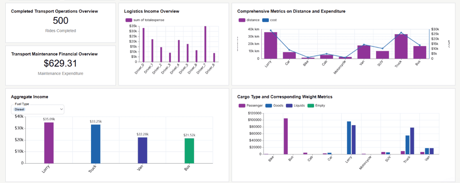
This dashboard tells you:
Where delays are happening
Which carriers are costing you more than they should
Whether you’re hitting promised timelines
This isn’t just for ops. Support teams need it to manage customer expectations. Leadership wants to see SLAs and cost trends, without spreadsheets.
🔄 This is where usability and real-time sync with PoS systems or TMS really kicks in.
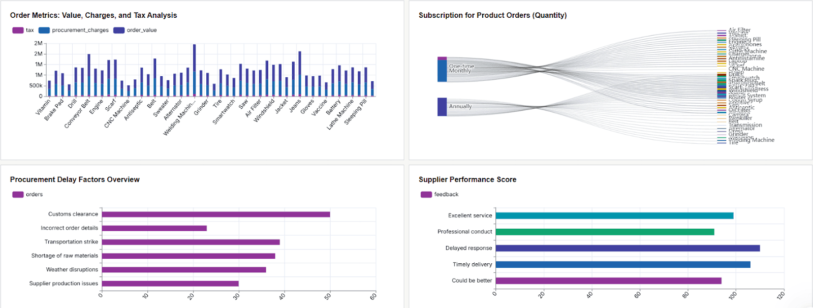
3. Supplier Performance Dashboard (for Procurement + Compliance)
The Supplier Performance Dashboard shows how well your suppliers are doing their jobs.
It tracks:
How long suppliers take to deliver
Product quality issues
Unit costs over time
More importantly: You see who’s hurting your margin or killing your timelines.
📍 Want to see this in action? PAXAFE, a supply-chain analytics company, delivers role-aware supplier and shipment dashboards to its own customers, built and embedded on Upsolve AI instead of maintained by hand. See the PAXAFE case study.
4. Demand Forecasting Dashboard (for Planners + Finance)
A Demand Forecasting Dashboard helps you guess what your customers will want in the future.
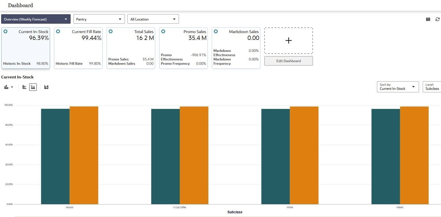
It combines:
Historical sales trends
Market seasonality
AI-based forecasts (if you’ve got the data for it)
It’s built so demand planners can plan and finance can sanity-check the plan, on the same page.
🎯 Multi-stakeholder views = fewer “surprise” inventory fire drills.
5. Procurement Dashboard (for Budget Owners + Vendors)
The Procurement Dashboard tells you two things:
Where your money’s going
Who’s wasting it
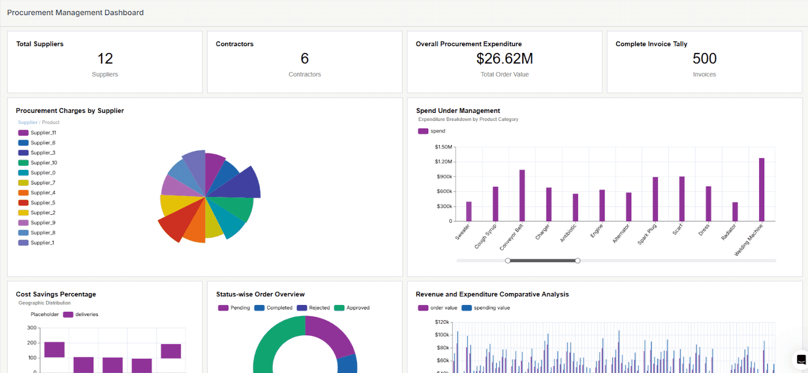
It shows:
All open/closed POs
Total spend by category
Vendor reliability, side by side
You can track this by team, project, vendor, or whatever matters to you.
💡 The best part? Less-technical users can self-serve this info instead of pinging finance.
Each of these dashboards solves a different slice of your supply chain.
But together? They give your team a shared operating system no matter how technical (or not) they are. That’s how you stop firefighting and start scaling.

What Should a Good Supply Chain Dashboard Include?
Let’s be honest. Most dashboards are built by data teams for data teams.
That’s a problem, because most supply chain teams are not data scientists. They’re doers.
A good dashboard isn’t just about the data. It’s about who sees it and how fast they can act on it.
Here’s what actually matters:
✅ Role-Based Views (a.k.a. Multi-Stakeholder Access)
Your warehouse team doesn’t care about vendor payment cycles.
Your CFO doesn’t need a heatmap of shipping routes.
But they both need their data, fast.
Your dashboard needs multi-level access:
By role
By region
By team
So every stakeholder gets their slice, without noise.
✅ Real Metrics That Move the Needle
If your dashboard can’t answer:
“What’s wrong?”
“Who’s responsible?”
“What should we do next?”
…it’s not a dashboard. It’s decoration.
You need visibility into:
Inventory across locations, SKUs, and teams
Delivery timelines vs. SLA targets
Supplier performance by cost, time, and quality
Demand vs. supply alignment
Procurement cycle times and spend
Each of these should be:
Real-time
Sliceable by role (warehouse, leadership, finance)
Usable by less-technical users
✅ Usability for Less-Technical Users
If your ops manager needs a training course just to pull a report, the dashboard has failed.
Your dashboard should:
Work like an app, not a spreadsheet
Show trends at a glance
Let users filter and slice without breaking it
Dashboards are only powerful if people actually use them.
✅ System Integration
A real dashboard connects with:
PoS systems
ERPs
Supplier portals
Internal spreadsheets
It becomes the operating system for your supply chain, not just another tool.
If you build your dashboard for everyone, no one will use it. If you build it for each person, they’ll use it every day.
Next, I’ll walk you through a plug-and-play template so you don’t have to start from scratch.
Use This Free Supply Chain Dashboard Template (Built for Actual Supply Chains)
Let’s be honest. Building dashboards from scratch is painful.
You usually end up with three options:
Buy an overpriced BI tool that no one actually uses
Spend weeks in meetings figuring out what should be on the dashboard
Start with a proven template and adapt it to your needs
We put together a free Supply Chain Dashboard Template that gives you a clear, practical view of your supply chain by tracking essential metrics such as:
Inventory Levels: Monitor stock quantities to avoid shortages and overstocking
Supplier Performance: Evaluate suppliers based on delivery speed and product quality
Delivery Timelines: Track shipment schedules to ensure on-time deliveries
By consolidating these metrics into one dashboard, you get a clearer picture of your supply chain’s health and operational efficiency, without starting from zero.
How to Use the Template: Step-by-Step
Download the Template:
Open the File:
Open the template with Microsoft Excel or a suitable compatible program.
Enter Your Data:
Data Worksheet: Input your supply chain information, including order numbers, item details, supplier names, order dates, and delivery statuses.
Master Section: Update details like months, years, supplier availability, defect presence, and defect types.
Review Calculations:
The Calculations Worksheet processes your input data automatically. You don't need to make changes here unless you have specific calculations to add.
View the Dashboard:
Navigate to the Dashboard Worksheet to see visualizations of key metrics such as defect rates, availability by month, lead times, and supplier performance.
How This Template Saves You Time and Effort
Automated Calculations: Once you input your data, the template automatically processes it, reducing manual work.
Visual Insights: The dashboard presents data in charts and graphs, making it easy to identify trends and areas for improvement.
Improved Decision-Making: You can make informed decisions quickly with all critical information in one place.
By using this template, you can enhance your supply chain management without investing in expensive software.
It's a practical tool to help you stay organized and efficient.
How to Pick the Right Dashboard (Without Getting Burned)
Most teams pick dashboards the same way they pick gym memberships. They look great on day one, then no one touches them again.
Here’s how to make sure that doesn’t happen to you.
1. Start With the Goal, Not the Tool
Too many teams buy dashboards with no clear use case. Then they wonder why they are still buried in spreadsheets.
Ask this first:
“What decision do I need to make faster?”
If the answer is:
Reducing delivery delays → You need strong logistics metrics
Avoiding stockouts → You need real-time inventory alerts
Cutting vendor issues → You need supplier scorecards
The tool should match the goal, not the other way around.
2. It Should Integrate With What You Already Use
If it does not plug into your PoS system, ERP, or Google Sheets, it creates more manual work.
A good dashboard should:
Sync in real time with your core systems
Pull clean data without constant exports
Avoid custom development work just to get started
📌 If you need an engineer just to build a report, it’s not a dashboard. It’s a project.
3. If It’s Not Easy, Your Team Won’t Use It
You don’t need “advanced analytics.” You need something your less-technical users can actually click through.
Look for:
A clean, simple UI with no learning curve
Easy customization like drag, drop, and filters
Role-based views so Ops sees Ops and Finance sees Finance
Your dashboard should feel like an operating system for your supply chain, not a second job for your team.
One Final Rule:
If you can’t answer a key business question in under 30 seconds, your dashboard’s broken.
Choose the option that gives you speed, clarity, and team-wide adoption.
That is how you go from “we have data” to “we make decisions.”
Where Supply Chain Dashboards Are Going: From Static Views to Analytics Agents
A dashboard shows you the stockout. It doesn't tell you which supplier caused it, what it will cost if the shipment slips another week, or whether to reroute. Someone still has to read the chart and chase the answer across procurement, logistics, and finance.
That next step is where analytics agents come in. Instead of clicking through filters, an ops lead asks in plain language, like "which lanes are running late this month and which carrier is driving it," and an analytics agent pulls the answer and builds the view on the spot, then takes the follow-up question after that.
The hard part isn't the question, it's the context. Supply-chain data is scattered across PoS, TMS, ERP, and spreadsheets, and the same word means different things in each: "on time" measured against the promised date or the revised one, "supplier" by legal entity or by ship-from location. An agent that doesn't know your definitions will answer confidently and wrongly. Getting it right depends less on the model and more on the context you feed it: clean lineage, agreed metric definitions, and rules about who can see which lane or vendor.
If you're weighing where to take your supply-chain reporting next, it helps to understand what to look for in an agent platform before you commit.
Conclusion: Dashboards Aren’t Optional Anymore
Your data comes from everywhere: inventory, suppliers, logistics, finance. When teams look at different numbers, or none at all, you waste time, money, and momentum. Dashboards fix this, but only when they are built for how people actually work.
You do not need ten tools or a data science team. You need one system that shows each stakeholder what matters, works with your existing tools, and does not slow anyone down. Start with one dashboard, use the template, make it work, then scale.
Get it right and your supply chain runs smoothly. Get it wrong and you keep firefighting after the damage is done.

Try Upsolve for Embedded Dashboards & AI Insights
Embed dashboards and AI insights directly into your product, with no heavy engineering required.
Fast setup
Built for SaaS products
30‑day free trial