Understand the key differences between Power BI dashboards and reports, from interactivity to data refresh, and know when to use each for your team.

Ka Ling Wu
Co-Founder & CEO, Upsolve AI
10 min

Confused about Power BI dashboards vs reports?
They sound similar.
They’re not.
Dashboards = quick snapshots.
Reports = deep dives into your data.
If you mix them up, you’ll either miss the big picture or get lost in the weeds.
In this blog, I’ll break it down fast:
How dashboards and reports are different (for real)
When to use one over the other
The limitations no one talks about
By the end, you’ll know exactly which one to use—and how to make smarter, faster decisions with your data.
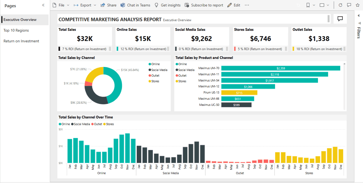
What Is a Power BI Report?
A Power BI report is a detailed, multi-page document that shows different visuals, charts, and tables using a single dataset to help you explore and understand your data better.
With the help of a Power BI report, one can:
Dive deep into sales trends
Track customer behavior
Analyze operational performance
Compare year-over-year growth
Identify patterns across different business areas
While reports and dashboards have the same goal to give you a business overview, they are totally different in how they're created and used in real work environments.
You create a report when you need:
Multiple pages of insights
Interactive filters and drill-down options
Custom layouts and rich visuals
Detailed data exploration with slicers and tables
Reports are perfect when you need a deep, customized view of your business, helping you explore every corner of your data easily and smartly.
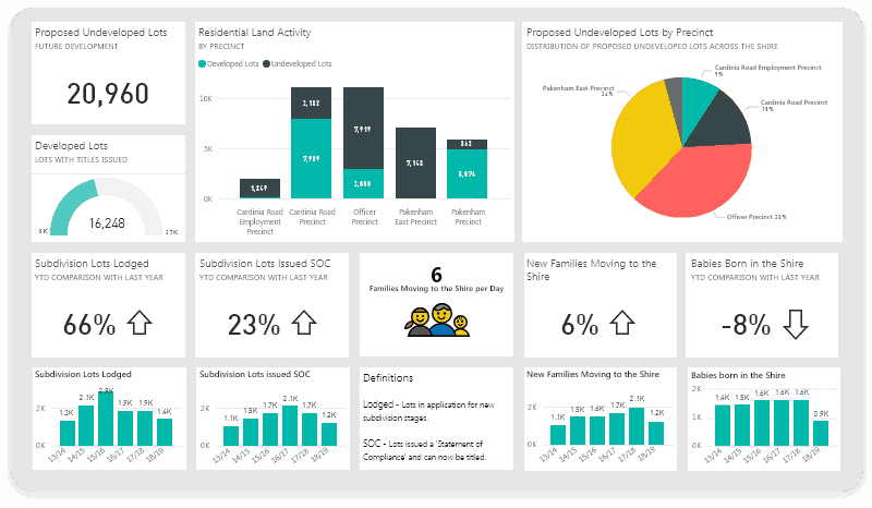
What Is a Power BI Dashboard?
A Power BI dashboard is a visualized overview filled with visuals, charts, and key numbers from different reports.
It quickly shows you what's happening across your business.
People use dashboards when they need instant answers like:
Checking daily sales numbers
Monitoring live website visitors
Watching real-time customer sign-ups
Tracking important KPIs at a glance
Dashboards are different from reports because they're simpler, less detailed, and quicker to view.
They can't be customized deeply, but they're great for seeing important info instantly, even from multiple datasets.
You usually create a dashboard when:
You want a quick snapshot, not a detailed analysis
You need to share information quickly with your team
Your goal is to monitor key numbers live
Power BI dashboards help you spot trends instantly, keep an eye on performance, and quickly share what's important without digging through pages of data.
Power BI Dashboard vs Report: 7 Key Differences
Sometimes, it's hard to pick between a dashboard and a report.
Both show data, but how they work and what they offer are completely different.
Here’s a quick comparison between the Power BI dashboard and the report:
Feature | Dashboard | Report |
Data Sources | Can pull from multiple datasets | Tied to a single dataset |
Interactivity | Limited filtering | Fully interactive with slicers and drill-downs |
Customization | Basic layout adjustments only | Deep formatting and layout control |
Visual Types | Pinned visuals only | Full range of visuals supported |
Data Refresh | Real-time updates possible | Manual or scheduled refresh |
Purpose | Quick snapshot of KPIs | Detailed data analysis and exploration |
Sharing | Easy to share, but read-only | Can be shared, embedded, and exported |
Now, let’s explore how dashboards and reports are built differently in real use.
1. Data Sources
Dashboard: Dashboards can use visuals from many reports and datasets.
That means you can pull different metrics into one view.
It helps when you need a big-picture overview.
Report: A report is tied to one dataset.
You can explore it deeply with charts, filters, and pages, but all visuals are based on that single source of data.
2. Interactivity
Dashboard: Dashboards are mostly static. Clicking a chart usually sends you to the report it's from.
You can’t slice or filter data directly on the dashboard.
Report: Reports are built for interaction.
You can use slicers, drill through pages, hover for tooltips, and explore data from many angles in one view.
3. Customization
Dashboard: Layout is simple. You can move visuals, resize them, and apply basic themes.
But customization is limited compared to what reports allow.
Report: Reports give full control.
You can build custom layouts, control visual interactions, apply complex themes, and add detailed formatting options.
4. Visualization Types
Dashboard: Dashboards only display visuals pinned from reports. You can’t create new charts directly. Visuals stay as they are from the source report.
Report: You can use a full range of visuals—bar, line, pie, maps, and more. You can even use custom visuals and interactive elements on each page.
5. Data Refresh
Dashboard: Dashboards support real-time updates with live data tiles.
That’s useful for monitoring metrics like sales, inventory, or user signups instantly.
Report: Reports depend on refresh settings.
You can schedule updates or use DirectQuery to show the latest data. Still, it's not real-time like dashboards.
6. Purpose
Dashboard: Dashboards show a quick snapshot.
They're made for high-level tracking and monitoring. Think of daily check-ins or executive summaries.
Report: Reports are for deeper analysis.
They help you dig into numbers, answer detailed questions, and understand trends across pages.
7. Sharing and Collaboration
Dashboard: Dashboards are read-only. You can share them easily, but users can’t change them.
They often click through to reports for more insights.
Report: Reports offer flexible sharing.
You can export them as PDFs, publish to apps, or embed them into portals with role-based access.
Choosing between a dashboard and a report depends on what you want to see, how fast you need it, and how deep you plan to go into the data.
Interactive Dashboard: What It Is and 5 Examples To Understand Better
When Should You Use a Dashboard vs a Report?
Choosing between a dashboard and a report depends on how fast you need insights and how deep you want to go into the data.
So, here are our recommendations based on when you should use a dashboard and a report:
✅ Use a Dashboard When:
You need a quick snapshot of live numbers (sales, signups, traffic)
You want to check KPIs daily without opening 10 pages
You manage a team and track goals at a glance
You want to combine data from different sources into one view
You need to share a simple overview quickly across teams
📊 Use a Report When:
You need to deep dive into detailed data (sales, finance, customers)
You want to filter, drill down, or compare data across dimensions
You’re building a full analysis or business review
You need to create multi-page, visual-rich reports
You want full control over layout, visuals, and storytelling
👥 Role-Based Quick Guide:
Role | Best Fit | Why |
Executives | Dashboard | Quick check on top KPIs without the noise |
Analysts | Report | Full control to explore, dig, and explain |
Marketing/Ops | Dashboard | Monitor campaign and ops performance daily |
Data Teams | Report | Build visuals, track patterns, and present findings |
⚡ Quick Takeaway:
Dashboards = Speed and monitoring.
Reports = Depth and analysis.
If you want faster decisions? Use a dashboard.
If you want smarter, deeper decisions? Build a report.
Both dashboards and reports serve different goals.
Choosing the right one will make your insights faster, clearer, and easier to share across your team.
Limitations of Power BI Dashboards & Reports
Power BI dashboards and reports are powerful tools, but they aren't perfect for every situation.
They both have some limitations that can slow your business down.
These are some of the limitations of Power BI Dashboards & Reports:
Limitation | What You Need to Know |
Real-time Data | Only dashboards offer real-time updates—and even then, not all data sources refresh instantly. |
Customization Limits | Dashboards are limited in visuals and layouts. Reports offer more flexibility, but require more time and skill to build. |
Multi-Tenant Complexity | Hard to build separate dashboards or reports for each customer if you're running a SaaS business. |
White-labeling Restrictions | Fully branding dashboards or reports with your logo, colors, or custom domain is difficult without heavy customization. |
Data Refresh Frequency | Reports can't refresh in real-time. You must set scheduled refreshes, limiting how fresh your data really is. |
It also comes with some integration and embedding challenges that you also need to consider:
Embedding dashboards and reports in external apps can be complicated and costly.
APIs have limits, making it tough to customize embedded analytics completely.
User permissions are sometimes hard to manage clearly when embedding reports in apps.
Power BI is strong, but these limits can make it challenging for teams needing simpler embedding, real-time data, or clearer branding control, especially for SaaS applications.
Is Power BI really Better for SaaS Dashboards?
Power BI is great for building reports and dashboards.
But for fast-moving SaaS teams, it often hits limits that make daily work harder instead of easier.
Here's how Power BI becomes limiting for SaaS teams:
Cross-tenant analytics is hard: You can’t easily isolate data by customer or tenant without complex models and DAX hacks.
White-labeling isn’t native: It’s difficult to fully brand dashboards with your own logo, color, and domain.
Scaling dashboards is slow: You need to manually build or duplicate reports per customer instead of automating that process.
Embedding is complex and costly: You need Power BI Premium or Embedded licenses, and integration still requires technical support.
Real-time data feels limited: Live dashboards only work with certain data types and need advanced setup to work smoothly.
Power BI can solve many analytics problems.
But for SaaS teams needing multi-tenant analytics, simple embedding, and white-labeling, a specialized platform like Upsolve AI might work better.
Upsolve AI: A Better Alternative for SaaS Analytics
Upsolve AI is a plug-and-play analytics platform that helps SaaS businesses deliver fast, beautiful dashboards with built-in multi-tenant support and real-time insights.
It’s built to solve problems SaaS teams face every day: onboarding customers faster, sharing insights easily, and embedding dashboards that actually scale.
Features of Upsolve AI:
Why settle for basic dashboards when you can build smarter, faster, and branded experiences—without the headache?
Multi-Tenant Analytics: Serve multiple customers from a single dashboard. No extra setup. No extra cost.
Easy Embedding: Drop dashboards straight into your app or portal—zero coding, zero expensive licensing nightmares.
One-Click White-labeling: Slap your logo, your colors, your domain on it. Fully yours—no messy workarounds.
Real-time Alerts: Get instant notifications when key numbers change—catch problems (or wins) before anyone else even notices.
No-Code Dashboard Builder: Drag, drop, done. Create dashboards that look pro-level without ever touching code.
Bottom line:
With Upsolve AI, you can do a faster setup, better branding, and get smarter insights without having support from developers, no duct tape fixes, and in no time.
Pricing of Upsolve AI:
Upsolve AI offers a free plan plus three paid tiers, billed around monthly credit usage:
Free ($0): 2,000 one-time credits (~200 questions); all Pro features, to test-drive
Pro ($500/mo): 2,000 credits/month; 50+ data connections, unlimited agents, full observability
Team ($2,000/mo): 10,000 credits/month; adds embedding, RBAC/row-level security, multi-tenant, and semantic-layer generation
Enterprise (custom): on-prem/VPC, SAML SSO, HIPAA, SOC 2, and BYOM
Annual billing is 20% off.
How Upsolve AI Differentiates from Power BI
While Power BI is a general-purpose analytics tool, Upsolve AI is designed specifically for SaaS teams, making tenant-level analytics, branding, and embedding much simpler and faster.
Feature | Power BI | Upsolve AI |
Multi-Tenant Support | Manual setup only | Built-in, no-code |
White-Labeling | Complex and limited | One-click, custom domain |
Embedding | Requires Premium licenses | API-first, simple integration |
Real-Time Data | Limited to some sources | Native support for real-time alerts |
SaaS Use Case Fit | General-purpose BI tool | Purpose-built for SaaS teams |
When Upsolve AI Outperforms Power BI:
Upsolve AI is built exactly for SaaS scenarios, offering clear benefits in scaling, embedding, and customizing dashboards for your customers without any complicated setup or added costs.
So, here’s when Upsolve AI is better than Power BI:
You serve many clients and want dashboards auto-created per customer
You want to embed dashboards without writing complex code
You need real-time usage data with built-in alerts
You want to style dashboards to match your brand without IT help
You want to scale reporting without rebuilding reports each time
Upsolve AI removes the heavy lifting for SaaS teams. It helps you launch, share, and scale analytics faster without needing a BI engineer for every step.
Final Thoughts: Dashboard or Report — What’s Right for You?
Choosing between a dashboard and a report comes down to a simple question: How deep do you need to go into your data?
Here's a clear table to help you decide quickly:
Dashboard is best when you: | Report is best when you: |
Need quick daily insights | Want a detailed exploration of data |
Monitor live or real-time metrics | Require interactive charts and filtering |
Want a simple overview for quick decisions | Need multiple pages for deep analysis |
Share insights instantly with your team | Want to customize visuals fully |
Combine multiple data sources in one view | Use a single data source for deep insights |
Think clearly about your goals, as dashboards are created to keep your team updated fast, while reports help you to explore and understand your data fully.
And, if you're a SaaS business needing something built specifically for you, tools like Upsolve AI simplify analytics.
It handles complex tasks like tenant analytics and embedding, saving you time and headaches.
FAQs
Q1: What is the biggest difference between a dashboard and a report?
A dashboard gives you a quick summary on one page. A report lets you explore data deeply with filters, pages, and interactive visuals.
Q2: Can you create dashboards without reports in Power BI?
No. Dashboards are built by pinning visuals from reports. So, you always need a report first to create a dashboard in Power BI.
Q3: Do dashboards update in real time?
Yes, but only if they use live data sources. Otherwise, dashboards refresh based on the underlying report’s update schedule or data refresh settings.
Q4: Can I embed both in external applications?
Yes, both dashboards and reports can be embedded. But embedding dashboards requires more setup and often needs a Power BI Premium or Embedded license.
Q5: What are Power BI’s limits for multi-user reporting?
Power BI lacks built-in multi-tenant support. You’ll need complex filters or row-level security to serve different users or customers with separate data views.

Try Upsolve for Embedded Dashboards & AI Insights
Embed dashboards and AI insights directly into your product, with no heavy engineering required.
Fast setup
Built for SaaS products
30‑day free trial