Learn what an interactive dashboard is, how it works, and explore real examples across sales, finance, marketing, and operations.

Ka Ling Wu
Co-Founder & CEO, Upsolve AI
10 min

Have you ever looked at a report full of numbers and thought, “What does this even mean?” I get it — too much data can feel confusing and stressful, especially when you’re trying to make the right decision for your business.
That’s why interactive dashboards are so helpful.
Instead of just showing plain reports, they let you click, explore, and understand your data in a simple way — all in real time.
In this blog, I’ll explain what interactive dashboards are, show you some examples, and help you see how they can make your work easier and smarter.
I’ll guide you through:
A clear understanding of what interactive dashboards are,
Key features that make them powerful tools,
Practical examples showing how businesses use them to solve real-world problems,
And essential factors to consider when creating a dashboard that fits your needs.
By the end, you’ll know precisely how interactive dashboards can improve your business and decision-making process.
What Is An Interactive Dashboard?
An interactive dashboard is a tool for exploring and analyzing data in real time using visual elements such as charts, graphs, and tables.
You can filter data by specific periods, drill down into particular categories, or even focus on specific areas, making it easier to uncover insights and act on them.
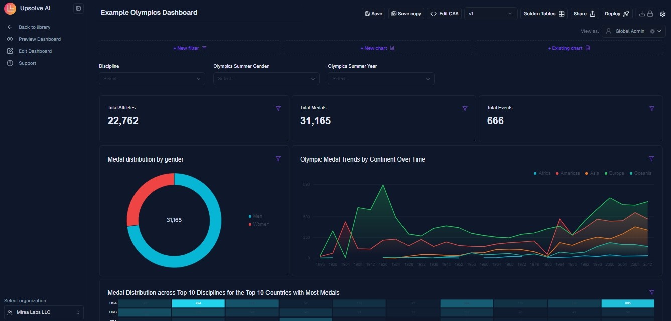
For example, an Olympic committee might use an interactive dashboard where overall medal counts are displayed.
By drilling down, swimming events could be focused on, individual athlete performances explored, or countries excelling in specific categories analyzed.
Key Features Of Interactive Dashboards
Interactive dashboards are designed to make it easier for you to explore and understand your data.
Here are some key features that make them practical tools for decision-making:
Real-Time Data Visualization
With real-time updates, you always see the latest information.
When new data comes in, the dashboard refreshes automatically.
For example, you can track live sales numbers or monitor campaign performance without requesting a new report.
Interactivity
Interactive dashboards let you explore your data in detail.
You can use filters to narrow specific timeframes or categories, drill down into deeper levels for more insights, or drill through to related data.
Customization
You can adjust the dashboard layout, choose different color schemes, and select the best visualizations.
This allows you to create a dashboard highlighting the metrics most relevant to your goals.
Tools like Upsolve AI and Tableau allow you to customize dashboards based on your unique needs, while competitors like Power BI focus on integrating existing workflows.
Collaboration Tools
Dashboards are easy to share with your team, making it simple for everyone to access the same data.
Some tools also allow annotations so that you can highlight significant trends or insights for others.
Mobile Compatibility
With mobile-friendly dashboards, you can access your data from anywhere.
Whether in a meeting or traveling, you can check your key metrics on your phone or tablet.

5 Examples Of Interactive Dashboards
Here are five examples that show how interactive dashboards can help simplify data analysis for various use cases.
Dashboard | Tracks | Use Case |
Sales | Revenue, regions, rep performance | Spot top reps, target lagging areas |
CFO | Cash flow, expenses, profit | Manage budgets, identify cost spikes |
Marketing | Conversions, engagement, ROI | Optimize campaigns and channels |
Supply Chain | Inventory, delivery, supplier reliability | Fix delays, manage stock levels |
Project Mgmt. | Tasks, deadlines, team load | Stay on schedule, balance team efforts |
Sales Dashboard
An interactive sales dashboard gives you a real-time view of your sales performance.
It tracks metrics like revenue, sales by region, team performance, and individual rep contributions.
For example, you can start with total sales figures and then drill down to see which regions are leading or lagging.
If a specific rep outperforms others, you can analyze their activity to identify what’s working.
This dashboard lets you filter data by products, timeframes, or customer segments, helping you understand trends and target opportunities.
It is a valuable tool for sales managers needing data to guide their teams effectively.
CFO Dashboard
An interactive CFO dashboard provides a real-time overview of your organization’s financial health.
It tracks cash flow, revenue, expenses, and profitability metrics.
For example, you can start with overall cash flow figures and then drill down to specific departments or periods to see where your money is coming from and where it’s being spent.
If expenses are unusually high in one area, you can analyze the data to identify the root cause.
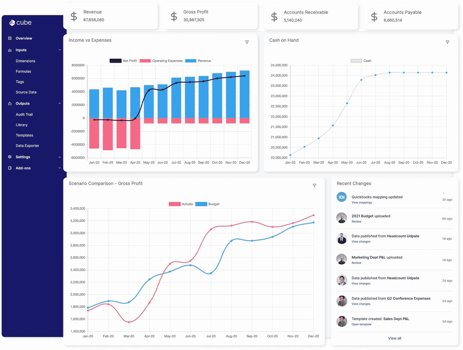
This dashboard also allows you to filter data by categories such as fixed costs, variable costs, or income sources, helping you spot trends and plan for the future.
It is essential for CFOs who need accurate, up-to-date financial insights to guide their decisions.
Marketing Campaign Dashboard
An interactive marketing campaign dashboard helps you monitor campaign performance and ROI in real time.
It tracks conversion rates, engagement levels, and customer acquisition costs.
For example, you can start by viewing the overall performance of all your campaigns, then drill down into specific channels, such as social media or email.
If one channel is underperforming, you can analyze the data to identify issues like low click-through rates or poor audience targeting.
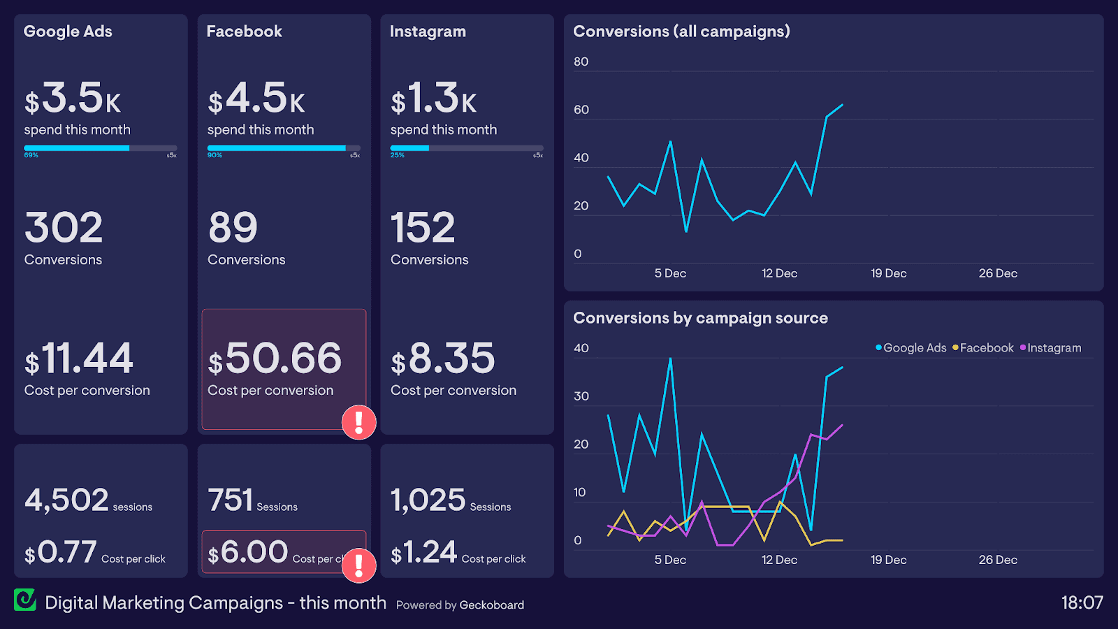
It also lets you filter by timeframes, audience segments, or campaign types, helping you understand what strategies are working best.
It’s a powerful tool for marketers who must optimize their efforts and allocate budgets effectively.
Customer Engagement Analytics: 10 Metrics + Use Cases To Boost Engagement
Supply Chain Dashboard
An interactive supply chain dashboard gives you real-time visibility into logistics and inventory operations.
It monitors stock levels, supplier reliability, and delivery performance.
For instance, you can begin by reviewing inventory across warehouses and then focusing on specific items that are understocked or overstocked.
If delivery timelines are being missed, you can review supplier data to pinpoint the issue and take the necessary steps to address it.
Supply Chain dashboards also let you sort data by product categories, regions, or suppliers, making it easier to streamline processes and reduce inefficiencies.
It’s a practical tool for managing supply chains effectively and ensuring smooth operations.
Project Management Dashboard
An interactive project management dashboard clearly shows project progress and resource utilization.
It tracks essential metrics such as task status, team workload, and deadlines.
For instance, you can begin with an overview of ongoing projects and focus on areas where deadlines are at risk.
If delays occur, you can dive into specific tasks to understand the bottlenecks and reassign resources to stay on schedule.
This interactive dashboard also lets you sort data by project phases, team members, or timelines, making it easier to prioritize tasks and improving efficiency.
It’s a valuable tool for keeping projects on track and achieving objectives.
Factors To Consider When Creating An Interactive Dashboard
When creating an interactive dashboard, it’s essential to plan carefully to ensure it meets your needs and delivers value.
Here are the key factors to consider before you start building.
Factors | What To Consider |
Objectives | Clearly define the dashboard's purpose and identify the key metrics it should track. |
Audience | Understand the needs and technical skills of the end-users to design a dashboard that is accessible and relevant. |
Tool Selection | Choose tools that align with your requirements. For example, tools like Upsolve.ai, Tableau, or Sisense. |
Integration Needs | Ensure compatibility with existing data sources like SQL databases, Google Sheets, or cloud storage solutions. |
Customization | Look for options to customize the layout, charts, and filters to match specific business needs and branding. |
Ease Of Use | Select intuitive and easy-to-use tools, especially for non-technical users. |
Real-Time Updates | Ensure the dashboard can update automatically as data changes to provide the latest insights. |
Scalability | Check if the dashboard can handle growing data and user demands as your business expands. |
Security | Prioritize tools with robust security features like user permissions, encryption, and secure data sharing. |
Collaboration | Consider features that allow users to share dashboards, add annotations, and collaborate effectively within teams. |
Support | Choose tools that provide reliable customer support, tutorials, and comprehensive documentation. |
AI Dashboard Generator: How To Create Dashboards Using AI [Within 5 Minutes]
Conclusion
Interactive dashboards can make a big difference in how you understand and use your data.
Instead of digging through endless reports, you get a clear, real-time view that helps you make better decisions.
If you're thinking about creating one, start simple: know what you need, who it’s for, and pick a tool that doesn’t overcomplicate things.
I’ve used Upsolve.ai myself, and honestly, it made the whole process much easier. It’s user-friendly, flexible, and lets you build professional dashboards without needing to be super technical.

Try Upsolve for Embedded Dashboards & AI Insights
Embed dashboards and AI insights directly into your product, with no heavy engineering required.
Fast setup
Built for SaaS products
30‑day free trial