Explore healthcare dashboard examples and key metrics to track for improving patient care, optimizing operations, and enhancing decision-making.

Ka Ling Wu
Co-Founder & CEO, Upsolve AI
10 min

Healthcare teams generate large volumes of clinical, operational, and financial data every day. The challenge is turning that data into clear insights teams can act on quickly.
Healthcare dashboards bring key metrics into a single, real-time view. When designed well, they help teams monitor patient status, manage capacity, track performance, and identify issues before they affect care.
This guide covers 10 practical healthcare dashboard examples, each tied to a specific role and use case, from patient monitoring and emergency care to finance and compliance. It focuses on what each dashboard is used for, who relies on it, and which metrics matter most, helping teams choose dashboards that support real operational needs.
You’ll also see examples of dashboards that track metrics such as:
Patient satisfaction and experience indicators
Emergency department throughput and response times
Hospital revenue, costs, and billing performance
The table below provides a quick overview of all ten dashboards, including primary users, core metrics, and operational outcomes.
10 Healthcare Dashboard Examples (By Use Case)
Before reviewing each example in detail, here’s a quick snapshot of ten healthcare dashboards that are actually meaningful for modern healthcare teams.
This table provides a clear view of each dashboard’s purpose, who uses it, the metrics it tracks, and the type of impact it supports, helping you avoid bad data visualizations that look polished but offer little practical insight.
Dashboard | Main Users | Key Metrics | Impact or Outcome |
Patient Monitoring | Nurses, Doctors | Vitals, alerts, real-time status | Improves response time and patient outcomes |
Hospital Operations | Admins, Ops Teams | Bed count, wait times, discharge rate | Boosts patient flow and resource planning |
Financial Performance | Finance Teams | Revenue, billing cycle, claim status | Helps cut losses and improve cash flow |
Emergency Room (ER) | ER Staff, Shift Leads | Live load, staff availability, treatment time | Speeds up care and reduces overcrowding |
Clinical Trial | Research Teams | Enrollment, protocol adherence, data logs | Keeps studies on track and fully compliant |
Population Health | Public Health Teams | Chronic disease trends, demographics | Helps target outreach and reduce disparities |
Quality and Compliance | Quality Control, Auditors | Infection rate, readmissions, audit logs | Improves safety and regulatory alignment |
Telehealth Performance | Virtual Care Teams | Session volume, call quality, outcomes | Enhances patient experience with remote care |
Staffing and Resource Utilization | HR, Operations | Shift coverage, overtime, burnout signs | Prevents overload and ensures team efficiency |
Patient Satisfaction | Executives, Experience Teams | NPS, feedback scores, complaint trends | Tracks service quality and improves loyalty |
To determine which dashboards are most relevant for your organization, the sections below break down each example and explain how it supports specific operational and clinical needs.
1. Patient Monitoring Dashboard
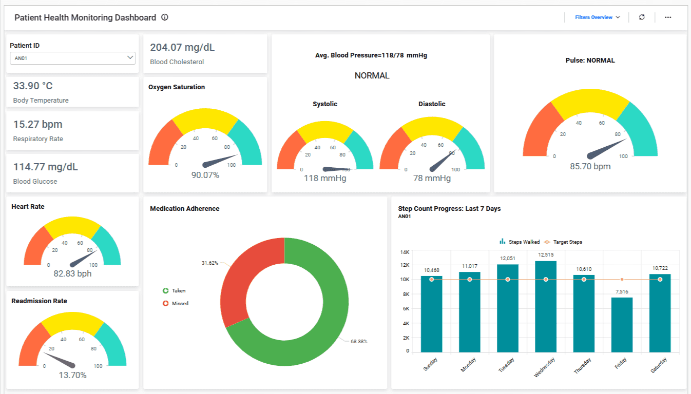
This dashboard gives doctors and nurses a live view of patient vitals so they can catch problems early and take action before things get worse.
It reduces guesswork and helps teams respond faster, especially during critical care or post-surgery recovery.
What It Tracks:
Heart rate, blood pressure, temperature
Oxygen saturation and respiration rate
Alerts for sudden changes or critical thresholds
Patient movement or fall risk indicators
Who Uses It: This dashboard is mostly used by nurses, ICU teams, and attending doctors who need to monitor patient status around the clock with zero delays.
Why It Matters:
When health data updates in real-time, teams don’t have to wait for manual charting or calls. They act instantly when something changes.
It improves patient outcomes, prevents emergencies, and builds trust with families who know their loved ones are closely monitored.
2. Hospital Operations Dashboard
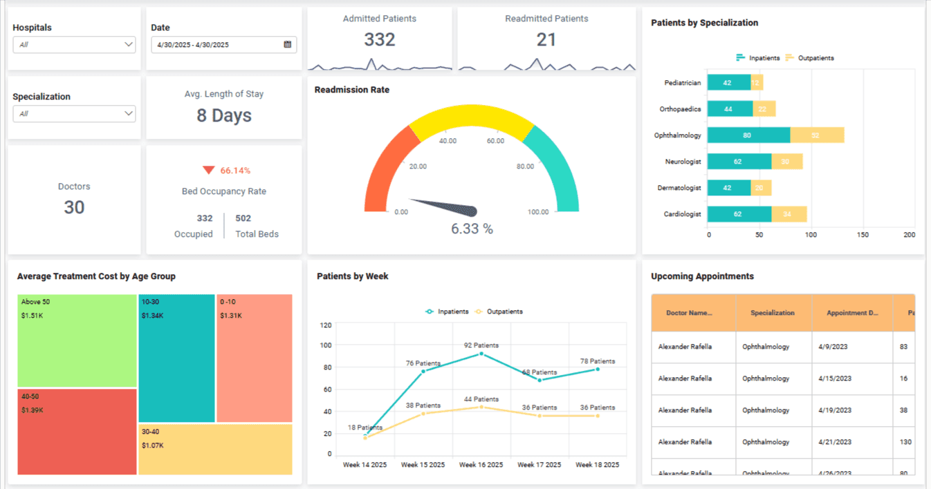
This dashboard gives hospital admins a live view of bed availability, patient flow, and discharge timelines across departments.
It helps reduce wait times, avoid overcrowding, and manage daily operations more smoothly.
What It Tracks:
Bed occupancy and turnover rate
Average patient wait times
Discharge status and delays
Department-wise patient load
Who Uses It: Hospital admins, ops teams, and shift managers rely on this dashboard to make sure resources are used properly and no department is overburdened.
Why It Matters:
Without a clear view of daily operations, it’s easy to lose track of beds, overbook staff, or delay discharges.
This dashboard helps teams plan better, balance workloads, and deliver smoother patient experiences across the board.
3. Financial Performance Dashboard
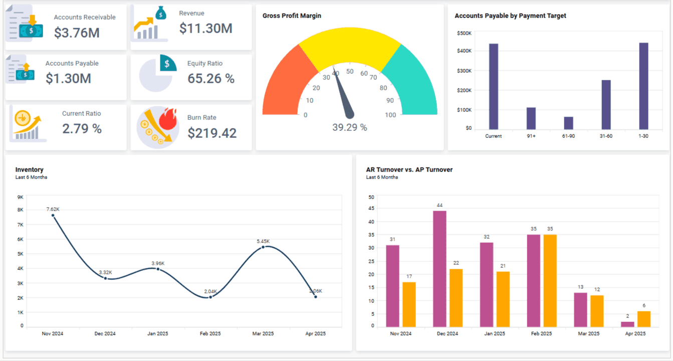
It shows how your hospital or clinic is doing financially, from billing cycles to revenue collection and unpaid claims.
It helps finance teams spot cash flow issues early and keep budgets on track.
What It Tracks:
Revenue by department or service
Billing cycle time and payment delays
Claim approval and rejection rates
Cost per patient or procedure
Who Uses It: Finance teams, revenue cycle managers, and hospital executives use this to monitor income, reduce unpaid bills, and improve overall financial health.
Why It Matters:
Healthcare teams often focus on care, but poor financial tracking leads to long-term risks like unpaid claims and shrinking margins.
This dashboard helps you stay profitable while keeping care affordable, making sure no revenue slips through the cracks.
Also Read: 5 Popular Financial Analytics Tools for CFOs
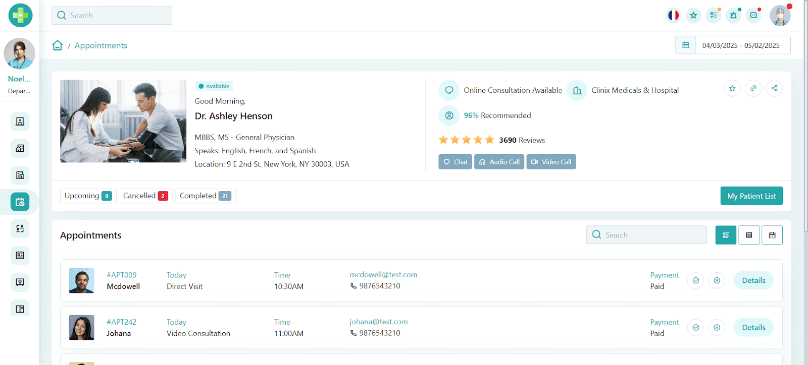
4. Emergency Room (ER) Dashboard
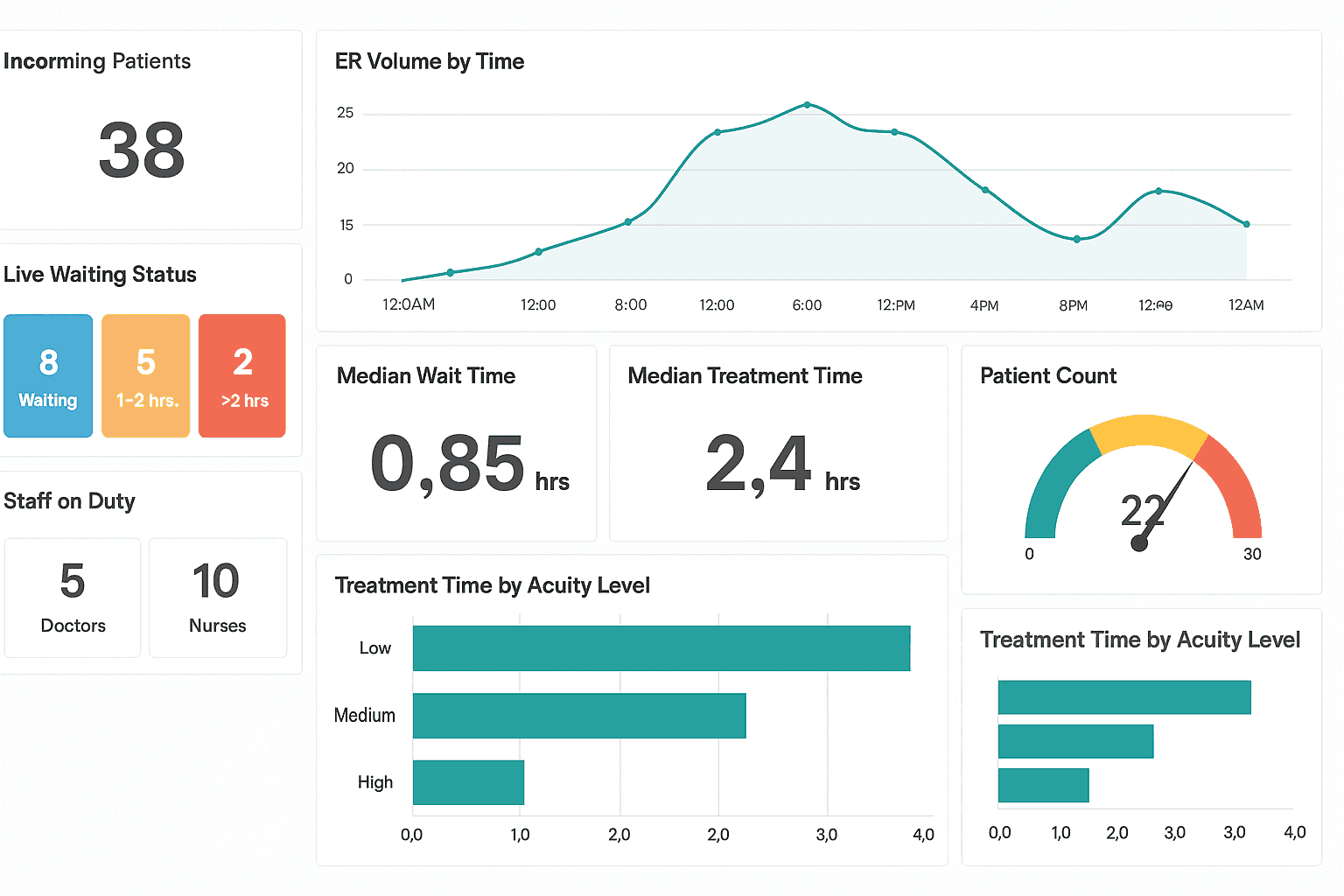
This dashboard shows ER teams the current patient load, available staff, and how quickly patients are being treated, all in real-time.
It helps ER teams manage busy shifts efficiently and deliver quicker care during emergencies.
What It Tracks:
Live patient volume and waiting status
Average time from arrival to treatment
Staff allocation and shift coverage
Current capacity and available resources
Who Uses It: ER nurses, shift leads, and emergency doctors rely heavily on this dashboard to quickly allocate resources and ensure rapid patient care.
Why It Matters:
In the ER, every second counts. Without clear visibility, overcrowding occurs, wait times increase, and patient care suffers.
This dashboard prevents delays, improves patient safety, and helps ER teams manage their stressful environment effectively.
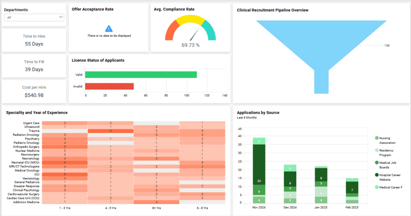
5. Clinical Trial Dashboard
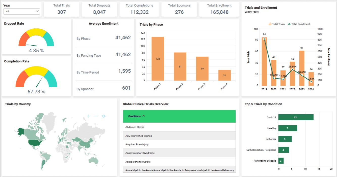
A clinical trial dashboard helps research teams keep studies running smoothly by tracking participants, protocols, and critical study data.
Teams stay on top of their studies, spot issues quickly, and ensure trials are completed without costly delays.
What It Tracks:
Participant enrollment status
Adherence to trial protocols
Accurate data collection and progress
Upcoming deadlines and milestones
Who Uses It: Clinical research coordinators, trial managers, and regulatory teams use this dashboard to keep trials compliant and efficiently manage research timelines.
Why It Matters:
Clinical trials can quickly become complex where missing deadlines or data issues can derail a study and cause serious setbacks.
But, with this dashboard, you can simplify trial management, improve data accuracy, and help your team deliver high-quality results with fewer headaches.
6. Population Health Dashboard
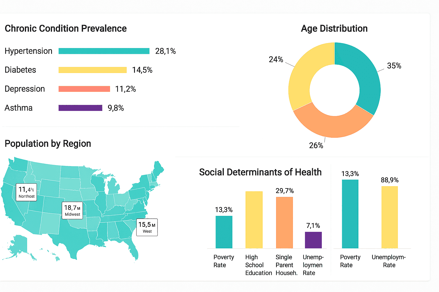
This dashboard gives your healthcare organization a complete picture of community health. It highlights chronic conditions, demographics, and areas needing immediate attention.
Using this dashboard, your team can better understand your community and target health interventions exactly where they're needed, and these types of dashboards mainly use adaptive analytics to keep you updated in real-time.
What It Tracks:
Chronic disease rates like diabetes and hypertension
Community demographics such as age, location, and socioeconomic factors
Patterns in social health determinants
Disease outbreak hotspots
Who Uses It: Healthcare executives, public health officials, and community outreach teams use this dashboard to strategize public health campaigns and allocate resources wisely.
Why It Matters:
Population health goes beyond individual patient care. It’s about keeping entire communities healthy by predicting and preventing health crises before they escalate.
7. Quality and Compliance Dashboard
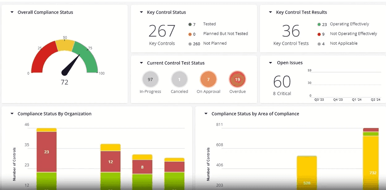
This dashboard keeps your team aligned with safety standards, internal policies, and external regulations. It pulls together data that shows where you're performing well and where risks exist.
What It Tracks:
Infection and complication rates
Hospital readmission trends
Internal audit results and compliance scores
Incident reports and safety checks
Who Uses It: Used mostly by quality teams, compliance officers, and risk managers who need to ensure the hospital is following rules and maintaining patient safety.
Why It Matters:
Failing an audit or missing a safety issue can lead to legal trouble or harm to patients. This dashboard helps spot those red flags before they become serious problems.
It builds accountability, supports certifications, and keeps your healthcare facility trusted and respected.
8. Telehealth Performance Dashboard
With telehealth becoming essential, this dashboard helps virtual care teams monitor patient interactions, call quality, and the overall effectiveness of remote sessions.
Teams can quickly see how well virtual visits are working and spot any issues that affect patient satisfaction or care quality.
What It Tracks:
Number of virtual visits completed
Call quality metrics like video clarity and connection stability
Patient feedback and resolution rates
Appointment cancellations or no-shows
Who Uses It: Virtual care providers, telemedicine coordinators, and digital health managers use this dashboard to keep telehealth services smooth, reliable, and patient-friendly.
Why It Matters:
Telehealth depends entirely on good patient experiences. Without clear performance data, virtual care can quickly become frustrating for both patients and providers. With this dashboard, it helps you tackle your customer-facing problems with powerful analytics.
By tracking these critical telehealth metrics, your team ensures virtual care stays effective, accessible, and patient-focused.
9. Staffing and Resource Utilization Dashboard
This dashboard gives managers a real-time view of team coverage, workload distribution, and potential burnout risks.
It helps prevent staff shortages and improves planning across departments.
What It Tracks:
Shift schedules and live coverage gaps
Overtime hours across teams
Absenteeism and leave trends
Who Uses It: Operations leaders, HR teams, and department heads use this dashboard to make smarter staffing decisions and avoid overloading any one group.
Why It Matters:
When staff are stretched too thin, both care quality and morale take a hit. This dashboard helps you avoid that.
It ensures patients get consistent care while your team stays supported and well-rested.
10. Patient Satisfaction Dashboard
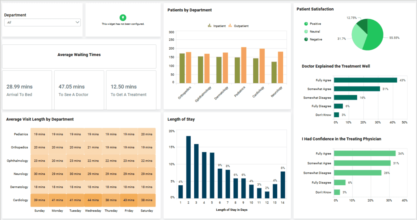
It helps your team understand how patients feel about their care, services, and overall experience within your facility.
What It Tracks:
Net Promoter Score (NPS)
Satisfaction survey results
Common feedback themes or keywords
Complaint rates and resolution timelines
Who Uses It: Used by patient experience teams, senior leadership, and quality departments to improve service quality and drive patient-centered care strategies.
Why It Matters:
Happy patients are more likely to return and recommend your facility. But without the right feedback, you’re guessing what needs fixing.
This dashboard helps your team listen better, respond faster, and create a care experience that builds long-term trust.
Dashboard Selection Guide by Team
Each of these dashboards serves a different purpose, but not every team needs all ten at once.
Start by picking the ones that solve your team's daily pain points. Focus on what drives the most clarity and impact for your role.
To simplify selection, the table below matches common healthcare teams with the dashboards they rely on most.
Team | Recommended Dashboards |
Operations | Hospital Operations, Staffing and Resource Utilization |
Clinical Teams | Patient Monitoring, Quality and Compliance |
Finance | Financial Performance, Clinical Trial (for grants) |
Executives | Population Health, Patient Satisfaction |
Now that you know exactly what matches your role, let's move on and discuss the most important healthcare metrics to track.
Also Check: AI Dashboard Generator: How To Create Dashboards Using AI [Within 5 Minutes]
Why Does Your Healthcare Team Need Effective Dashboards?
The right dashboards can transform how healthcare teams work. They simplify data, speed up decisions, and improve care.
Here’s why your team needs them:
Instant Clarity: View patient status, beds, and finances at a glance.
Faster Response: Real-time alerts help your team act quickly, especially in emergencies.
Fewer Mistakes: Everyone sees the same accurate data, reducing confusion and errors.
Better Patient Outcomes: Track satisfaction and care quality to improve results.
Easy Compliance: Stay audit-ready by spotting and fixing issues early.
If you’re still guessing from spreadsheets, it’s time to switch to dashboards that help your team move fast and care better.
Also Read: Dashboard vs Report: 5 Key Differences To Know
12 Essential Healthcare Metrics to Track (By Category)
Choosing the right metrics makes a meaningful difference in how healthcare teams operate. Tracking too many metrics at once, however, can quickly overwhelm teams and dilute focus.
The table below highlights 12 commonly used healthcare metrics, grouped by category, that healthcare teams rely on to monitor performance, improve care quality, and support decision-making. These metrics align with best practices for your interactive dashboard, where teams can explore data, drill into trends, and act on insights in real time.
Category | Metrics to Track | Why It Matters |
Clinical | Patient Readmission Rate | Indicates quality of care and effectiveness |
Treatment Adherence Rate | Ensures treatments are effective and followed | |
Infection or Complication Rate | Measures patient safety and care standards | |
Operational | Bed Utilization Rate | Manages resources and avoids overcrowding |
Average Wait Time (ER or admission) | Reduces patient frustration and care delays | |
Discharge Turnaround Time | Speeds up patient flow and operational efficiency | |
Financial | Cost Per Patient Visit | Helps budget accurately and identify overspending |
Billing Cycle Length | Improves cash flow and reduces payment delays | |
Claim Rejection Rate | Ensures accurate billing and revenue protection | |
Experience | Net Promoter Score (NPS) | Tracks patient satisfaction and loyalty |
Complaint Volume | Highlights service gaps and areas to improve | |
Compliance | Audit Success Rate | Keeps your facility compliant and audit-ready |
HIPAA or Policy Violation Count | Reduces legal risks and maintains patient trust |
Once you’ve identified the metrics that matter most to your team, the next step is making them easy to track and act on. Some teams use AI-assisted dashboard tools, such as Upsolve AI, to reduce setup time and keep reporting consistent across roles.
Also Check: Supply Chain Dashboard: 5 Examples + Template
Final Thoughts: Ready To Build a Smarter Healthcare Dashboard?
If you want to build a smarter healthcare dashboard, it’s essential to evaluate your team’s daily needs and focus on the metrics that truly support better decisions.
The dashboards outlined in this guide highlight how healthcare teams use data to:
Simplify complex information into clear, actionable views
Respond faster to operational and clinical changes
Improve patient outcomes and satisfaction
Strengthen financial and operational performance
Even when teams know exactly which dashboards they need, building and maintaining them from scratch can be time-consuming and complex. Choosing the right approach plays a key role in turning insights into action without unnecessary overhead.
FAQs
1. What’s the difference between EHRs and dashboards?
EHRs store patient data. Dashboards visually organize this data so your team can quickly understand what's happening and make better decisions.
2. Can these dashboards integrate with Epic or Cerner?
Yes, many modern healthcare dashboards support integrations with major systems like Epic and Cerner, allowing teams to work with data from their existing EHR platforms.
3. Which teams should use which dashboard?
Operations teams use hospital ops dashboards, clinical teams rely on patient monitoring, finance teams track financial metrics, and executives prefer satisfaction dashboards.
4. Are these dashboards customizable?
Absolutely. Good dashboards let you easily change metrics, visuals, and layouts so your healthcare team sees exactly what matters most.
5. How secure is my data with tools like Upsolve AI?
Healthcare dashboards are typically built with security and compliance in mind, using measures such as access controls and encryption. Teams should always ensure that any dashboard solution they use aligns with applicable healthcare privacy and security requirements, including HIPAA.

Try Upsolve for Embedded Dashboards & AI Insights
Embed dashboards and AI insights directly into your product, with no heavy engineering required.
Fast setup
Built for SaaS products
30‑day free trial