Explore real examples of bad data visualization, why they mislead, and practical tips to avoid common mistakes in charts, graphs, and dashboards.

Ka Ling Wu
Co-Founder & CEO, Upsolve AI
10 min

Disclosure: This article is published by Upsolve AI. Where our product is mentioned alongside competitors, we aim to provide balanced coverage based on publicly available information. We encourage readers to evaluate all options independently.
Ever looked at a chart and thought, “What am I even looking at?” Poor data visualization doesn’t just confuse viewers. It misrepresents information, hides important insights, and can quickly undermine trust in the data.
In this article, we break down 10 real-world examples of bad data visualization to show what went wrong, why these mistakes happen, and how to avoid repeating them in your own work.
Here’s what you’ll learn:
What bad data visualization looks like and why it happens.
Common mistakes to avoid.
Simple tips to improve your visuals.
Let’s break down what goes wrong and how to create data visualization that’s clear, accurate, and easy to understand.
What is Bad Data Visualization?
Bad data visualization happens when visuals confuse the audience, failing to convey the intended message.
This often results from misunderstanding data presentation principles or a rushed design process prioritizing speed over clarity.
Another significant factor is over-reliance on automation tools.
While they save time, they often produce generic visuals that need tweaking to match the context. Without changes, the impact of data visualization can be lost.
10 Real-World Examples of Bad Data Visualization
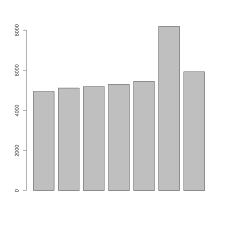
Example 1: Misleading Bar Charts
Bar charts are excellent for comparing values, but when used incorrectly, they can totally lead to a different story. Now look at these misleading bar charts that look like:
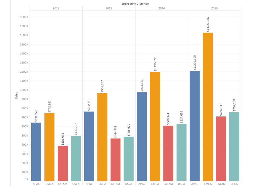
What is wrong here?
Bar charts can be misleading when their axes are manipulated to exaggerate or minimize value differences.
For instance, if the Y-axis starts at a number other than zero, even minor differences can seem significant.
Additionally, inconsistent widths or spacing of the bars can confuse viewers. Whether these tactics appear deliberate or careless, they result in misunderstandings.
How to avoid It:
Always start the Y-axis at zero for bar charts to reflect accurate proportions.
Keep bar widths consistent and use even spacing.
Ensure colors and labels are clear so there’s no room for misinterpretation.
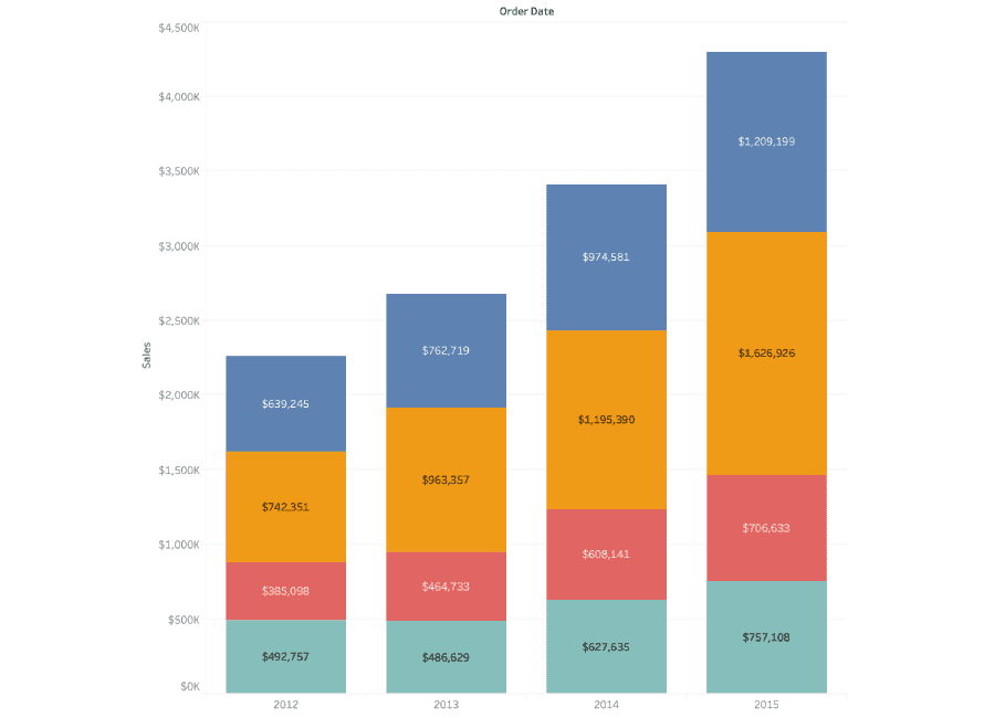
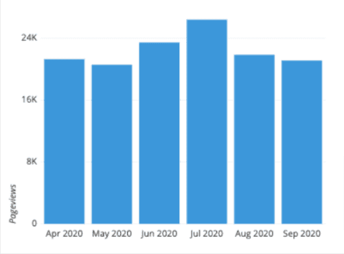
And this is how the correct bar chart visualization should look like:
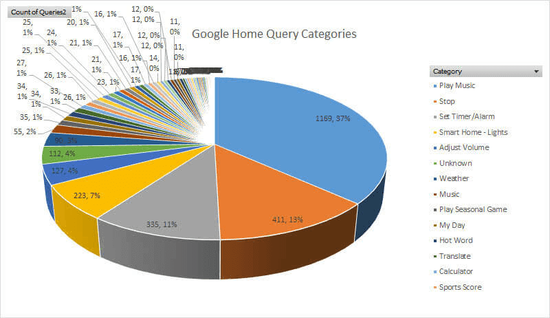
Example 2: Confusing Pie Charts
Pie charts should clearly show proportions, but they often fail when too many segments are included or the slices are difficult to compare.
Now check out these confusing pie charts that appear like this:
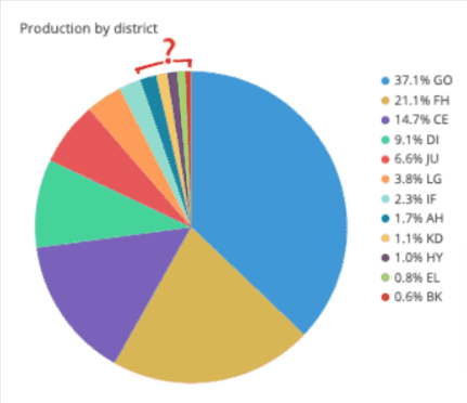
What is wrong here?
When pie charts include too many slices, they become nearly impossible to read. Additionally, using similar colors for adjacent slices makes it hard to distinguish between them. Sometimes, data with close percentages can appear identical, further confusing the audience.
How to avoid It:
Limit the number of segments to 5-7 for better readability.
Use contrasting colors and label slices directly to avoid confusion.
For small differences, consider using a bar chart instead of a pie chart.
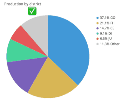
Here’s what a clear and simplified pie chart should look like:
Example 3: Overloaded Line Graphs
Line graphs are perfect for showing trends, but too many lines can clutter the visualization.
Now, observe these overloaded line graphs that might overwhelm you with data:
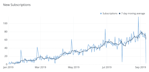
What is wrong here?
An overloaded line graph often includes too many data series, making it hard to focus on key trends. Overlapping lines and a lack of distinction between colors or line styles add to the chaos, leaving the viewer overwhelmed and frustrated.
How to avoid It:
Highlight the most important trends and simplify the graph by reducing the number of data series.
Use distinct colors and line styles for each series.
Consider breaking the graph into multiple smaller ones if needed.
And here’s what a cleaner and more focused line graph should look like:
Example 4: Unreadable Heatmaps
Heatmaps visualize density or intensity but become unreadable with poor color scales or excessive data points.
Now, let’s check out these heatmaps that may be overwhelming to read:
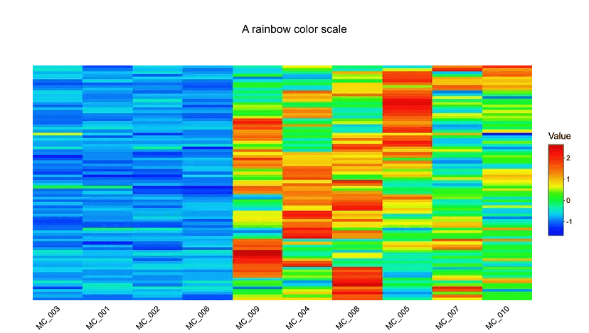
What is wrong here?
Unreadable heatmaps often use color scales that are either too similar or too extreme, making it difficult to distinguish between data points.
A lack of proper legends or excessive data clusters can also overwhelm the audience, reducing the effectiveness of the visualization.
How to avoid It:
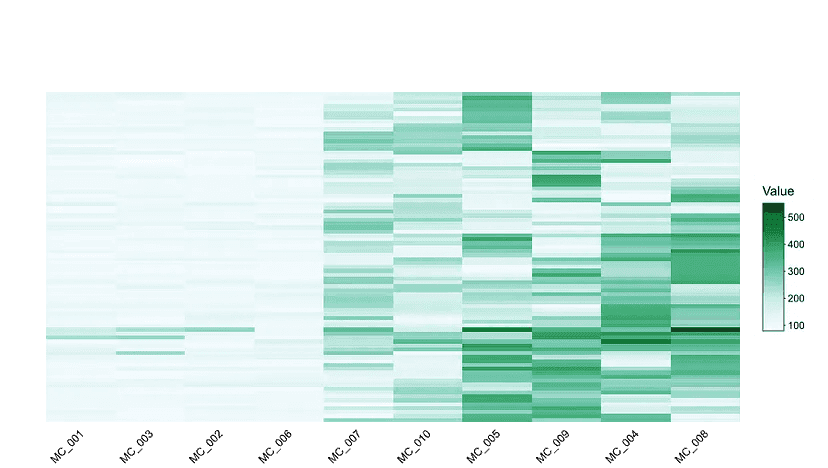
Use a clear, gradual color scale with enough contrast to highlight differences.
Add a legend to guide the audience in understanding the values.
Limit data density by clustering or summarizing data points where necessary.
And here’s what a properly designed heatmap should look like:
Example 5: Poor Use of Color
Colors are powerful in visualization but can be confusing when used without a purpose.
Now consider these charts with poor color choices that might distract you:

What is wrong here?
Using random or clashing colors can distract and confuse viewers. For example, assigning similar colors to vastly different data points or using an overwhelming color palette makes it harder to focus on the data’s message.
How to avoid It:
Use a consistent color scheme with a clear purpose (e.g., red for negative, green for positive).
Avoid using too many colors; stick to a palette that highlights key points.
Ensure the colors are accessible to colorblind viewers by using patterns or textures as a backup.
And here’s what a well-chosen color scheme should look like having a proper color scale:

Example 6: Inconsistent Scales
When scales differ across similar visualizations, they create confusion and distort the data story.
What is wrong here?
Inconsistent scales can make comparisons misleading. For example, using different Y-axis scales across similar bar or line charts can exaggerate or hide trends. This misrepresentation confuses readers and often leads to incorrect conclusions.
How to avoid It:
Use consistent scales across charts when comparing related datasets.
Label axes clearly to ensure the reader understands the scale.
Avoid cutting or skipping values on the axes unless necessary, and explain if you do.
Example 7: Missing Labels and Legends
Visualizations without labels or legends are like maps without directions, leaving the audience feeling lost.
Now imagine a graph with no labels or explanations, and it might look like this:
What is wrong here?
When labels and legends are missing, viewers are forced to guess what each axis, line, or segment represents. This lack of clarity can lead to frustration and misinterpretation of the data.
How to avoid It:
Always include descriptive labels for axes, legends, and data points.
Use concise text to guide readers without overwhelming them.
Ensure that every element in the chart has a clear explanation or context.
And this is what a well-labeled and clearly explained visualization should look like:
Example 8: Too Much Data in One Chart
Overloading a chart with too much data creates a visual mess that’s hard to decipher.
Here’s an example of an overly cluttered chart that looks like this:
What is wrong here?
Trying to cram too much data into a single chart makes it difficult for viewers to focus on what’s important. Overcrowded visuals result in information overload, causing the audience to miss the key message entirely.
How to Avoid It:
Break the data into multiple charts or use summaries to simplify the presentation.
Highlight only the most relevant data points to keep the visualization focused.
Choose the right chart type to represent the data more clearly.
And this is how a focused and simplified visualization should look like:
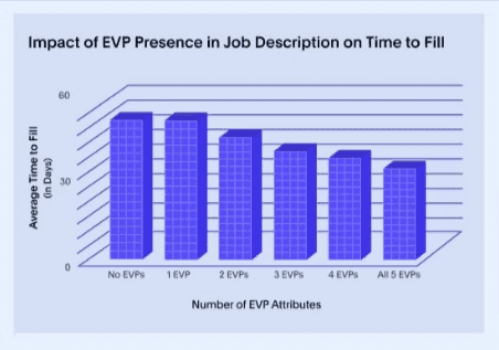
Example 9: Using the Wrong Chart Type
Choosing an unsuitable chart type can completely distort the data’s message.
Picture an irrelevant or poorly chosen chart type, and it might look like this:
What is wrong here?
Using the wrong chart type—a pie chart for trends or a bar chart for proportions—confuses the audience and misrepresents the data. It also distracts from the insights the visualization is supposed to convey.
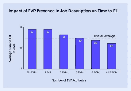
How to avoid It:
Match the chart type to the data you’re presenting (e.g., use line charts for trends and pie charts for proportions).
Consider the audience’s perspective—will this chart type make sense to them?
Test different visualizations to find the one that best represents the data.
And this is how using the correct chart type should look like:
Example 10: Lack of Context
A chart without context can feel like a story missing its plot, making viewers curious about its message.
Now, look at this visualization missing essential context, and it might look like this:
What is wrong here?
When visualizations lack context—such as timeframes, data sources, or annotations—they leave viewers with unanswered questions. The absence of explanatory text or references makes it hard for the audience to grasp the significance of the data.
How to avoid It:
Add annotations, titles, or captions to provide the necessary context.
Always mention the data source and timeframe if applicable.
Ensure the visualization answers the “why” or “what” behind the data story.
And this is what a well-contextualized visualization should look like:
What are the Root Causes of Bad Data Visualization?
Mistake | Description |
Unclear Goals | No clear purpose leads to confusing or irrelevant visuals. |
Wrong Chart Type | Using the wrong chart makes data harder to understand. |
Too Much Data | Overloading visuals overwhelms the audience. |
Poor Design | Inconsistent colors or unreadable fonts distract from the message. |
Lack of Context | Missing labels or legends leave viewers guessing. |
Manipulated Data | Tweaking scales misleads and breaks trust. |
Ignoring the Audience | Too simple or too complex visuals fail to connect with viewers. |
Overreliance on Tools | Charts can feel generic if overly dependent on automation. |
These issues can be avoided by focusing on clarity, audience needs, and proper design choices.
And if you’re wondering, "How can I tell for sure?" here are some clear signs to look out for.
Common Signs of Bad Data Visualization
Sign | Description | Example |
Misleading Scales | Skewed or undefined axes distort trends and create false impressions. | Uneven y-axis exaggerating small changes. |
Too Much Information | Overloaded charts confuse viewers and obscure key insights. | Line chart tracking 20 variables at once. |
Poor Color Choices | Clashing or similar colors reduce clarity and accessibility. | Heatmap with indistinguishable shades of red. |
Lack of Context | Missing labels, legends, or titles leave viewers guessing. | Pie chart without a legend. |
Unnecessary Complexity | 3D effects or intricate designs distract from the data. | 3D bar charts make comparisons difficult. |
Data Misrepresentation | Selective or altered visuals mislead and erode trust. | Cherry-picking survey results to hide negatives. |
Irrelevant Visuals | Using the wrong chart type for the data. | Pie chart for time series data instead of a line graph. |
Low-Resolution Graphics | Blurry visuals look unprofessional and hard to interpret. | A pixelated graph in a presentation. |
Consequences of Bad Data Visualization?
Poor data visualization not only causes immediate viewer confusion but also presents distinct challenges for various roles, and this is how it impacts:
Role | Impact |
Team Leads | Difficulty in communicating progress, goals, or issues effectively. |
Data Analysts | Increased time spent revising visuals that fail to deliver insights. |
Decision-Makers | Poor decisions are made based on unclear or misrepresented data. |
By understanding root causes and recognizing bad data visualization, you can ensure charts communicate insights effectively, empowering your audience instead of confusing them.
Also Read: Customer Facing Analytics vs Customer Analytics: 9 Key Differences to Know
Now that you know the signs and impact, let’s look at 10 real examples of bad data visualization and the lessons we should learn.
Why Bad Data Visualization Hurts Understanding
Bad data visualization not only appears unattractive but can lead to significant issues. We will examine how it affects decision-making, annoys your audience, and leads to missed opportunities.
1. Impact on Decision-Making
Have you ever taken action based on a chart, only to discover it was misleading? It’s frustrating when visuals don’t tell the whole story, as they can lead to decisions we later regret.
For example:
Wrong business focus: A chart with a distorted scale might show a product is thriving when it’s struggling, wasting time and resources.
Misplaced resources: Confusing visuals can shift attention away from critical areas, leading to inefficiencies.
Decisions built on unclear data often end in wasted efforts or missed goals.
2. Frustration for the Audience
Nobody likes staring at a confusing graph. It wastes time and makes people lose trust.
Here’s why:
Time-consuming process: Instead of quickly understanding the insights, People are left guessing what the chart means.
Trust erodes: Your audience might doubt your credibility if your visuals seem unclear or misleading.
A confusing visual is a fast way to lose your audience’s attention and trust.
3. Missed Opportunities
When your visuals aren't quite clear, you might miss out on some important insights!
Here’s how:
Overlooked trends: Buried data means important patterns go unnoticed.
Lost impact: Miscommunication can cause missed chances to act on valuable insights.
Clear visuals ensure your message gets through, helping you turn data into action.
Takeaway: Complicated visuals can be confusing and frustrating, making it harder to move forward. However, using clear and simple designs, you can easily transform your data into meaningful decisions that truly matter!
5 Tips To Avoid Bad Data Visualization
Making clear and impactful visuals can be fun and easy. I’d love to share a few simple tips that have worked well for me.
1. Keep It Simple
Less is always more when it comes to charts.
Focus on the key data points and avoid unnecessary extras like 3D effects.
A clean, straightforward design is easier for everyone to understand.
2. Choose the Right Chart Type
Not all charts fit every story.
Use bar charts for comparisons, line graphs for trends, and pie charts for proportions.
Ask yourself, “Does this chart make the data clearer?”
3. Use Consistent Scales and Clear Labels
Clarity is everything.
Keep scales consistent across charts to avoid confusion.
Add clear labels for axes, legends, and data points so no one has to guess.
4. Test Your Visualizations
Always test before sharing.
Show your chart to someone and ask, “What do you see?”
If they’re confused, adjust it until it’s crystal clear.
5. Prioritize Accessibility
Make sure your visuals work for everyone.
Use colorblind-friendly palettes and readable fonts.
Accessibility ensures your message is transparent to the broadest audience possible.
3 Best Tools To Improve Your Data Visualizations
Sometimes, even with the best tips, you need extra help to make your data visuals flawless. Here are a few tools I’ve found incredibly useful for creating clear, impactful visualizations.
1. Tableau
Tableau is a well-known tool for building intuitive dashboards and performing visual checks. It’s ideal if you want to transform raw data into clear and interactive visualizations.
Key Features:
Drag-and-drop functionality for easy dashboard creation.
Pre-built templates to speed up your workflow.
Interactive visualizations to help your audience explore data insights.
Strong community support with tutorials and guides for new users.
Tableau works best for data analysts and BI teams who need deep exploratory analysis and flexibility when working with complex datasets.
2. Power BI
Power BI is a Microsoft tool designed for creating dynamic, data-driven reports and visuals. It’s perfect if you’re looking to integrate data from multiple sources into one clear presentation.
Key Features:
Seamless integration with other Microsoft products like Excel and Teams.
AI-powered insights to uncover trends and patterns quickly.
Robust sharing options to collaborate with your team.
A wide range of chart types for all kinds of data presentations.
Power BI is a strong choice for organizations already invested in the Microsoft ecosystem that need structured reporting and internal dashboards.
3. Upsolve.ai
Upsolve.ai is a two-sided agentic analytics platform. Business users build charts through an Agentic Dashboard by asking in natural language and describing what they want, while data teams use Agent Studio to encode the definitions and rules that keep answers accurate.
For SaaS products, those dashboards embed into your app with role-based access, so users see clear, in-context visuals rather than raw exports.
Key Features:
Agentic Dashboard: ask for a chart in natural language and the agent builds it, no SQL required.
Agent Studio: data teams encode metric definitions and business rules so answers stay accurate.
Fully white-labeled embedded dashboards with role-based access for customer-facing use.
Real-time data from your live sources, so visuals reflect current numbers.
Upsolve.ai is best suited for product teams and SaaS companies that need clear, customer-facing analytics without heavy setup or ongoing maintenance.
These tools can help you present your data more clearly. Whether you build dashboards in Tableau, report in Power BI, or embed agent-driven, customer-facing analytics with Upsolve.ai, each can support cleaner, more accurate visuals.
Still need more analytics tools? Read here about the best embedded analytics tools available on the market today.
Conclusion: Turning Mistakes Into Masterpieces
We’ve gone through some classic examples of bad data visualization, like misleading bar charts and cluttered graphs. These mistakes teach us a lot about what not to do and how to make better visuals.
By learning from them, you can create charts that are clear, interesting, and easy to understand. It’s all about knowing what went wrong and doing it right!
Here’s what I suggest:
Keep it simple: Don’t overcomplicate things.
Choose the right chart: Match your data to the right visual.
Test your visuals: Get feedback to ensure they make sense.
It takes time to become more proficient at data visualization. You may transform those typical errors into polished, powerful images that truly convey a message with practice.
Take what you've learned and use it to make your charts glow. Your audience will appreciate it, and you'll feel fantastic about having done it perfectly!
FAQ Section
1. What are the most common data visualization mistakes?
The most common mistakes include using the wrong chart type, cluttering visuals with too much data, and inconsistent scales that confuse viewers.
2. How can I choose the right chart type?
Start by asking, "What story am I trying to tell?" For comparisons, use bar charts. For trends, go with line graphs.
3. What tools are best for creating error-free visuals?
Several tools help here. Tableau and Power BI offer polished templates and visualization depth, and agent-driven platforms like Upsolve.ai build dashboards from natural-language questions. Each can reduce common errors through cleaner defaults and guided chart choices, so the right one depends on your team's needs.
4. How do I ensure my visualizations are accessible?
Use colorblind-friendly palettes and sufficient contrast so everyone can distinguish data points, and check your charts against an accessibility checker before publishing.

Try Upsolve for Embedded Dashboards & AI Insights
Embed dashboards and AI insights directly into your product, with no heavy engineering required.
Fast setup
Built for SaaS products
30‑day free trial