Discover five customer analytics dashboard examples and templates designed to enhance user engagement, sales, and customer satisfaction.

Ka Ling Wu
Co-Founder & CEO, Upsolve AI
10 min

You can’t improve retention, increase customer lifetime value, or fix confusing user journeys if your data lives across multiple tools.
A customer analytics dashboard brings all of that information into one clear view, helping teams understand how customers behave, where they drop off, and what drives revenue.
In this guide, you’ll find five practical customer analytics dashboard examples you can actually use. Each example focuses on a specific business goal, such as retention, sales performance, website behavior, customer satisfaction, and loyalty.
Along the way, you’ll see real dashboard examples, key metrics to track, and guidance on choosing the right dashboard template for your team. By the end, you’ll know exactly which customer analytics dashboard fits your needs and how to build one without unnecessary complexity.
What is a Customer Analytics Dashboard?
A customer analytics dashboard is a centralized view of customer behavior, revenue, retention, and satisfaction metrics that helps teams monitor performance and make data-driven decisions.
Instead of switching between multiple tools, teams use a single dashboard to understand how customers interact with their product, where they drop off, and which actions drive long-term value.
Real-Time Dashboards vs Static Reports: What You Actually Need?
Not every metric needs to be monitored every second.
Knowing when to use real-time dashboards or static reports helps your team focus and avoid unnecessary complexity.
Real-Time Dashboards work best for urgent scenarios:
Tracking active users and website visitors right now.
Identifying immediate churn signals, such as sudden usage drops.
Responding quickly to customer feedback or support tickets.
Static Reports work fine when data doesn't change quickly:
Monthly customer satisfaction trends (like NPS or CSAT).
Quarterly sales or revenue reports.
Annual retention and loyalty analysis.
But the smartest teams use a hybrid approach.
They combine real-time dashboards for urgent insights with static reports for strategic planning.
This gives clarity without overwhelming your team.
Dashboard vs Report: 5 Key Differences To Know
How To Spot a Great Customer Analytics Dashboard (Before You Build One)
Before creating a customer analytics dashboard, you need to know exactly what makes it useful and valuable for your entire team.
A good dashboard combines metrics like customer behavior, revenue, and satisfaction into one clear view, so you can quickly understand what's happening and why.
Look for dashboards that offer:
Custom views for different teams:
Marketing teams tracking conversion rates.
Product teams focusing on user adoption.
Sales teams watching revenue closely.
Simple filters and segmentation:
Quickly analyze data by customer segment, product feature, or journey stage without getting lost in complicated menus or endless dropdowns.
Real-time alerts and updates:
Get immediate notifications when something important happens, such as churn spikes, negative feedback, or unusual buying behavior.
If your dashboard ticks these boxes, your team will always have the right insights at exactly the right moment.
Best 5 User-Facing Analytics Platforms With Pros And Cons
5 Customer Analytics Dashboard Examples You Can Use
Choosing the right dashboard is key.
Here are five practical customer analytics dashboards you can start using immediately, with clear examples and templates included.
1. Retention & Churn Dashboard
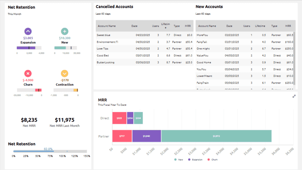
Retention and churn dashboards show which customers stay loyal and which ones leave over time, breaking churn down by cohort, timeline, and user group. They help teams spot early warning signs and understand why users drop off.
KPIs this dashboard tracks:
It focuses on key retention metrics like churn rate, user stickiness through DAU to MAU ratio, and cohort-based retention performance over time.
Why is this dashboard useful?
This dashboard helps you proactively stop churn before it escalates.
Specifically, it lets you:
Identify exactly when users start dropping off
Spot patterns or common triggers causing churn
Measure the impact of retention initiatives clearly
Who uses this dashboard?
Great for SaaS and product-led growth teams needing clear visibility on retention issues and user loyalty trends.
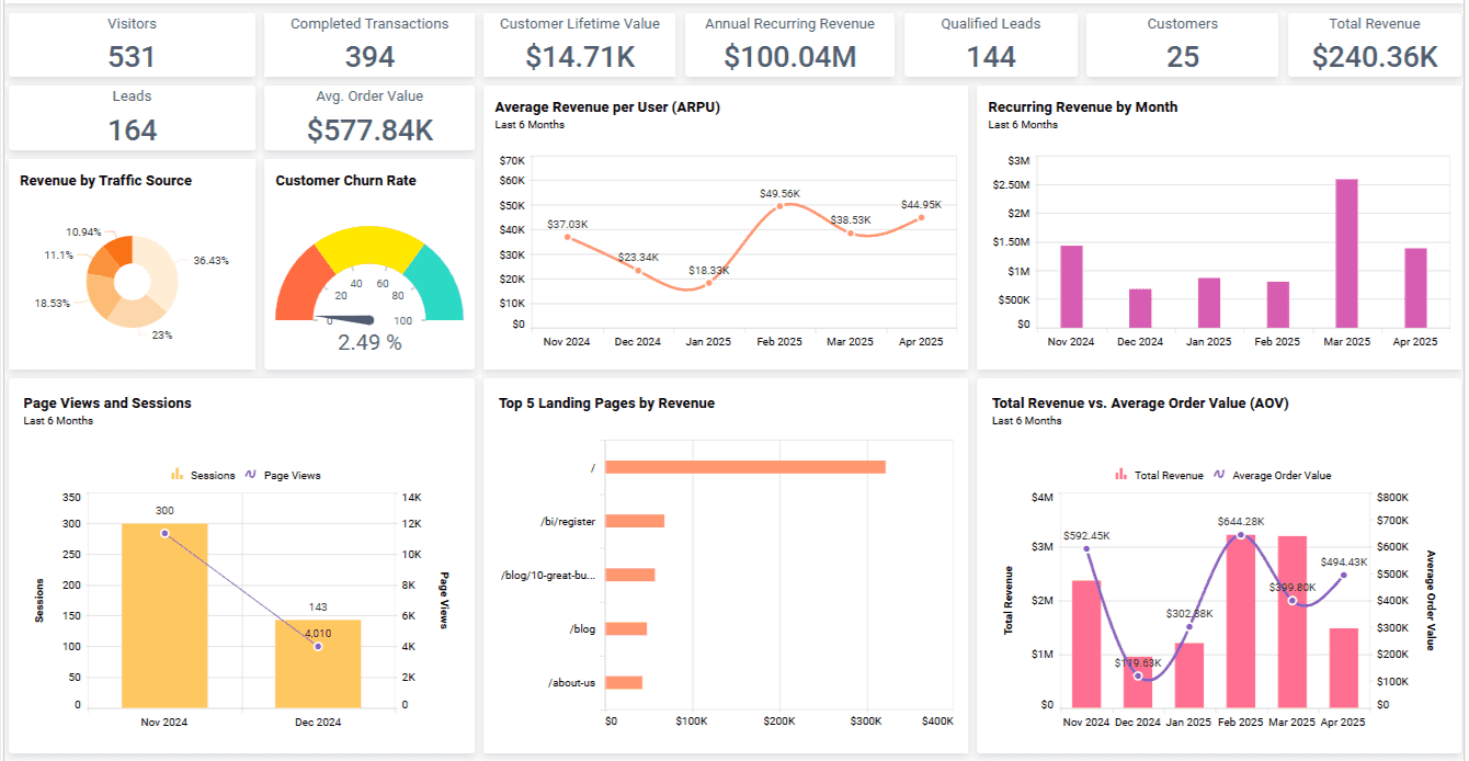
2. Sales Analysis Dashboard
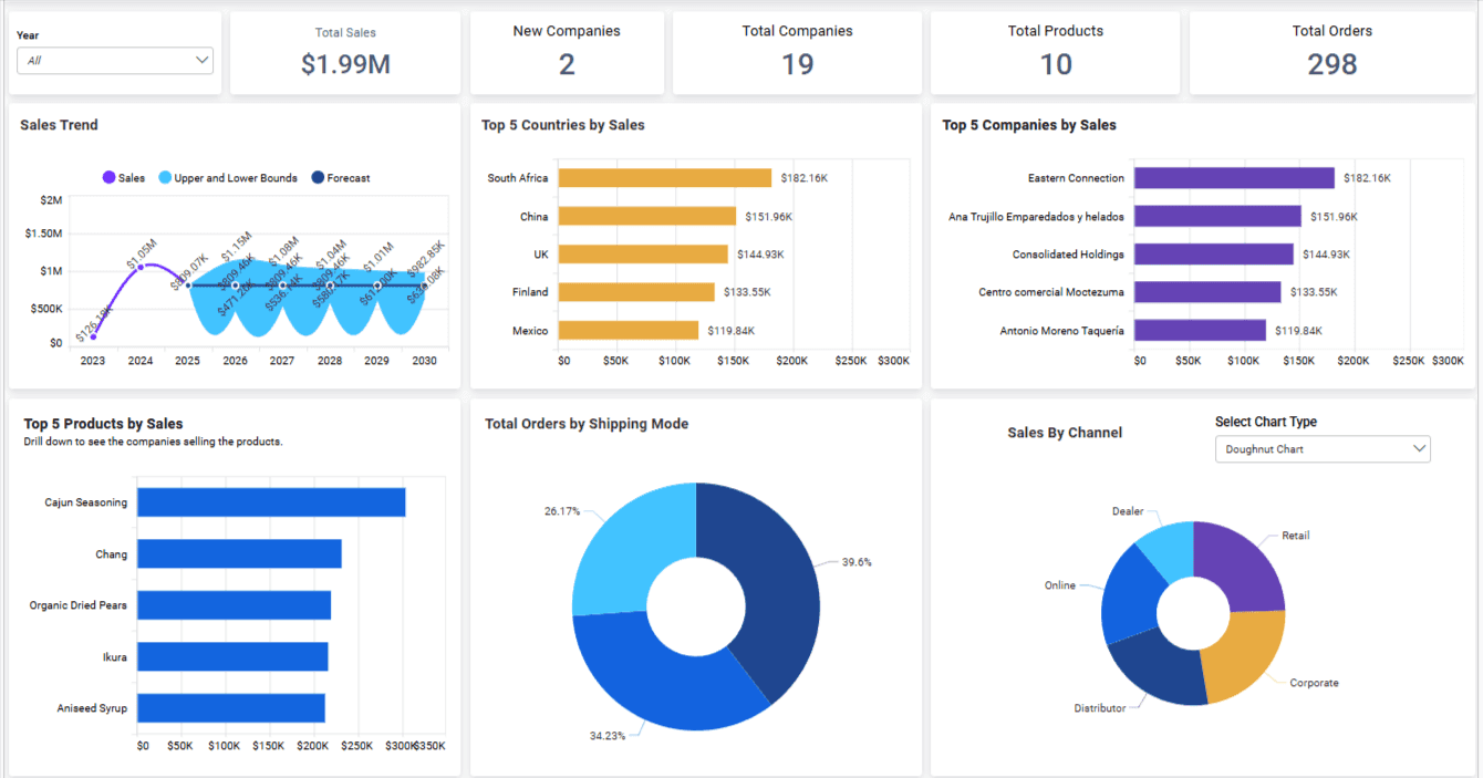
Sales analysis dashboards provide clear visibility into revenue performance and pipeline activity, highlighting which customers or segments drive growth. They make it easier to see where deals progress, stall, or fall through.
KPIs this dashboard tracks:
It tracks sales revenue by customer or segment, conversion rates across your pipeline stages, and the frequency of repeat purchases over time.
Why is this dashboard useful?
Quickly find opportunities to boost sales and understand customer value.
It allows you to:
Identify which customers or segments drive most revenue
Track sales trends clearly, month-over-month
Spot opportunities for upsells or cross-sells faster
Who uses this dashboard?
Perfect for sales managers, revenue leaders, and customer success teams who need accurate sales insights without combing through raw data.
3. Web Analytics Dashboard
Web analytics dashboards focus on how users interact with a website, from traffic sources to on-page behavior. They help teams understand which pages perform well, where visitors drop off, and how changes impact conversions.
KPIs this dashboard tracks:
It focuses on website performance metrics like bounce rate, session duration, traffic sources (organic, paid, referral), and top-performing landing pages.
Why is this dashboard useful?
Optimize your website performance and user experience without guesswork. This dashboard lets you:
Immediately spot pages causing drop-offs
See clearly where your best traffic comes from
Track real-time changes to website performance
Who uses this dashboard?
Ideal for growth marketers, digital analysts, and web teams who need fast insights on improving site conversions.
4. Customer Satisfaction Dashboard
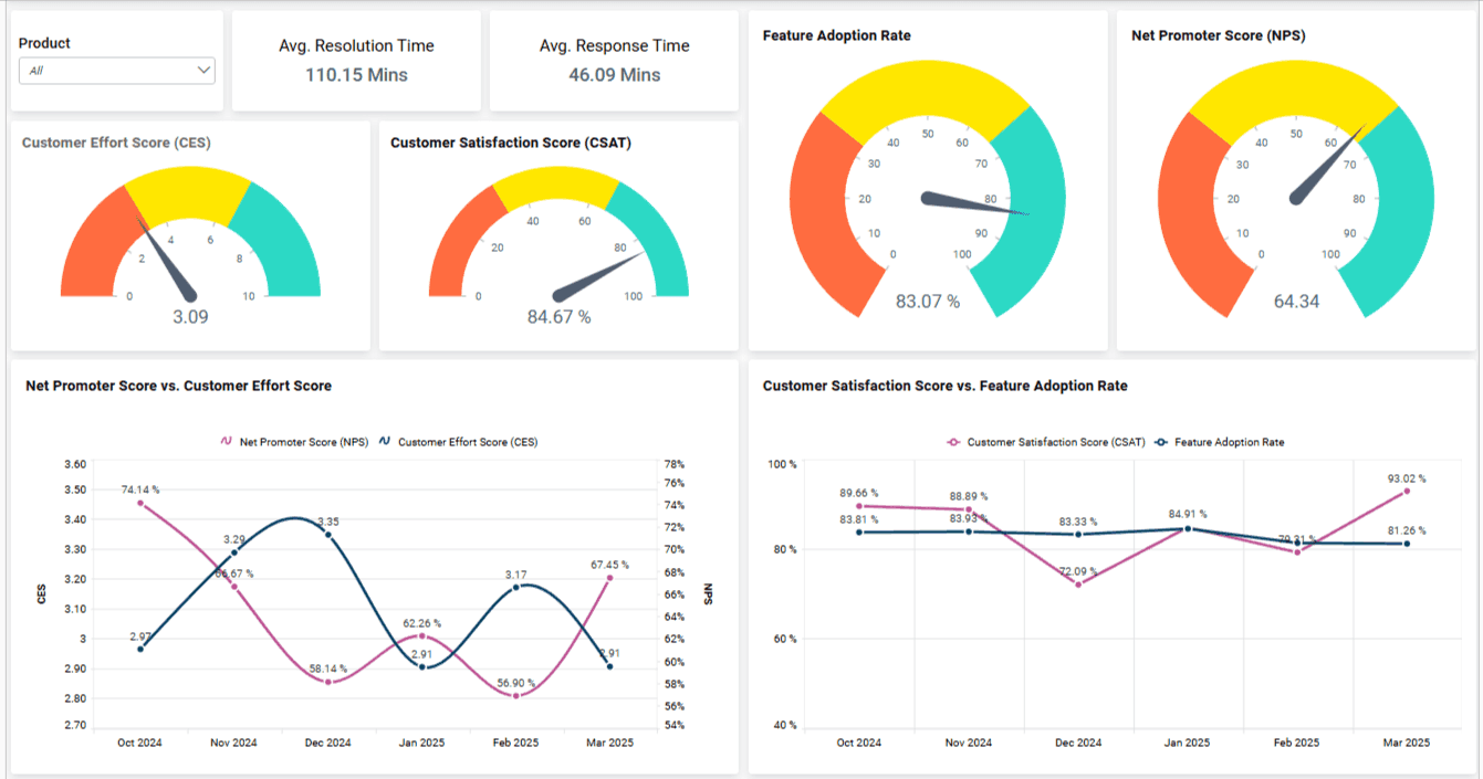
Customer satisfaction dashboards bring together feedback from surveys and support interactions to show how customers feel across different touchpoints. Trends in satisfaction, effort, and sentiment become easy to track in one place.
KPIs this dashboard tracks:
It gathers feedback scores such as Net Promoter Score (NPS), Customer Satisfaction (CSAT), and Customer Effort Score (CES) across all touchpoints.
Why is this dashboard useful?
Quickly find and fix customer experience issues. It helps you:
Understand satisfaction trends instantly
Identify recurring customer pain points
Measure the effectiveness of CX improvements over time
Who uses this dashboard?
Best suited for customer support and success teams, or any team that regularly deals with customer feedback and experience management.
Customer Engagement Analytics: 10 Metrics + Use Cases To Boost Engagement
5. Customer Loyalty Dashboard
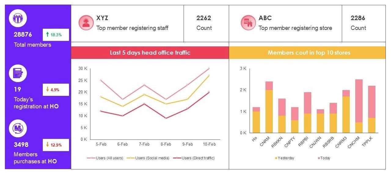
Customer loyalty dashboards highlight repeat behavior and long-term customer value, showing how often customers return and what drives ongoing engagement. They help teams identify loyal segments and refine retention strategies.
KPIs this dashboard tracks:
It measures loyalty-focused data like repeat purchase rate, customer lifetime value (CLV), and loyalty program engagement across different customer segments.
Why is this dashboard useful?
Improve your customer loyalty and retention rates effectively by allowing you to:
Clearly identify loyal segments and behaviors
Track the effectiveness of loyalty programs
Pinpoint referral opportunities to grow organically
Who uses this dashboard?
Perfect for e-commerce, direct-to-consumer (DTC) brands, or subscription-based businesses looking to boost customer loyalty and repeat purchases.
Now that you've seen each dashboard in detail, here's a quick comparison to help you decide which dashboard suits your team's specific needs best:
Dashboard | Best For | Top Feature |
Retention & Churn Dashboard | SaaS & PLG teams | Cohort-based retention tracking |
Sales Analysis Dashboard | Sales & Revenue teams | Sales pipeline and conversion views |
Web Analytics Dashboard | Growth & Web marketers | Real-time web performance |
Customer Satisfaction Dashboard | Customer Support & CX | Pre-built CSAT/NPS visuals |
Customer Loyalty Dashboard | E-commerce/DTC brands | Visual loyalty analysis |
These dashboards help you find actionable customer insights quickly.
Start with the one matching your most urgent challenge to get immediate clarity and results.
Customer Analytics In Retail: 5 Use Cases To Drive Sales
Key Metrics To Track in Customer Analytics Dashboards
Your customer analytics dashboard is effective only if it tracks the right numbers.
Here's a simple breakdown of key metrics grouped by clear business goals.
Check the table below to quickly understand which metrics matter most for your team, based on your main objectives.
KPI Category | Examples | Best For |
Retention | Churn Rate, Active Users, User Stickiness | SaaS and Subscription Companies |
Revenue | Customer Lifetime Value, Sales Win Rate | Sales and Revenue Teams |
Experience | NPS, Customer Satisfaction, Effort Score | Customer Support Teams |
Loyalty | Repeat Purchases, Referrals, Engagement | E-commerce and Retail |
Here’s what each category means and why these metrics are essential:
1. Retention Metrics
These metrics tell you if your customers stay with your business over time.
Churn Rate: Percentage of customers who leave.
Active Users (DAU/MAU): How regularly users interact with your product.
User Stickiness: How likely users are to return consistently.
Use these metrics to quickly find out if customers lose interest and leave your service.
2. Revenue Metrics
Revenue metrics help you connect customer activity directly to your business profits.
Customer Lifetime Value (CLV): How much revenue each customer generates over time.
Sales Win Rate: The percentage of sales opportunities you successfully close.
Sales Velocity: How quickly your team closes sales.
These metrics help you clearly see who your most valuable customers are.
3. Experience Metrics
These metrics show you how satisfied customers are with your products or services.
Net Promoter Score (NPS): Likelihood that customers recommend your business.
Customer Satisfaction (CSAT): How happy customers are after interacting with your team.
Customer Effort Score (CES): How easy customers find it to use your products or services.
Use these to find out how customers feel and where improvements are needed.
4. Loyalty Metrics
Loyalty metrics measure if customers keep coming back and if they recommend you to others.
Repeat Purchase Rate: How often customers buy again.
Referral Rate: How many customers recommend your business to others.
Loyalty Program Engagement: How actively customers use loyalty programs.
Focus on these to turn satisfied customers into long-term supporters of your brand.
Customer Experience Analytics - 10 KPIs and Metrics You Need To Know
How To Choose the Right Customer Analytics Dashboard Template
Choosing the right customer analytics dashboard template doesn't have to be complicated.
It mainly depends on your team's needs, resources, and goals.
Here are three simple guidelines to help you select the best option:
1. Role-Based Dashboard Views
Different teams require different insights. Pick a template that aligns clearly with the goals of your team:
Customer Support: Satisfaction scores, ticket volume, resolution times.
Sales & Revenue: Revenue tracking, sales pipeline, repeat purchases.
Marketing & Growth: Conversion rates, traffic sources, website performance.
2. Real-Time vs Static Reporting
Decide if your data needs to be updated instantly or at regular intervals:
Real-Time Dashboards: For quickly changing metrics like website visitors, support tickets, and churn alerts.
Static Reports: For steady metrics such as monthly satisfaction ratings or quarterly sales trends.
3. Plug-and-Play vs Custom API-Based Dashboards
Consider your resources and time availability when picking a dashboard:
Plug-and-Play Templates: Quick setup, user-friendly, good for teams without technical support.
Custom API Dashboards: Flexible, customizable, ideal for teams with dedicated developers or analysts.
Clearly understanding these three points will help you pick a customer analytics dashboard that provides meaningful insights without unnecessary complexity.
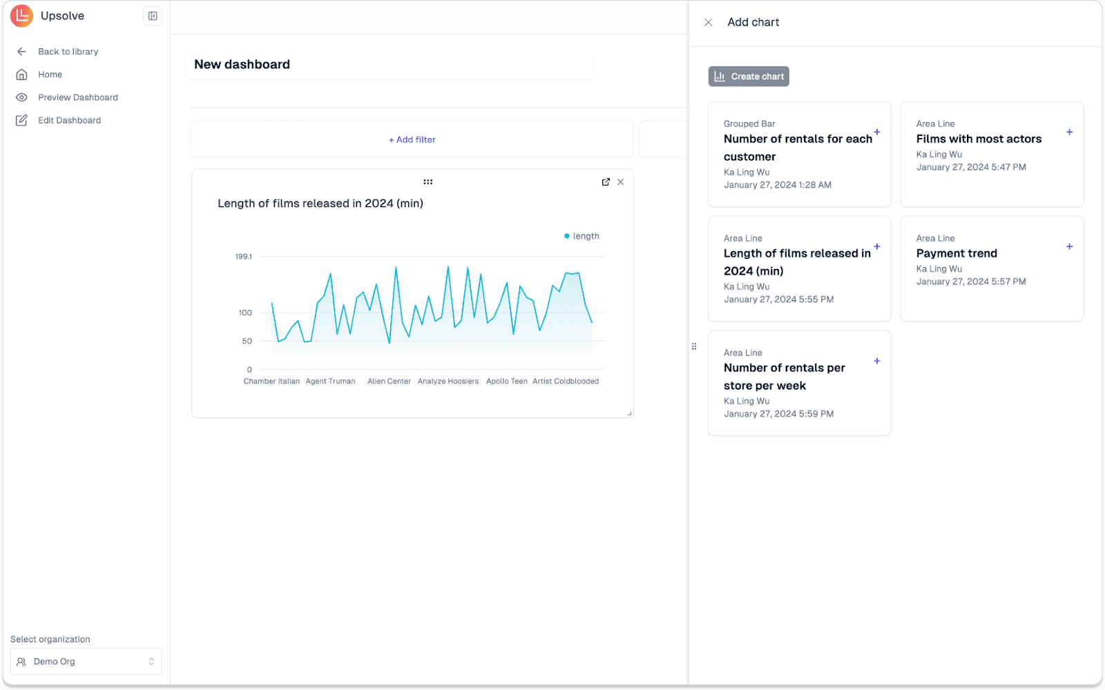
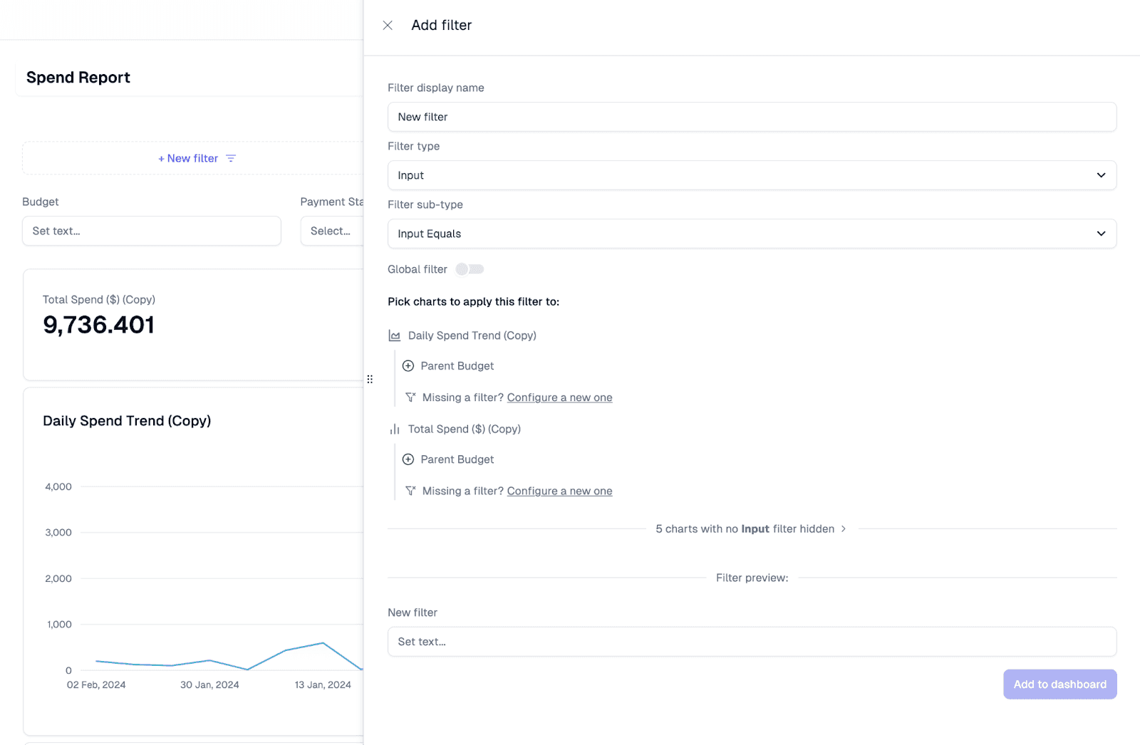
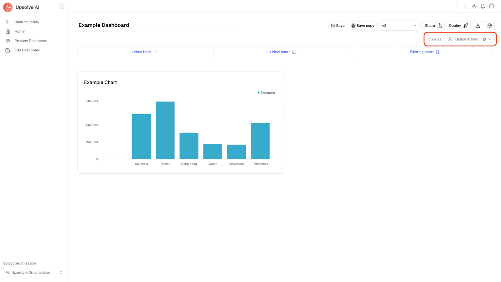
Upsolve AI: Build Your Customer Analytics Dashboard With AI
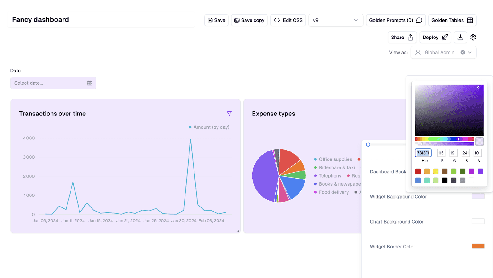
Upsolve AI is a no-code analytics platform that helps you quickly create customer analytics dashboards, even if you have zero technical or coding experience.
It lets your team easily gather scattered customer data into clear, interactive dashboards, giving instant clarity and actionable insights tailored to specific roles.
Features of Upsolve AI:
Easy no-code, drag-and-drop dashboard builder
AI-generated insights and natural-language search
Real-time integrations with CRM, marketing, and support tools
Custom dashboard views for different team roles
Fully embeddable dashboards using iFrame or React components
Pros of Upsolve AI:

Easy dashboard creation without needing developers
Real-time integrations with popular business tools
Highly customizable views based on user roles
AI-powered insights and automated alerts
Cons of Upsolve AI:
May be pricey for early-stage startups with tight budgets
Limited customization options compared to fully custom-coded solutions
Requires initial data integration effort for complex use cases
Upsolve AI Pricing:
Upsolve AI offers a free plan plus three paid tiers, billed around monthly credit usage:
Free ($0): 2,000 one-time credits (~200 questions); all Pro features, to test-drive
Pro ($500/mo): 2,000 credits/month; 50+ data connections, unlimited agents, full observability
Team ($2,000/mo): 10,000 credits/month; adds embedding, RBAC/row-level security, multi-tenant, and semantic-layer generation
Enterprise (custom): on-prem/VPC, SAML SSO, HIPAA, SOC 2, and BYOM
Annual billing is 20% off.
Case Study: How Fiber AI Boosted Campaign Effectiveness With Upsolve
Fiber AI helps businesses improve revenue using AI-driven marketing automations.
They faced challenges in quickly delivering customized campaign analytics to customers without overwhelming their engineering team.
With Upsolve AI, Fiber built customer-specific dashboards effortlessly, displaying key marketing metrics right within their app.
This reduced their analytics deployment timeline by two months, empowered customers to act faster on insights, and freed their developers to focus on Fiber’s core product.
Read the full case study here!
If you're ready to build your own customer analytics dashboards effortlessly in minutes:
Final Thoughts: Stop Guessing, Start Tracking
When customer data lives across multiple tools, it becomes harder to see what is really happening and even harder to act with confidence. A well designed customer analytics dashboard brings that data together and helps teams focus on what matters most instead of chasing disconnected metrics.
You do not need dozens of dashboards to get value. Starting with a single dashboard tied to your most pressing challenge, whether that is retention, revenue, satisfaction, or loyalty, is often enough to create immediate clarity.
A simple approach works best:
Identify the customer question you need answered first
Choose a dashboard built specifically for that goal
Use tools that make implementation manageable for your team
Good dashboards turn customer data into clarity, not just charts. They help teams understand customer behavior, spot trends early, and make decisions based on evidence rather than assumptions.
Once you have that foundation in place, improving and expanding your analytics becomes far easier.
Related Resources:

Try Upsolve for Embedded Dashboards & AI Insights
Embed dashboards and AI insights directly into your product, with no heavy engineering required.
Fast setup
Built for SaaS products
30‑day free trial