
AI now drafts the chart for you. Learn how AI data visualization builds, formats, and turns plain-language questions into finished visuals.

Ka Ling Wu
Co-Founder & CEO, Upsolve AI
10 min
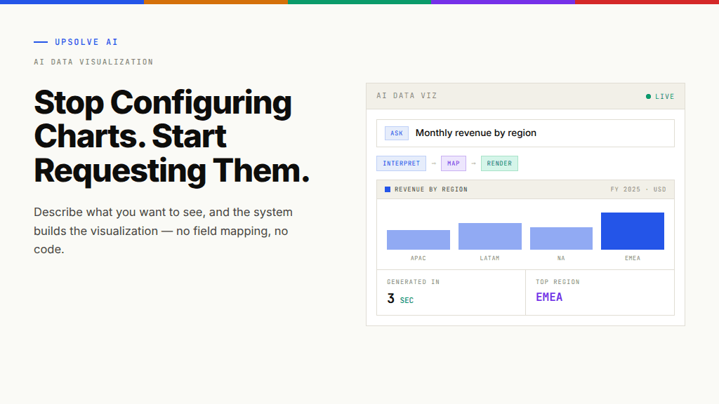
AI data visualization is the use of artificial intelligence, and large language models in particular, to turn raw data into charts, graphs, and visual summaries with little or no manual configuration. Instead of picking a chart type, mapping fields, and styling axes by hand, you describe what you want to see in plain language and the system builds the visualization for you.
That single shift, from configuring charts to requesting them, is quietly rewriting who gets to work with data and how fast. This guide covers what AI data visualization actually does, the core techniques changing how charts get made, where generative approaches shine, and the one thing that determines whether the charts you get back are trustworthy or just convincing.
Key Takeaways |
|---|
|
What Is AI Data Visualization?
AI data visualization is a category of tools and techniques where a model interprets your data and your intent, then produces a visual representation automatically. The traditional path required two skills that rarely live in the same person: analytical judgment (knowing what to look for) and technical execution (knowing how to build a clear, accurate chart). AI closes the gap between them.
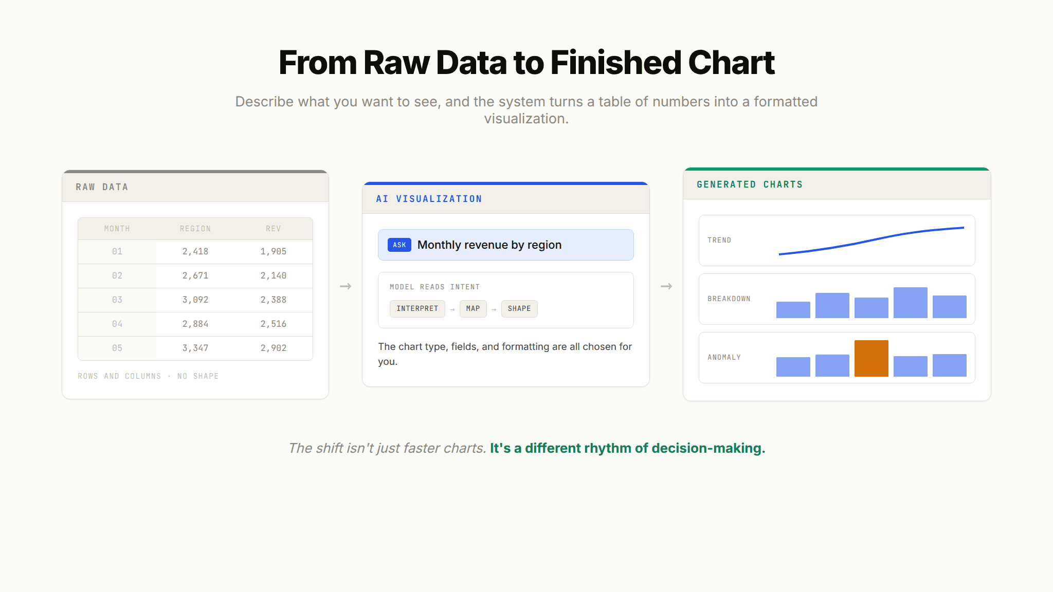
In practice, that means you can type "show me monthly revenue by region for the last two years" and get a formatted line chart back in seconds, with no drag-and-drop builder, no field mapping, and no code. The AI decides the chart type, applies sensible styling, and in many cases flags what is interesting about the result.
It helps to separate AI data visualization from a couple of neighboring ideas. It is narrower than AI for data analysis as a whole, which spans everything from data cleaning to forecasting to conversational querying. And it is focused on the charts themselves rather than the containers they live in. Assembling many charts, filters, and controls into one screen is a related but distinct job, which is why moving from individual charts to full dashboards is worth treating as its own topic.
Why AI Is Reshaping Data Visualization
For most of the past decade, the promise of self-service analytics ran into a stubborn wall: the tools were powerful but slow to operate. Someone still had to know which chart answered the question, connect the right fields, and clean up the formatting before anyone could act. That friction is exactly why so many teams defaulted to a small set of dashboards and a long queue of "can you just pull this for me" requests.
AI removes the friction at the point where people give up. When the cost of producing a chart drops to a single sentence, more people ask more questions, and they ask follow-ups they would never have bothered to file as a ticket. The result is not just faster charts; it is a different rhythm of decision-making.
The money is following the shift. The broader data visualization market is expected to grow from USD 10.92 billion in 2025 to USD 18.36 billion by 2030, and analysts point to the migration from static reports toward real-time, AI-assisted visuals as one of the main forces behind that growth. In fact, several 2025 market reviews now treat automated insight generation and anomaly detection as baseline features rather than premium add-ons, a sign of how quickly expectations have moved.
Here is the thing worth remembering, though. Faster does not automatically mean better. A tool that generates a beautiful chart of a subtly wrong number has not helped you; it has made a mistake harder to catch. That tension runs through everything below.
How AI Changes the Way Charts Get Made
Most AI visualization tools, despite different interfaces and pricing, operate on the same underlying mechanics. Four techniques do the real work. Understanding them tells you far more about what a tool can and cannot do than any feature list.
Automatic Chart Selection
The first thing AI takes off your plate is choosing the chart. Trained on visualization best practices, the model reads the shape of your data (a time series, a set of categories, a distribution, a relationship between two variables) and recommends or directly applies the format that communicates it most clearly. A trend over time becomes a line chart. A comparison across categories becomes a bar chart. A part-to-whole breakdown becomes a stacked or proportional view.
This matters more than it sounds. Poor chart choice is one of the most common ways people accidentally mislead an audience, and automatic selection quietly corrects for a lack of design training across a whole organization.
Smart Formatting and Styling
Once the chart type is set, the AI handles the details that usually eat time: axis labels, legends, color palettes, number formatting, and layout. The goal is a visual that is readable and consistent without anyone opening a formatting menu. Good implementations also keep styling consistent across every chart a user generates, so a set of visuals looks like it belongs together rather than like it came from five different people.
Pro tip: Consistent formatting is not cosmetic. When colors and scales stay stable across charts, readers compare them correctly. When they drift, people misread differences that are really just styling artifacts.
Natural-Language-to-Chart Generation
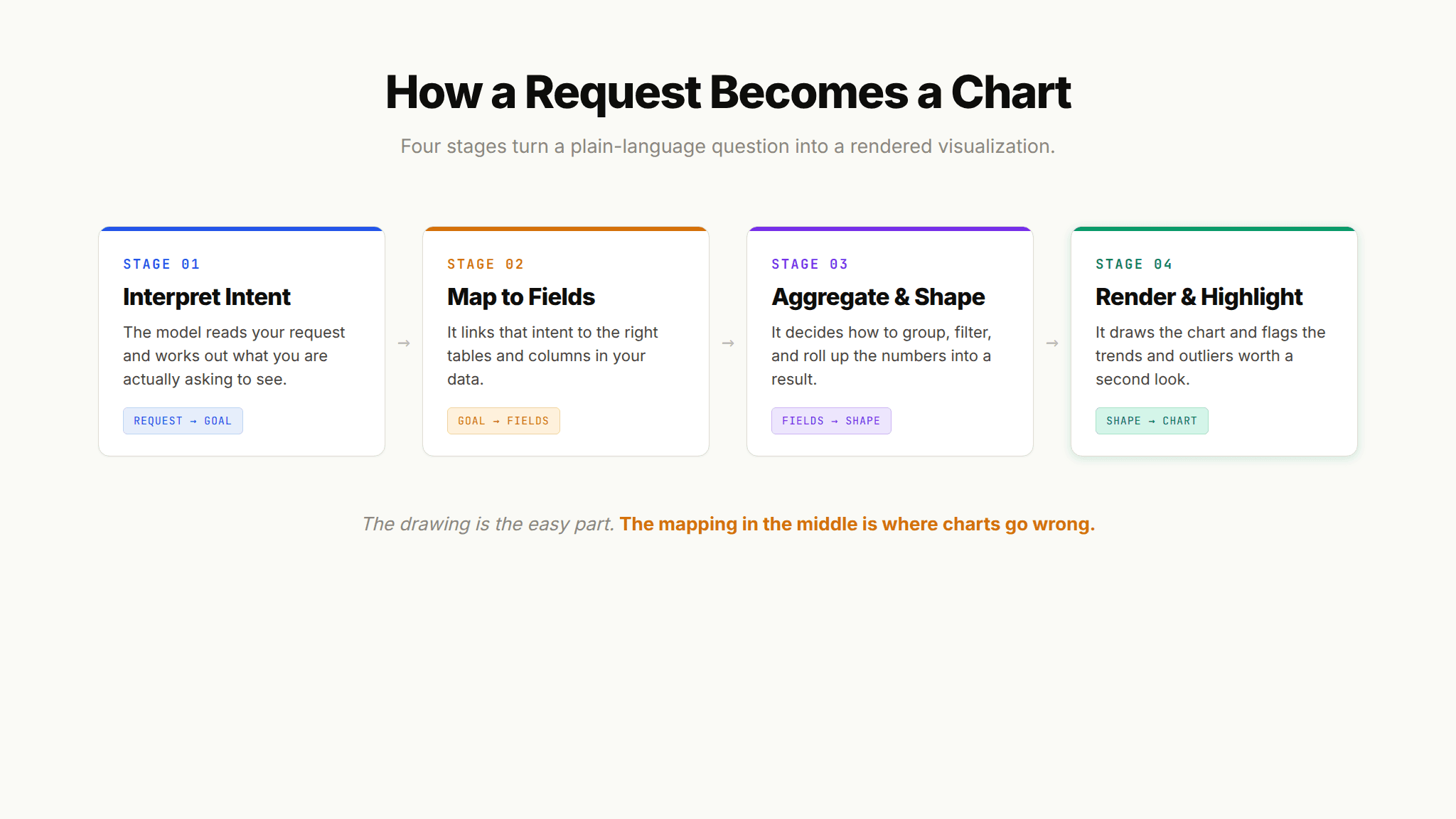
This is the technique most people mean when they say "AI data visualization." You describe what you want in plain language, and the system converts that request into a rendered chart. Under the hood, the process moves through a few distinct stages: the model interprets your intent, maps it to the relevant fields in your data, decides how to aggregate and shape the result, and then produces the visual.
The research community has been chipping away at this problem for years under the label natural language to visualization, and modern language models pushed it from a lab curiosity into something that works in everyday tools. The experience feels conversational: you ask, you see, you refine. "Now split that by product line." "Show it as a percentage instead." Each follow-up reshapes the chart without starting over.
Anomaly Highlighting and Insight Callouts
The most useful step is the one that goes beyond drawing. Rather than leaving you to spot what matters, many tools now highlight trends, outliers, and anomalies and explain them in plain language. A spike gets circled. A month that breaks the pattern gets flagged. A short written summary tells you what changed and by how much.
This is where visualization starts blurring into analysis. The chart is no longer a passive display; it is pointing at the thing you should look at next.
Generative AI for Data Visualization
It is worth separating two things that often get bundled together. Traditional AI visualization recommends or automates chart creation from your existing data. Generative AI for data visualization goes a step further: a large language model actively produces the visualization, and sometimes the accompanying narrative, as an original artifact from your prompt.
The practical difference shows up in flexibility. A recommendation engine is choosing from a menu of chart types it knows. A generative system can compose something closer to what you actually described, adjust it through conversation, and generate the supporting explanation alongside it. That is why generative approaches feel less like operating software and more like briefing a very fast analyst.
There is a catch that deserves honesty. Generative systems can also generate plausible-looking mistakes. A model can render a confident chart from a misread of your request, or summarize a pattern that is not statistically real. Independent testing of analytics agents has repeatedly found that the visual polish of an output tells you nothing about whether the number behind it is right. So the generative leap raises both the ceiling on what is possible and the importance of verification.
"Data and analytics agents are essentially useless without the right context." That framing, from a16z's analysis of why data agents fail, applies squarely to generative visualization. A great chart of the wrong metric is still the wrong answer.
From Requests to Renders: The Agentic Dashboard
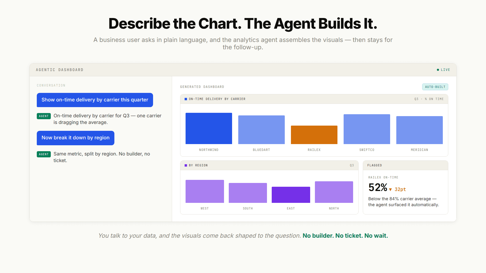
The clearest sign of where this is heading is a change in who does the building. In the older model, a business user filed a request and an analyst built the chart. In the emerging model, the business user describes the chart and an agent builds it, then stands by for the follow-up.
This is the idea behind Upsolve AI's Agentic Dashboard. Rather than handing business users a blank canvas of chart tools, it lets them describe the visualizations they want in natural language, and the agent assembles them. Someone in operations can ask for a view of on-time delivery by carrier over the last quarter and get it, then immediately ask to break it down by region, without ever touching a builder or waiting on the data team. The end-user experience is genuinely conversational: you talk to your data, and the visuals come back shaped to the question.
What makes that reliable rather than risky is the layer underneath, which is where the Agent Studio side comes in. The agent is not guessing at what your fields mean; it is drawing on encoded institutional knowledge about how your business defines its metrics. That distinction, between a chart that looks right and a chart that is right, is the whole game, and it is the subject of the next section.
Why AI Visualization Falls Apart Without Context
Here is the failure mode nobody puts in the marketing copy. You ask an AI tool to "show me revenue this quarter." It produces a flawless chart. The number is wrong. Not because the model malfunctioned, but because it did not know that your company reports revenue on a recognized-revenue basis, excludes a certain product line, and defines "this quarter" on a fiscal calendar that starts in February.
The AI had no way to know any of that. It filled the gaps with reasonable-sounding assumptions, and reasonable-sounding assumptions are exactly what make a wrong chart dangerous. The visual is confident. The logic behind it is invented.
This is why the most important work in AI visualization is not the rendering, it is the context. An agent needs three kinds of it to produce trustworthy charts:
Structure: what data exists, how tables relate, which columns are authoritative, and where the lineage runs.
Meaning: what a metric means at your specific company, which KPI definition is current, and what the business rules say.
Trust: which answers and queries have already been validated, so the agent reuses a verified pattern instead of improvising a new one.
Most tools solve one layer and leave the others to chance. That is the root of the "great demo, broken in production" story so many teams have lived through. A big part of the Meaning layer is often handled by a semantic model, which is why understanding why semantic layers matter for AI visualization is worth the detour if you are evaluating anything serious. The semantic layer encodes the definitions, but on its own it does not cover Structure or Trust, and agents need all three.
The lesson from teams who have built real systems reinforces this. When OpenAI documented its in-house data agent, the recurring theme was that high-quality answers depend on rich, accurate context, not on a smarter model. The model was already good enough. The work was in feeding it the right institutional knowledge.
How the Main Approaches Compare
AI visualization is not one thing; it is a spectrum of capability. This is not a ranking of products, but a way to reason about what a given approach can actually do. The higher up you go, the more the tool depends on encoded context to stay accurate.
Approach | What It Does | Effort From You | Best For |
|---|---|---|---|
Chart recommendation | Suggests or auto-applies the best chart type for your data | You still connect and shape the data | Speeding up manual chart building |
Natural-language-to-chart | Turns a plain-language request into a rendered chart | You describe the chart in a sentence | Ad-hoc questions and quick exploration |
Generative visualization | Produces charts plus written explanations from prompts | You prompt and verify | Narrative reporting and first-pass analysis |
Agentic (context-aware) visualization | Builds and refines charts using encoded business context | You ask; the agent handles definitions | Production use where accuracy is non-negotiable |
The pattern across the table is simple. Convenience rises as you move down, but so does the amount of business context the tool needs to be right. A chart recommender can be useful with almost no setup because you are still in control of the meaning. An agent that builds charts from a sentence is only as trustworthy as the context it has been given, which is why the setup work moves from "configuring charts" to "encoding knowledge."
Where Instant Charts Quietly Go Wrong
Let's be honest: the speed of AI visualization makes it easy to skip steps that used to be forced on you. The failures below rarely announce themselves, because the output still looks finished.
Reading Polish as a Sign of Accuracy
A clean chart feels authoritative. That feeling is exactly the trap. Get in the habit of asking not just "does this look right" but "what did the tool assume to produce this," especially for any metric with a company-specific definition. The better a tool is at formatting, the easier it becomes to wave through a number nobody actually checked.
Letting a Single Metric Mean Ten Things
When ten people can each generate a chart of "active users," you can end up with ten different numbers because the tool interpreted "active" differently each time. The fix is not slower charts; it is a shared, encoded definition the tool draws from every time, so everyone's chart of active users means the same thing. Without that, every self-serve chart quietly widens the gap between what people think they are comparing and what they actually are.
Treating a Highlighted Outlier as a Conclusion
Anomaly highlighting is powerful, but a flagged outlier is a starting point, not a finding. The tool can tell you a number moved; it usually cannot tell you why. Treat AI callouts as prompts for investigation rather than answers, and be especially wary when the accompanying written explanation sounds more certain than the underlying data supports.
Regenerating Answers You Have Already Verified
The questions people ask most often are the ones most worth validating once and reusing. If your tool can save a verified query or chart as a trusted pattern, use it. Reusing a validated answer beats regenerating a fresh one that might quietly differ from the last version, especially for the recurring reports that stakeholders make decisions on.
The Chart Was Never the Hard Part
AI data visualization has crossed from novelty into infrastructure. The techniques are settled: automatic chart selection, smart formatting, natural-language-to-chart generation, and anomaly highlighting show up in nearly every serious tool. What separates a helpful system from a risky one is no longer whether it can draw a chart from a sentence. It is whether the chart is right, and that comes down to the context the tool can draw on.
If you are moving from "AI can make charts" toward "which system can I actually depend on," the next question is architectural, not visual. Understanding how platforms turn natural-language requests into trustworthy visualizations is the natural place to go deeper, because that is where the context question gets answered.
Frequently Asked Questions
What is AI data visualization?
AI data visualization is the use of artificial intelligence to turn raw data into charts and graphs automatically, usually from a plain-language request. Instead of manually choosing a chart type and mapping fields, you describe what you want and the system generates it, often with formatting and insight callouts included.
What are AI visualization tools used for?
They are used to speed up and broaden data exploration. Common uses include generating charts from natural language, automatically selecting the clearest chart type, applying consistent formatting, and highlighting anomalies or trends. The larger goal is letting non-technical users get visual answers without waiting on a data team.
Can AI generate charts from natural language?
Yes. Natural-language-to-chart generation is now a standard capability. You type a request like "compare sales by channel this year," and the tool interprets your intent, maps it to your data, and renders the chart. Most tools also support conversational follow-ups so you can refine the visual without rebuilding it.
Are AI generated charts accurate?
The chart drawing is usually reliable; the risk is in the data logic behind it. An AI can produce a clean chart of the wrong number if it does not know how your company defines a metric or filters its data. Accuracy depends far more on the business context an agent has than on the sophistication of the model.
How is AI data visualization different from an AI dashboard?
AI data visualization is about producing individual charts and graphs. An AI dashboard is about assembling many of those visuals, plus filters and controls, into a single interactive screen. The two are related, but building a full dashboard is a broader job than generating a single chart.
Do I need a semantic layer to use AI for data visualization?
Not to try it, but you need encoded business meaning to trust it at scale. A semantic layer supplies much of that meaning by standardizing metric definitions, though on its own it does not cover data structure or answer validation. Reliable AI visualization draws on all three.

Try Upsolve for Embedded Dashboards & AI Insights
Embed dashboards and AI insights directly into your product, with no heavy engineering required.
Fast setup
Built for SaaS products
30‑day free trial