
LLM UI replaces static dashboards with intelligent, adaptive interfaces. Learn how LLM-controlled UI enables personalized analytics through intent and context.

Serguei Balanovich
Co-Founder & CTO
10 min

This article documents the process and iterations behind how Upsolve AI (YC W24) arrived at our LLM-controlled UI solution, presented in our latest Y Combinator demo.
The Evolution Gap
Software has undergone remarkable transformation over the past two decades—from clunky desktop applications to fluid cloud services, from rigid interfaces to adaptive experiences. Yet dashboards remain stubbornly static. They look virtually identical to their counterparts from 15 years ago: rows of charts, dropdown filters, static legends. The same rigid architecture persists while everything around it evolves.
The contrast is stark between modern interfaces and traditional dashboards. On one side: flexible, intuitive systems that adapt to users or are designed to be familiar (such as conversational interfaces). On the other: dashboards quite literally stuck in space and time, requiring users to adapt to them. It's about time to reimagine how customer-facing analytics can work for the end user—not the other way around.
This is exactly what our team at Upsolve AI (YC W24) have been working on. Here we document and showcase the various iterations we went through to get to the LLM-generated UI that creates a role-based, hyper-personalized view for each end user.
If you want to skip the behind-the-scenes journey and go straight to the end result, watch our Y Combinator demo that was featured twice by Y Combinator.
The Challenge
The core problem becomes apparent when you examine complex enterprise dashboards. When a dashboard contains multiple charts pulling from different database tables—each with their own structure—traditional filtering becomes exponentially more complex.
Our journey through four generations of filtering solutions revealed a clear trajectory:
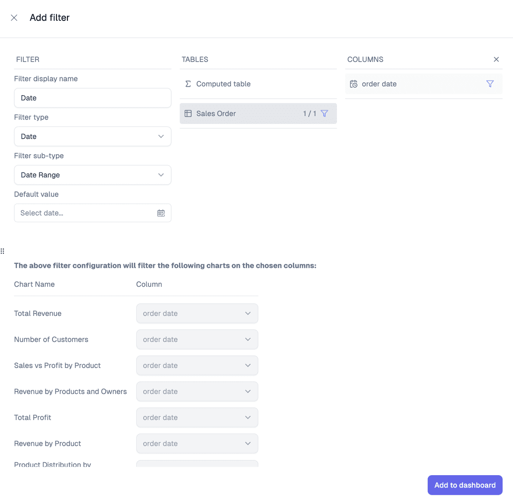
Version 1: Manual Configuration
Our initial approach required explicitly mapping filters to specific columns in each chart. The result was predictably problematic:
Configuration became tedious and error-prone
Schema changes broke filters
Traceability was non-existent

Version 2: Structured Relationships
We created chart-level filters linked to dashboard filters, which improved traceability but:
Multiplied the configuration burden. The million clicks became 3 million clicks; users had to configure many new filters everywhere
Failed to accommodate new charts seamlessly

Version 3: Semi-Automation
Automating the creation of chart-level filters brought us closer to an ideal state:
Configuration became manageable
Listeners maintained integrity as data evolved. Everything was kept up to date as the data & dashboard changed through listeners
Version 4: The Intelligence Breakthrough
LLM-controlled filtering changed everything:
A single natural language prompt could manage the entire filtering system
The LLM correctly interpreted context and applied filters appropriately
Users could express intent without understanding underlying complexities, true self-service analytics.

LLM-Controlled UI as The Path Forward
At Upsolve AI (YC W24), we’re now considering what might seem radical to many: moving entirely to LLM-controlled interfaces and eliminating traditional UI controls altogether. Is this crazy? Perhaps. Has anyone else attempted to completely replace their UI with an LLM-powered interface that converts natural language prompts directly into the visualization the user needs? Few have ventured this far.
Filters have been such a fundamental, long-standing concept in analytics and dashboarding that fully retiring them feels almost heretical. But what seems unthinkable today becomes obvious tomorrow.
While we currently maintain a hybrid approach, our testing shows the future clearly belongs to intelligent interfaces.
The question isn’t whether LLM-controlled interfaces will replace traditional dashboard design, but what value lies within this kind of shape-shifting UX. Organizations that embrace this shift early will gain significant competitive advantages in how widely, quickly, and effectively they can extract value from data.
From Smarter Filters to an Agentic Dashboard
The filtering journey was never really about filters. It was about a shift in who does the work. In every version before the last one, a human had to anticipate what an end user might want and pre-build the controls for it. The LLM-controlled version flipped that: the user states intent, and the interface assembles itself around the answer.
Once you see that, the next step is obvious. If an intelligent interface can generate the right filtered view from a prompt, it can generate the right chart, the right breakdown, and the right follow-up too. That is what our Agentic Dashboard does today, and it is one half of the broader move toward agentic analytics. Instead of navigating someone else's layout, a business user describes the chart or answer they want in plain language, and the agent builds it on the spot. The dashboard stops being a fixed artifact and becomes a surface that reshapes itself per person, per question, per role.
This is the End User Studio side of what we build. Behind it sits Agent Studio, where a data team encodes the rules that keep those generated views correct. The two run as a loop: users ask, the agent answers, and the answers that get validated feed back into the context that makes the next answer better.
The Interface Follows the User: Slack, Teams, and Beyond
A traditional dashboard has one address. You go to it. An intelligent interface works the other way around: it meets people where they already spend their day.
Because the interface is generated from intent rather than hand-built screen by screen, the same data agent can surface in a lot of places at once. A revenue lead can ask a question in Slack and get a chart back in the thread. A support manager can pull the same answer inside Microsoft Teams. A developer can reach it through an MCP-compatible tool without leaving their editor. And your own customers can get it embedded directly in your product through a React or iFrame component, styled to look like part of your app rather than a bolted-on report.
The point is not that there are many integrations. It is that the interface is no longer tied to a screen someone designed in advance. When the UI is produced on demand, distribution stops being a rebuild and starts being a deployment target.
Why an Intelligent Interface Is Only as Good as Its Context
Here is the part that is easy to underestimate. An LLM that generates UI from a prompt is only trustworthy if it knows what the prompt actually means inside your business. Ask for "active accounts this quarter" and the interface has to know which table holds accounts, how your company defines "active," which quarter you run on, and whether the answer it is about to render has ever been validated.
That knowledge is context engineering, and it is the real reason a shape-shifting interface can be reliable instead of merely impressive. We encode it in three layers: Structure (your schemas and how tables relate), Meaning (how your metrics and business rules are actually defined), and Trust (which answers have been verified). Strip that context away and an LLM-controlled UI degrades into a confident guess generator. Keep it, and the same flexibility that makes the interface feel remarkable is what makes it production-ready.
It is worth being honest about the tradeoff. Retiring filters and fixed layouts moves the hard work from the front end to the context underneath. That is the point: the effort goes once into encoding institutional knowledge, instead of endlessly into configuring controls that break every time the schema changes.
Guardrails Make the Freedom Usable
Handing an interface this much freedom raises a fair objection. If the agent can generate anything, what stops it from generating something wrong, or showing a user data they should not see? This is where the builder side earns its keep. In Agent Studio we set scope rules and behavioral guardrails, so the agent answers within the boundaries a data team defines, and every generated view respects the same row-level permissions as the rest of your product. Freedom for the end user and control for the data team are not in tension. The second is what makes the first safe to ship.
What This Means for Your Product
The dashboards of the last fifteen years asked users to adapt to software. Intelligent interfaces adapt to the user instead. For teams shipping analytics inside their own products, that is the difference between a static reporting tab customers tolerate and an experience they come back to.
We are not claiming filters vanish overnight; we still run a hybrid today. But the direction is set. The interface that wins is the one that assembles itself around a person's intent, backed by enough context to be trusted, and delivered wherever that person already works.
If you’re ready to Upsolve your product and see the power of customizability and hyper-personalization for yourself, let’s chat!

Try Upsolve for Embedded Dashboards & AI Insights
Embed dashboards and AI insights directly into your product, with no heavy engineering required.
Fast setup
Built for SaaS products
30‑day free trial