Explore 10 business intelligence dashboards designed to turn data into clarity, helping teams make better decisions, monitor performance, and act faster.

Ka Ling Wu
Co-Founder & CEO, Upsolve AI
10 min

Disclosure: This article is published by Upsolve AI. Where our product is mentioned alongside competitors, we aim to provide balanced coverage based on publicly available information. We encourage readers to evaluate all options independently.
You’re flying blind without the right data. That’s why business intelligence dashboards exist, so you can stop guessing and start making decisions that actually move the needle.
This post is about showing you 10 dashboards that can help you make more money, save time, or spot problems before they blow up.
No tech jargon. Just real tools that work.
Here’s what you’ll get:
A list of 10 business intelligence dashboards that actually help you see what’s going on
The standout features that matter (and what’s just noise)
How to pick the one that fits your business without wasting weeks testing
If you care about growth, you need visibility.
These dashboards give you that. Let’s break it down.
What Is a Business Intelligence Dashboard?
A business intelligence dashboard is like a control panel that shows you exactly what’s happening in your business, all in one place.
For example, it could be like driving a car. The dashboard tells you about your speed, fuel level, and more.
It takes all the important info, like sales numbers and customer feedback, and shows it in easy pictures and graphs.
With a business intelligence dashboard, you get:
Real-Time Tracking – You can see what’s happening right now. For example, if sales drop by 10%, you’ll spot it fast and can act right away.
Simple Visuals – It converts big numbers into easy graphs and charts, so you don’t need to be a data expert to see sales going up or down in a quick graph instead of reading through lines of numbers!
Quick Decision-Making – It gives you the necessary answers without searching through reports. If customer happiness is 85%, you’ll know if things are good or need a boost.
Therefore, the business intelligence dashboard is not only your tool but also a business assistant filled with crucial data.
Why Do You Need the Best Business Intelligence Dashboard?
Alright, so now you know what a business intelligence dashboard is and how it brings all your key data together.
But why should you choose the best business intelligence dashboard for your business?
Because picking the right one can change how you see, understand, and act on your data.
Here’s why having the best dashboard matters:
Easier Data Insights – The best dashboard doesn’t just show data but it helps you see what’s really happening. Let’s say you spot a 5% drop in sales this month. Instead of guessing why, you’ll know the reason, making it easy to fix things fast.
Quicker Decisions – A clear and easy-to-use dashboard means you’re not wasting time. If customer engagement jumps by 20%, you instantly know what’s working and can build on it.
Better Team Collaboration – With a great dashboard, everyone sees the same numbers. So, your sales and marketing teams are on the same page, making every plan work better.
Early Trend Detection – A top dashboard lets you see patterns over time. If you notice new customers growing by 10% each month, you know your approach works and can keep the momentum.
With the best business intelligence dashboard, you’re not just watching numbers instead, you’re spotting trends and making every movement count.
How to Choose the Best Business Intelligence Dashboard?
Choosing the best business intelligence dashboard means finding one that fits right into how you work and the decisions you need to make.
Here’s a checklist to help you spot the perfect one:
🟢 User-Friendly Interface
→ Simple layout, no steep learning curve.
→ Ideal for non-technical users to find insights quickly.
🟢 Real-Time Data Tracking
→ View data as it changes, minute by minute.
→ Spot issues or wins instantly—no delay in action.
🟢 Customization Options
→ Choose the metrics that matter to your business.
→ Rearrange charts and KPIs to match your workflow.
🟢 Data Integration Capabilities
→ Connects with tools like CRM, accounting, or marketing platforms.
→ All your key data in one dashboard, no tab-hopping.
🟢 Collaboration Features
→ Share dashboards with teammates or stakeholders.
→ Leave comments, tag others, and make decisions faster.
🟢 Budget-Friendly Pricing
→ Find tools that grow with your business.
→ Many offer free trials or entry-level plans under $100/month.
So, run through this checklist next time you look at business intelligence dashboards.
The right dashboard should be easy to use, packed with helpful features, and something your whole team can benefit from.
What Are the Benefits of Using the Best Business Intelligence Dashboard?
Using the best business intelligence dashboard brings a whole set of benefits to your business. With it, you get insights faster, stay organized, and help your team work together smoothly. Here’s what makes a top dashboard worth it:
Benefit | What It Means |
1. Improved Decision-Making | Helps you make faster, smarter choices using live data—not old reports or guesswork. |
2. Enhanced Data Organization | Keeps key info in one place, turns complex numbers into easy visuals anyone can understand. |
3. Better Team Collaboration | Everyone sees the same data, reducing miscommunication and aligning teams across departments. |
4. Real-Time Insights | Live updates let you adjust on the fly and respond to changes or issues immediately. |
5. Custom Reports for Your Needs | Lets you focus only on the metrics that matter—no distractions, just relevant insights. |
With these benefits, the best business intelligence dashboard can keep your data organized, help you make better decisions, and make sure your whole team is in sync.
10 Best Business Intelligence Dashboards You Must Try
Now let's look at the top 10 business intelligence dashboards you can try, each with unique features, pros & cons, and pricing.
1. Tableau
Tableau is one of the most popular business intelligence dashboards, known for its strong data visualization capabilities. It’s built to help you transform raw data into meaningful visuals, making it easy to spot trends and gain insights.
Tableau stands out for its powerful and interactive insights. Here’s why many people choose Tableau:
Because of its stunning visuals and in-depth data analysis, Tableau easily transforms complex data into clear, interactive visuals.
Great for teams needing real-time insights and collaboration on data projects.
Features:
Drag-and-drop interface for building dashboards.
Real-time data updates to keep your insights current.
Advanced visual analytics for deeper exploration.
Collaboration tools for team-based insights.
Available in both cloud and on-premise options.
Pros and Cons of Using Tableau:
Pros | Cons |
User-friendly with a simple interface | Higher cost compared to some tools |
Excellent visualizations and charts | The steep learning curve for advanced users |
Flexible data integration | Performance can lag with large datasets |
Pricing:
You need to contact the sales team to ask for Pricing and choose the best plan out of the Tableau, Enterprise, and Tableau+ options.
2. Power BI
Alt Text – Power BI Business Intelligence Software
Microsoft Power BI stands out for its seamless integration with other Microsoft tools like Excel, Azure, and more. It’s a solid choice for users familiar with the Microsoft ecosystem who need reliable data modeling and visualization.
Power BI is a favorite for many who already use Microsoft tools. Here’s what makes it a top pick:
Seamlessly integrates with Microsoft tools, making it ideal for businesses already using Excel, Azure, or other Microsoft products.
Budget-friendly and user-friendly, perfect for those seeking quick insights without a steep learning curve.
Features:
Strong data modeling capabilities with DAX.
Seamless integration with Microsoft products.
Interactive dashboards and reports.
Powerful analytics and data transformation tools.
Pros and Cons of Using Power BI:
Pros | Cons |
Integrates well with Microsoft tools | The learning curve for DAX and the setup |
Good for data modeling and infrastructure | Complex for beginners |
Flexible for custom solutions | Limited without premium options |
Pricing:
Power BI offers a free version, a Pro plan starting at $10 per user/month, and a Premium plan for larger teams.
3. Looker

Alt Text – Looker Business Intelligence Software
Looker, part of Google Cloud, is known for its strong data exploration and visualization capabilities. It’s ideal for teams looking to embed analytics across different platforms or applications.
For businesses in the Google ecosystem, Looker is a natural fit. Here’s why it’s worth considering:
Works seamlessly within Google’s ecosystem, providing strong embedded analytics and powerful data exploration.
Ideal for companies that rely on Google Cloud and need flexible, custom reporting.
Features:
Strong data exploration and visualization tools.
Integrates well with Google Cloud products.
Embedded analytics options for app integrations.
Real-time data access with LookML language for modeling.
Pros and Cons of Using Looker:
Pros | Cons |
Great for data exploration | High cost, especially for small teams |
Real-time data and powerful LookML | Steeper learning curve with LookML |
Excellent for the Google ecosystem | Limited offline capabilities |
Pricing:
Looker’s pricing is custom and generally calculated to meet your needs.
4. Domo
Alt Text – Domo Business Intelligence Software
Domo provides real-time data access, allowing teams to make faster decisions. It integrates data from various sources and delivers it in a user-friendly format.
For those who value real-time updates, Domo stands out. Here’s why it’s a great choice:
Offers real-time data updates, keeping you informed and ready to act at any moment.
Great for businesses needing easy integration with a wide range of tools and data sources.
Features:
Real-time data visualization and reporting.
Strong data integration with third-party tools.
Customizable dashboards with easy sharing.
Predictive analytics with AI capabilities.
Pros and Cons of Using Domo:
Pros | Cons |
Real-time data updates | Costly for small teams |
Simple data integration | Performance can slow with large datasets |
User-friendly interface | Limited customization for advanced users |
Pricing:
Domo’s pricing is custom and often calculated for larger businesses. However, you can also try out a Free version.
5. Qlik Sense
Alt Text – Qlik Business Intelligence Software
Qlik Sense is built to enable data-driven insights with a user-friendly, self-service approach. It’s perfect for teams wanting interactive analytics with smart visualizations.
If self-service analytics is your goal, Qlik Sense is designed just for that. Here’s why it’s a popular choice:
Built for self-service analytics, allowing users to explore and visualize data on their own with AI-powered insights.
Interactive visuals make it great for teams looking to uncover patterns quickly.
Features:
AI-powered analytics for faster insights.
Self-service data visualization tools.
Strong associative data model to connect data.
Interactive dashboards with drag-and-drop capability.
Pros and Cons of Using Qlik Sense:
Pros | Cons |
User-friendly with great visuals | Pricey for small businesses |
Good self-service analytics options | Limited offline options |
Strong AI capabilities | Requires some training for best use |
Pricing:
Qlik Sense starts at $825 monthly for the Standard plan, with custom pricing for Enterprise.
6. Sisense
Alt Text – Sisense Business Intelligence Software
Sisense is known for its powerful analytics, flexibility, and data integration options, which allow users to combine various data sources for robust insights.
When it comes to combining multiple data sources, Sisense is tough to beat. Here’s why people choose it:
Known for its strong data integration capabilities, Sisense connects data from multiple sources into a single, customized view.
Perfect for companies needing deep customization and advanced analytics.
Features:
Embeddable analytics and white-label solutions.
AI-powered analytics with Sisense Fusion.
Strong data integration from multiple sources.
Interactive dashboards with drag-and-drop features.
Pros and Cons of Using Sisense:
Pros | Cons |
Strong data integration | Higher learning curve |
Great for embedding analytics | Expensive for smaller businesses |
AI features enhance data insights | Performance can slow with complex queries |
Pricing:
Sisense offers custom pricing based on business requirements. But you can request for a demo to try out.
7. Zoho Analytics
Alt Text – Zoho Analytics Business Intelligence Software
Zoho Analytics is a simple, cost-effective option for businesses seeking straightforward analytics. It’s known for its easy-to-use interface and strong reporting features.
For small to medium businesses on a budget, Zoho Analytics offers great value. Here’s why it’s a popular choice:
Affordable and straightforward, Zoho Analytics is perfect for small to medium businesses that need solid reporting without high costs.
Provides easy-to-use dashboards and reporting, ideal for beginners or budget-conscious users.
Features:
Drag-and-drop report builder.
Wide range of integrations, especially within Zoho.
AI-powered data insights for faster reporting.
Pre-built dashboards and visualizations.
Pros and Cons of Using Zoho Analytics:
Pros | Cons |
Affordable for small businesses | Limited advanced analytics |
Strong reporting features | Slower data updates |
Easy to use for beginners | Fewer options for customization |
Pricing:
Zoho Analytics starts at $24 per month for the Basic plan, with higher plans for more features.
8. Yellowfin

Alt Text – Yellowfin Business Intelligence Software
Yellowfin is known for its collaborative analytics, making it ideal for teams looking to work together on data-driven insights.
If team collaboration is your priority, Yellowfin is built with that in mind. Here’s why teams love it:
Focuses on collaboration and storytelling, making it easy for teams to share insights and build data-driven stories.
Real-time alerts keep everyone updated, great for teams needing frequent communication.
Features:
Collaborative features like storytelling and reports.
Embedded analytics for third-party applications.
AI-powered analytics with automated insights.
Real-time alerts and notifications.
Pros and Cons of Using Yellowfin:
Pros | Cons |
Great for collaboration | Higher learning curve |
Strong on data storytelling | Limited offline capabilities |
Excellent embedded analytics options | Prices can be high for smaller teams |
Pricing:
Yellowfin offers custom pricing based on business needs.
9. Board

Alt Text – Board Business Intelligence Software
Board combines analytics with planning, making it a unique choice for businesses that want a single tool for insights and strategic planning.
If you’re looking for an all-in-one solution, Board offers analytics along with planning and forecasting. Here’s what makes it a strong choice:
Combines analytics with planning, budgeting, and forecasting tools, offering a complete package for business insights and planning.
Ideal for businesses seeking an all-in-one solution for analytics and strategic planning.
Features:
Combines analytics with budgeting and forecasting.
Interactive dashboards and custom reporting.
Built-in planning and simulation tools.
Integration with third-party apps and data sources.
Pros and Cons of Using Board:
Pros | Cons |
Combines planning with analytics | Pricey, especially for small teams |
Great for forecasting and budgeting | It can feel complex for basic analytics |
Easy integration with other tools | Takes time to set up effectively |
Pricing:
Board offers custom pricing based on the scale of usage.
10. Google Data Studio

Alt Text – Google Data Studio Business Intelligence Software
Google Data Studio is a free, easy-to-use dashboard option, perfect for businesses that need basic data visualization and reporting without the cost.
For those seeking a free and accessible tool, Google Data Studio fits the bill. Here’s why many choose it:
Free and integrates seamlessly with Google products, making it perfect for basic reporting and for Google users.
A simple, easy-to-use tool for businesses that need accessible, shareable data insights.
Features:
Free access with no additional costs.
Strong integration with Google products.
Customizable and shareable reports.
User-friendly interface, ideal for beginners.
Pros and Cons of Using Google Data Studio:
Pros | Cons |
Free to use | Limited features compared to paid tools |
Great for Google ecosystem users | Fewer customization options |
Easy for beginners | Limited for complex data needs |
Pricing:
Google Data Studio is completely free to use.
These dashboards offer various strengths, from affordability and user-friendly designs to advanced features and powerful integrations.
Comparison of Best Business Intelligence Dashboards
When choosing the best business intelligence dashboard, it helps to see how they compare.
I’ve put together a simple table comparing the top 10 dashboards so you can easily find the one that best fits your needs.
Dashboard | Best For | Key Features | Pros | Cons | Pricing |
Tableau | Advanced data visuals and analysis | Drag-and-drop, real-time data, strong visuals | Powerful visuals, user-friendly interface | Higher cost, steep learning curve | Custom pricing |
Power BI | Easy and affordable for Microsoft users | Microsoft integration, real-time data, and AI insights | Affordable, easy to use, great for Microsoft users | Limited customization, requires Microsoft | Free version & Pro at $10/month |
Looker | Google users and embedded analytics | Seamless Google integration, customizable dashboards | Flexible, strong embedded analytics | Custom pricing can be expensive | Custom pricing |
Qlik Sense | Interactive self-service analytics | AI-powered insights, drag-and-drop, smart visuals | User-friendly, strong AI features | Pricey for small businesses, limited offline | Starts at $825/month |
Sisense | Custom data integration and insights | AI-powered analytics, strong data integration | Highly customizable, powerful analytics | Higher learning curve, expensive | Custom pricing |
Domo | Real-time data access and integration | Real-time updates, customizable dashboards | Easy data integration, user-friendly | Costly for small teams, limited customization | Custom pricing |
Zoho Analytics | Affordable and easy reporting | Drag-and-drop reports, wide integrations | Budget-friendly, easy to use | Limited advanced features, slower updates | Starts at $24/month |
Yellowfin | Team collaboration and storytelling | Collaborative reports, real-time alerts | Great for teamwork, strong storytelling | Higher learning curve, pricey for small teams | Custom pricing |
Board | Combined analytics and planning | Budgeting, forecasting, and interactive dashboards | Combines planning with analytics | Expensive, complex setup | Custom pricing |
Google Data Studio | Free and easy for Google users | Free to use, strong Google integration, customizable | Free, easy to share, user-friendly | Limited features, fewer customization options | Free |
This table helps you see which dashboard might be the best fit for your business. Whether you need powerful visuals, seamless integration with Microsoft or Google, or something budget-friendly, there’s a dashboard here.
Challenges of Using a Business Intelligence Dashboard
Using a business intelligence dashboard can make data insights easier, but it also comes with some bumps. Here are a few common challenges you and I might face:
Challenge | What It Means | Why It Matters |
1. Data Integration Issues | Syncing data from multiple sources (CRM, sales tools, sheets) isn’t always smooth. | Leads to mismatched or outdated data; often needs tech support. |
2. Steep Learning Curve | Some dashboards are complex and take time to learn. | Slows team adoption; non-technical users may struggle. |
3. Data Overload | Showing too much data at once can distract from what really matters. | Important insights may get lost in the noise. |
4. High Costs & Maintenance | Dashboards can get expensive with licenses, updates, or IT support. | Not budget-friendly for startups or scaling teams. |
5. Data Security Concerns | More users and integrations mean higher risk of data leaks or misuse. | Strong access control and security settings are a must. |
These challenges don’t mean a business intelligence dashboard isn’t worth it. Knowing these hurdles helps you be prepared to handle them smoothly and make the most of your dashboard.
How Analytics Agents Are Replacing Static Dashboards
Every dashboard on this list shares one limit: it answers the questions you built it to answer. The moment a stakeholder asks something the dashboard was not designed for, they are back in the queue waiting on the data team. That gap is why the category is shifting from static dashboards toward agentic analytics, where an analytics agent answers questions in plain language and builds the view on request, instead of making you hunt for the right chart.
The difference is not cosmetic. A static dashboard shows a fixed slice of data; an agent interprets a new question, decides which tables and metrics apply, and returns an answer. That only works if the agent carries the context a human analyst keeps in their head: what the numbers mean, which source is authoritative, and which answers have been verified.
Getting that right is the discipline of context engineering, and it is the difference between an agent that impresses in a demo and one that stays accurate in production. Most agents fail because they can generate a query but cannot tell whether the result is meaningful for your business. Encoding metric definitions, business rules, and validated answers is what closes that gap.
So as you weigh the ten dashboards above, it is worth asking a second question: not just which dashboard fits today, but whether your team should also be evaluating agent builder platforms for analytics as dashboards give way to on-demand answers.
Final Verdict: Which Best Business Intelligence Dashboard Should You Try?
When it comes to picking the best business intelligence dashboard, it really depends on what you need most.
Each dashboard has its own strengths, so it’s about finding the one that matches your goals. Let’s break it down simply:
If you’re new to dashboards and want something easy to use, Power BI could be a great fit.
For teams that need deeper data analysis with powerful visuals, Tableau is known for its detailed visualizations.
And if your business uses Google, Looker makes connecting with other Google tools while offering strong embedded analytics.
Here’s a quick look at the top picks:
Dashboard | Best For | Key Strengths | Pricing |
Tableau | Advanced visuals and data analysis | Strong visuals, real-time insights, and team collaboration | Starts at $70/user/month |
Power BI | User-friendly, mostly for Microsoft users, and budget-friendly | Integrates with Microsoft, affordable, and easy insights | Free version & Pro version at $10/month |
Looker | Google tools and embedded analytics | Embeds into apps, customizable, deep data exploration | Custom pricing |
Each of these dashboards can help you make sense of your data and turn it into clear actions.
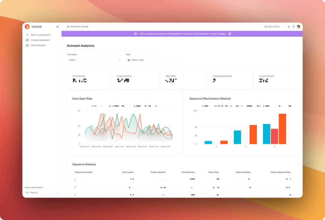
Want a different approach than building dashboards by hand? Upsolve takes an agentic path: business users ask questions in plain language and describe the views they want, and an analytics agent builds them, grounded in your team’s own metric definitions and validated data.
It’s designed for growing businesses that want real-time, trustworthy answers without standing up a full data team. 👉 Start with the Free trial today to see what an agent-driven approach looks like.
FAQs
What is a business intelligence dashboard?
A business intelligence dashboard is a visual tool that shows your key business data in one place. It helps you track sales, customer feedback, performance metrics, and more using easy-to-read charts and graphs.
Why should I use a business intelligence dashboard?
It helps you spot problems early, make faster decisions, and see real-time updates. Instead of digging through reports, you get simple visuals that tell you what’s working and what needs fixing.
What features should the best business intelligence dashboard have?
Look for easy setup, real-time data tracking, custom charts, strong integrations (like CRM or marketing tools), team sharing options, and budget-friendly pricing.
What are the common challenges with using business intelligence dashboards?
Some dashboards can be hard to set up, show too much data at once, or get expensive. Data integration and security can also be tricky if not handled properly.
Which business intelligence dashboard is best for small businesses?
Power BI and Zoho Analytics are great for small businesses because they are affordable, easy to use, and offer strong data visualization features.
Can I use a business intelligence dashboard for free?
Yes, some tools like Google Data Studio are completely free to use. Others like Power BI also offer free versions with basic features.
How do I choose the right business intelligence dashboard for my company?
Pick one that matches your team’s skill level, connects with your current tools, fits your budget, and offers the features you actually need—like real-time data, easy sharing, or custom reports.
Is Upsolve a good alternative for building dashboards?
Upsolve takes a different approach from traditional dashboard builders. Instead of building charts by hand, business users ask questions in natural language and describe the views they want, and an analytics agent builds them, embeddable and shareable inside your product. It’s built for teams that want trustworthy, real-time answers without heavy engineering work.

Try Upsolve for Embedded Dashboards & AI Insights
Embed dashboards and AI insights directly into your product, with no heavy engineering required.
Fast setup
Built for SaaS products
30‑day free trial