We tested five Domo competitors to compare analytics dashboards, features, pricing, and use cases to help you choose the right alternative.

Ka Ling Wu
Co-Founder & CEO, Upsolve AI
10 min

Are you using Domo for your analytics dashboards? I understand how important the right tool is for your business. But what if Domo isn’t meeting all your needs?
That’s why I decided to test 5 Domo Analytics Competitors. I wanted to find out which alternatives might offer better features, easier use, and more value for you.
In this blog, you’ll find which embedded analytics tool is better than Domo. You’ll learn which competitor has the best features, is user-friendly, and fits your budget.
Here’s what you’ll find:
A clear comparison of each tool’s key features
Insights on which tools are best for different industries
Pricing details to help you make an informed choice
By the end, you’ll know which Domo Analytics Competitor is right for your business. So, don’t miss out on this, as it will help you find the perfect dashboard to enhance your data and decision-making!
Why You Should Consider Domo Competitors?
While Domo is a powerful tool, many users face challenges that can impact how effectively it serves their needs. Let’s explore some of the most common issues and why you might want to consider alternatives.
Complicated Setup and Usage
Domo often feels complex to set up and use, especially for beginners. Many users report spending extra time learning the platform, which can slow down workflows.
Why This Matters:
It delays getting your dashboards up and running.
Your team may need extra training, adding costs and effort.
High Costs for Small and Mid-Sized Teams
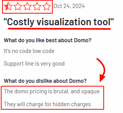
Domo’s pricing can be a challenge for businesses on tighter budgets. Many users feel the platform doesn’t offer enough flexibility to match its cost.
Why This Matters:
Smaller teams may struggle to justify the expense.
You might end up paying for features you don’t actually use.
Limited Customization
If you like dashboards tailored to your exact needs, Domo’s customization options might not be enough. Users often mention difficulties in creating fully personalized reports.
Why This Matters:
Limited flexibility can prevent you from presenting data the way you need.
You may feel restricted in showcasing unique insights.
Performance Issues with Large Data
Domo users often mention slower performance when handling large datasets. This can be a roadblock, especially if your business relies on quick decisions.
Why This Matters:
It can slow down critical processes.
Performance issues may grow as your data scales.
Lack of Advanced Features
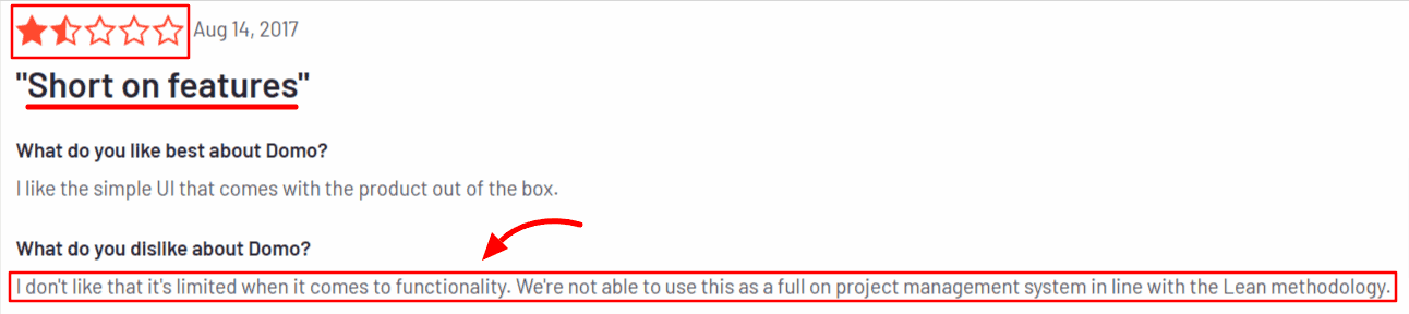
For businesses with complex analytics needs, Domo’s advanced capabilities may not always deliver, leaving gaps in how they analyze data.
Why This Matters:
You may need additional tools to fill these gaps.
It adds extra work and complexity to your analytics process.
These challenges don’t make Domo a bad choice but highlight why exploring other options is worth exploring. Finding the right tool can save you time, reduce costs, and help your team work smarter.
5 Best Domo Analytics Competitors for Analytics Dashboards
Picking the right Domo analytics competitor can save you time and effort, helping your business grow faster. After testing several tools, here are my top picks:
Upsolve.ai
Tableau
Mode
Power BI
MicroStrategy
Upsolve.ai – Best for Customer-Facing Analytics
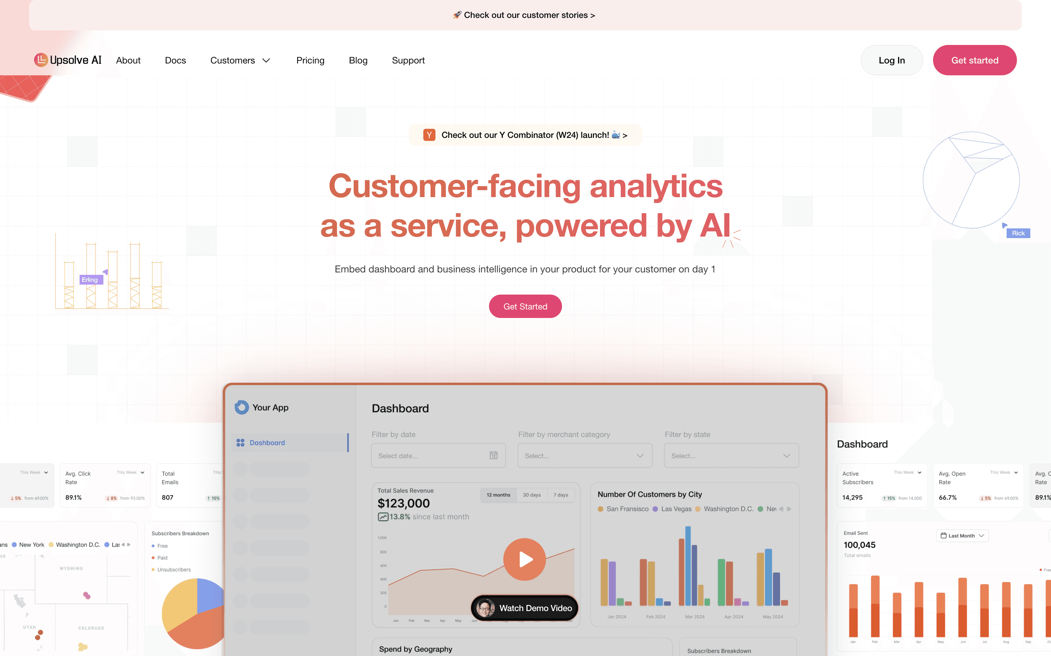
Upsolve.ai is perfect for businesses that want to create dashboards for their customers. It makes data simple to understand and use.
It’s designed to help you turn complex data into easy-to-read dashboards, making it a great choice if your users need clear, actionable insights.
Key Features of Upsolve.ai
Easy-to-Use Dashboards
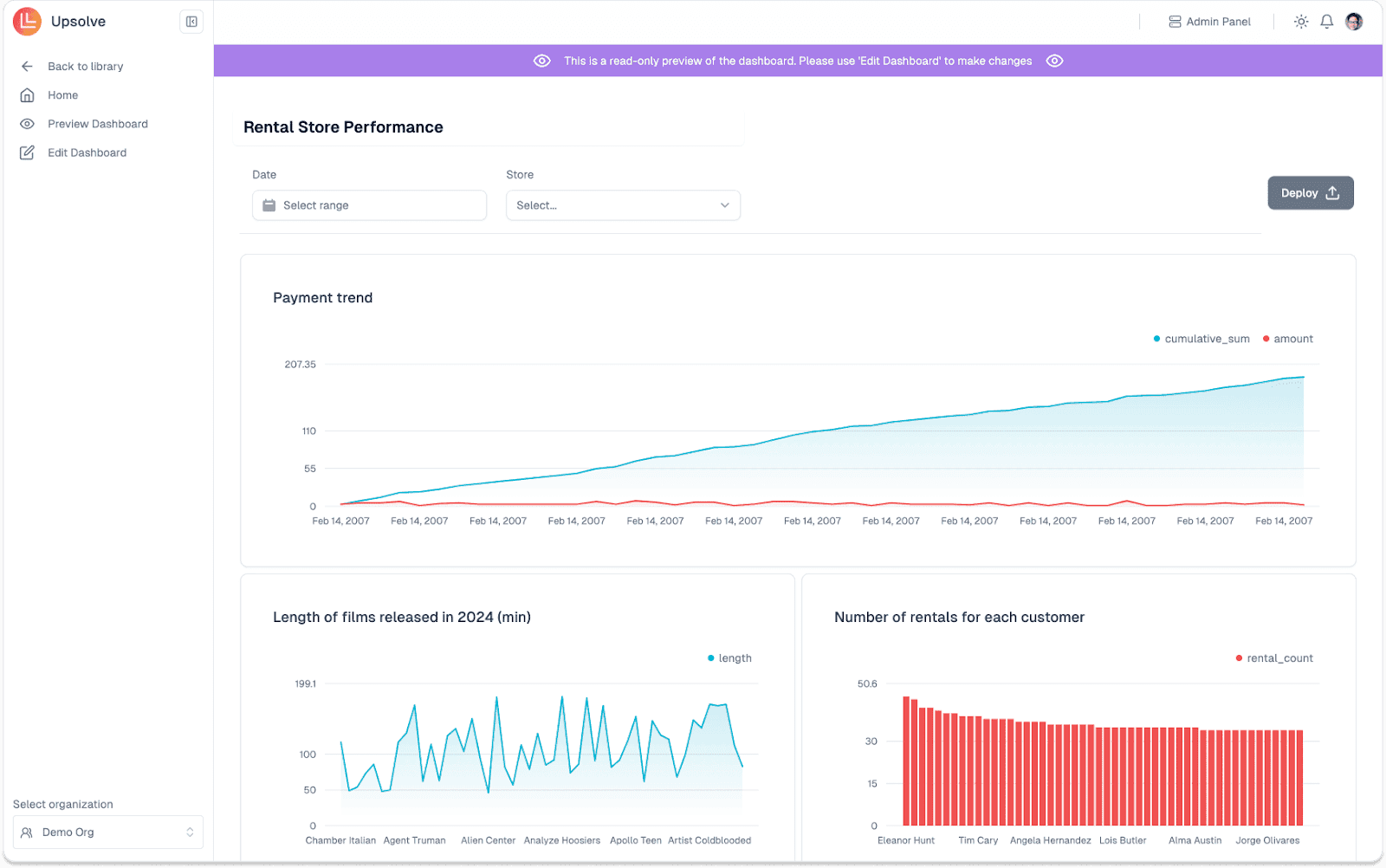
Upsolve.ai lets you create simple and interactive dashboards. Customers can explore and even customize them to meet their own needs, making your data useful and easy for them to work with.
Actionable Insights
Upsolve.ai helps you turn data into meaningful decisions. It shows patterns in your data and provides recommendations that you and your customers can act on right away.
Flexible Integration with Databases
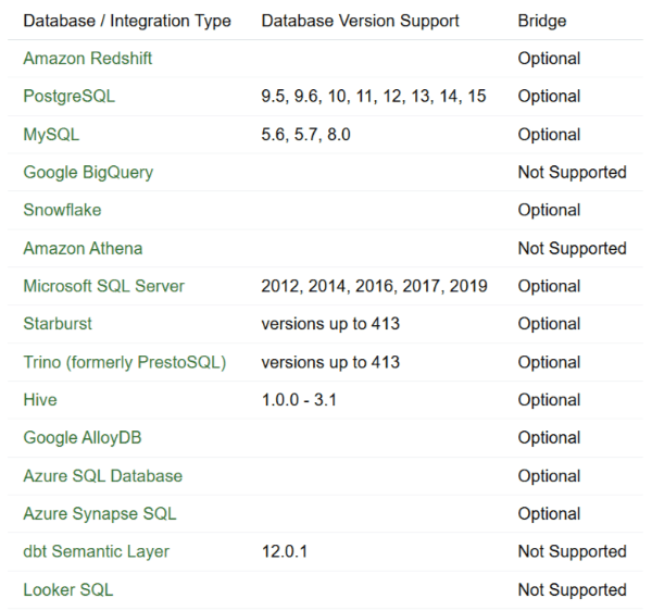
You can easily connect your data sources to Upsolve.ai. Whether it’s databases or data warehouses, the platform supports a wide range of integrations. It also allows custom setups for unique needs.
Customization for End Users
This tool puts control in the hands of your customers. They can personalize dashboards without needing your team’s help, saving you time and making them happier with the experience.
Pros and Cons of Upsolve.ai
Pros:
Easy to set up and use.
It helps make better decisions by turning data into insights.
Customers can customize dashboards on their own.
Connects seamlessly with most data sources.
Cons:
Setting up integrations may take some time initially.
It might not suit businesses with very unique or complex needs.
Some advanced features may require extra learning.
Pricing
Upsolve AI offers a free plan plus three paid tiers, billed around monthly credit usage:
Free ($0): 2,000 one-time credits (~200 questions); all Pro features, to test-drive
Pro ($500/mo): 2,000 credits/month; 50+ data connections, unlimited agents, full observability
Team ($2,000/mo): 10,000 credits/month; adds embedding, RBAC/row-level security, multi-tenant, and semantic-layer generation
Enterprise (custom): on-prem/VPC, SAML SSO, HIPAA, SOC 2, and BYOM
Each plan is designed to match different business sizes and budgets so you can scale as you grow. You can check more details on our pricing.
Tableau – Best for Interactive Data Visualization
Tableau is well-known for turning data into beautiful, easy-to-understand visuals. If you need clear, interactive dashboards, Tableau might be a great fit for you.
It’s designed for anyone, from beginners to experts, and helps you create dashboards that make even complex data easy to explore and share.
Key Features of Tableau
Simple Drag-and-Drop Tools
Tableau makes creating visuals straightforward. You can drag and drop data fields to build charts and graphs without needing any technical skills.

Real-Time Updates
Tableau connects to your data sources and updates in real time. This means you always work with the most accurate and current data.Interactive Dashboards
With Tableau, your dashboards aren’t just static visuals. Users can click, filter, and drill down into the data for deeper insights.Supports Multiple Data Sources
Tableau works with almost any data source, like spreadsheets, databases, and cloud-based services. This flexibility makes it easy to bring all your data together.Helpful Community and Resources
Tableau has a large community where you can find answers, tips, and inspiration to make the most out of your dashboards.
Pros and Cons of Tableau
Pros:
Easy to use for beginners and advanced users.
Stunning visualizations that are simple to customize.
Real-time data updates for accurate insights.
A strong community for support and ideas.
Cons:
Pricing can be expensive for small businesses.
Learning advanced features might take some time.
May slow down with very large datasets.
Pricing
Tableau offers different plans based on your needs:
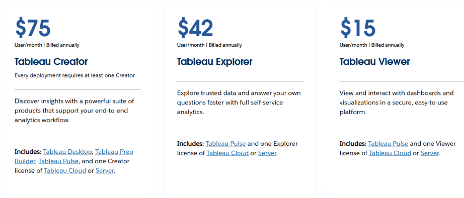
Creator ($75/user/month): Best for those building dashboards and analyzing data. This includes access to Tableau Desktop, Prep Builder, and one Creator license.
Explorer ($42/user/month): Ideal for those who want to explore and analyze dashboards but don’t need to create them from scratch.
Viewer ($15/user/month): For teams who only need to view and interact with existing dashboards.
Each plan is designed to fit businesses of different sizes and needs.
Mode – Best for Collaborative Data Analysis
Mode is a data analytics platform that brings together data teams and business users to explore and understand data collaboratively. It combines SQL, Python, R, and visual analytics in one place, making it easier to analyze and share insights.
Designed for both technical and non-technical users, Mode helps you create reports and dashboards that are easy to understand and share across your organization.
Key Features of Mode
Integrated SQL, Python, and R Notebooks
Mode allows you to write SQL queries and use Python or R for deeper analysis, all within the same platform. This integration streamlines your workflow and keeps everything in one place.
Interactive Dashboards and Reports
With Mode, you can create interactive dashboards that let users explore data by filtering and drilling down into details. This makes it easier to uncover insights and make informed decisions.Collaboration Tools
Mode offers features like shared reports, comments, and notifications, enabling your team to work together effectively and fostering a data-driven culture within your organization.Data Connectivity
Mode connects to various data sources, including databases and cloud services, ensuring you can analyze all your data in one place. This flexibility helps you get a complete view of your business.Custom Visualizations
Mode provides a range of visualization options and allows for custom HTML dashboards, enabling you to present data in a way that best suits your audience. This helps in communicating insights more effectively.
Pros and Cons of Mode
Pros:
Combines multiple tools (SQL, Python, R) in one platform.
Facilitates collaboration among team members.
Offers interactive and customizable dashboards.
Supports various data sources for comprehensive analysis.
Cons:
It may have a learning curve for new users.
Advanced features require technical knowledge.
Performance can be affected with very large datasets.
Pricing
Mode offers different plans to meet the various needs:
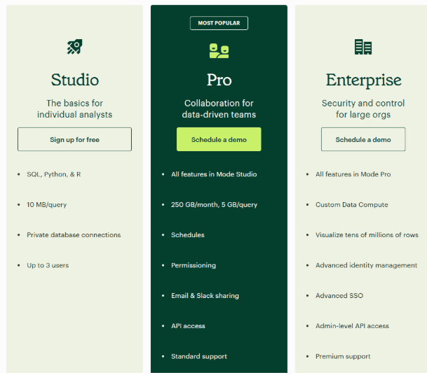
Studio (Free): Suitable for individual analysts, this plan includes SQL, Python, R, and private database connections.
Pro (Contact for Pricing): Designed for data-driven teams, it includes all Studio features plus schedules, permissions, email and Slack sharing, API access, and standard support.
Enterprise (Contact for Pricing): Tailored for large organizations, it offers all Pro features plus advanced identity management, advanced SSO, admin-level API access, and premium support.
Each plan is designed to meet the needs of different users, from individuals to large organizations.
Power BI – Best for Comprehensive Business Analytics
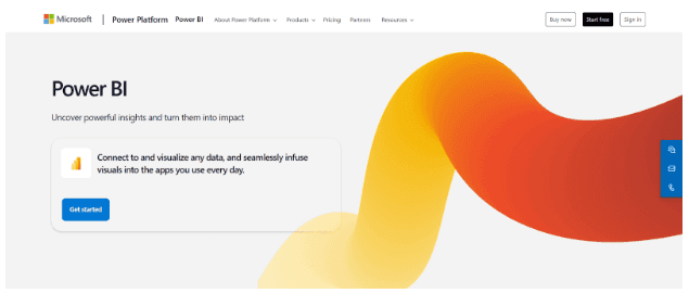
Power BI, created by Microsoft, helps you turn your data into clear, easy-to-read visuals. It’s great for businesses of all sizes and works well for both beginners and advanced users.
With Power BI, you can quickly create dashboards and reports that are simple to share with your team, making decision-making faster and smarter.
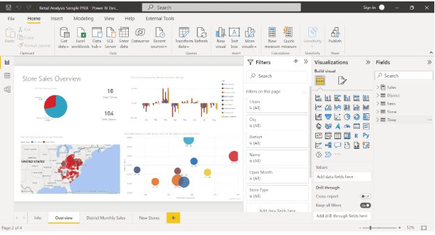
Key Features of Power BI
Easy-to-Use Interface
Power BI makes it simple to create dashboards using a drag-and-drop feature. You don’t need to be a tech expert to get started.
Real-Time Updates
Power BI connects to your data sources and keeps everything updated in real time. This ensures that your reports always have the latest information.
Interactive Dashboards
Your dashboards aren’t just for viewing—they allow you to click, filter, and explore data in detail, making it easier to understand and analyze.Works Seamlessly with Microsoft Tools
If you already use tools like Excel or Azure, Power BI fits right in, making your workflow smoother and more efficient.Strong Security
Power BI gives you control over who can view and use your reports, keeping your data safe and secure.
Pros and Cons of Power BI
Pros:
Simple and easy to use for beginners.
Great visuals with lots of customization options.
Works perfectly with other Microsoft products.
Real-time updates ensure your data is always current.
Cons:
Advanced analytics may take time to learn.
It can slow down with very large datasets.
Some advanced features require extra licenses.
Pricing
Power BI offers flexible pricing options:
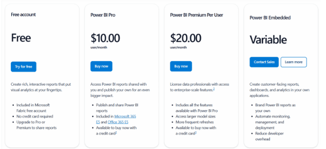
Power BI Desktop (Free): Perfect for individuals who want to create dashboards and reports on their computer.
Power BI Pro ($10/user/month): Lets you share and collaborate on reports with others.
Power BI Premium (Starting at $20/user/month): Best for businesses needing larger storage, faster data refreshes, and advanced features.
Power BI is a fantastic option if you want a tool that combines ease of use, powerful visuals, and strong integrations. It’s especially useful for businesses already using Microsoft products. If you’re looking for a Domo alternative, Power BI might just be the perfect fit!
MicroStrategy – Best for Enterprise-Level Analytics
MicroStrategy is a powerful tool designed for businesses that handle large amounts of data. It helps organizations analyze complex data, create reports, and make better decisions.
This platform is ideal for enterprises looking for advanced analytics with the ability to scale as the business grows.
Key Features of MicroStrategy
Advanced Analytics
MicroStrategy offers tools for analyzing complex data. It helps you spot trends and patterns, giving you a deeper understanding of your business.Scalable Design
This platform is built to handle large amounts of data. MicroStrategy adapts to meet your needs, whether your business is small or growing fast.Mobile Access
You can access dashboards and reports from your phone or tablet. This flexibility lets you stay connected to your data, even on the go.Wide Data Integration
MicroStrategy connects to many data sources, such as databases, cloud services, and big data platforms. This ensures that you can view all your business data in one place.Strong Security
MicroStrategy keeps your sensitive data safe with built-in features like user authentication and encryption.
Pros and Cons of MicroStrategy
Pros:
Handles large data volumes and complex analytics.
Flexible access with mobile features.
Secure platform to protect your business data.
Suitable for businesses of all sizes, especially large ones.
Cons:
It can be difficult for beginners to learn.
Higher cost compared to other tools, making it less ideal for small businesses.
Setting up the platform might take some time and effort.
Pricing
MicroStrategy doesn’t list standard pricing as it offers custom plans based on your needs. They provide flexible options like user-based and usage-based pricing.
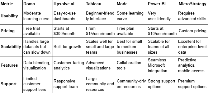
Comparison Table: Domo vs Top Competitors
If you’re trying to choose the right analytics tool, it can be overwhelming to compare all the options. That’s why I’ve created this simple comparison table to help you see how Domo still lacks in comparison to its top competitors: Upsolve.ai, Tableau, Mode, Power BI, and MicroStrategy.
Here’s what I’ve focused on:
Usability: How easy is it to use?
Pricing: Is it budget-friendly for your needs?
Scalability: Can it grow with your business?
Features: What makes each tool unique?
Support: How reliable is customer support?
Take a look at the table below to find the best fit for your business.
I hope this comparison makes your decision easier. Each tool has its strengths, so pick the one that matches your needs and budget. And if you’re unsure, start with a free trial or demo to see if it can really work for your business!
How to Choose the Right Tool Among Domo Analytics Competitors
Picking the right Domo analytics competitor tool doesn’t have to be complicated. So, I’ve broken it down so you can find what works best for your business. It all comes down to understanding your needs, testing options, and finding the perfect match.
What to Consider When Choosing the Right Tool
Your Purpose: Are you creating dashboards for customers or for internal use? If it’s for customers, Upsolve.ai is designed to make this easy and effective.
Ease of Use: Choose a tool that fits your skill level. If you want simplicity, tools like Upsolve.ai or Power BI are great choices.
Scalability: Consider how much data you handle and how quickly you grow. Tools like Upsolve.ai or MicroStrategy are great for scaling up.
Your Budget: Mode and Power BI work well for smaller budgets. Larger businesses may find tools like MicroStrategy or Domo more suitable.
Steps to Test and Choose the Right Tool
Know What You Need: Consider what features matter most to you, like customization or user-friendliness.
Test Tools First: Many tools offer free trials. Try them to see how they work for you.
Look at Support Options: Make sure you’ll have help when you need it.
Ask Your Team: Get feedback from the people using the tool the most.
Compare Prices and Features: Check what you’re getting for the cost to ensure it’s worth it.
Final Thoughts
Each tool has its strengths, but if you need dashboards for your customers, Upsolve.ai is the way to go. It’s easy, scalable, and designed to create dashboards your customers will actually use.
Still, choosing the right Domo alternative depends on you if Domo has not fulfilled specific embedded analytics requirements. So, research on ease of use, scalability and budget to take control of business data.

Try Upsolve for Embedded Dashboards & AI Insights
Embed dashboards and AI insights directly into your product, with no heavy engineering required.
Fast setup
Built for SaaS products
30‑day free trial